How to Create a Spaced Out Text Effect in Canva
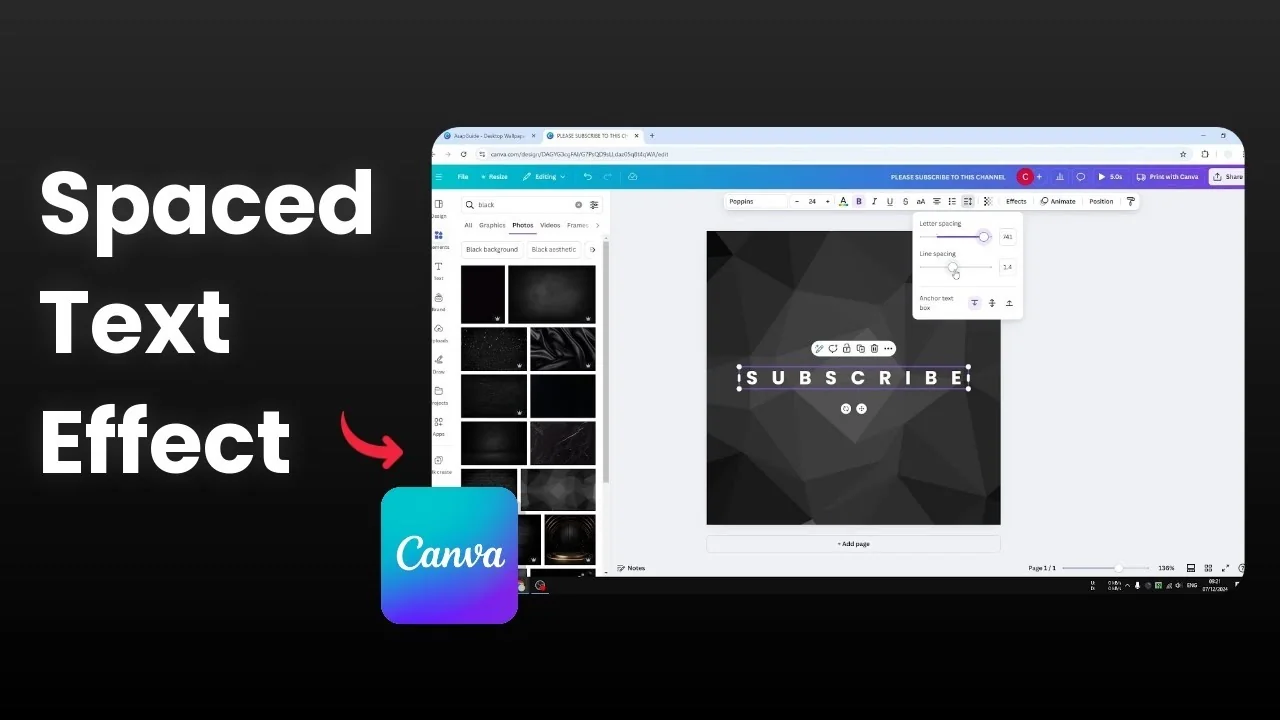
I want to show you how to space out text in Canva. The goal is to create more gaps between letters in a text box and also adjust the distance between lines. By default, Canva follows the font’s built-in spacing, but you can change both at any time.
If you enjoy styling text effects too, try a playful look with a balloon text effect in Canva once your spacing looks right.
Create a Spaced Out Text Effect in Canva
You can adjust two controls inside the Spacing panel. Letter spacing spreads characters farther apart, while line spacing changes the vertical distance between lines of text. Both settings help you match the look and feel you want.
Letter spacing
Letter spacing increases or decreases the space between each character in a text box. This makes letters appear more distant from one another for a clean, airy look. It works with any font.
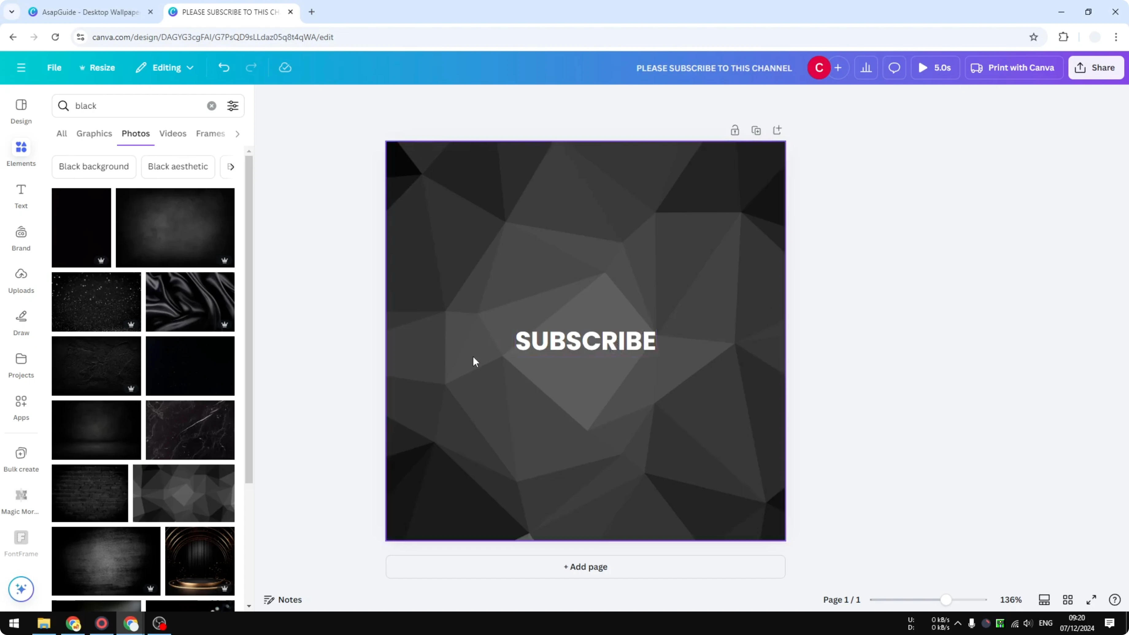
Open your design in Canva.
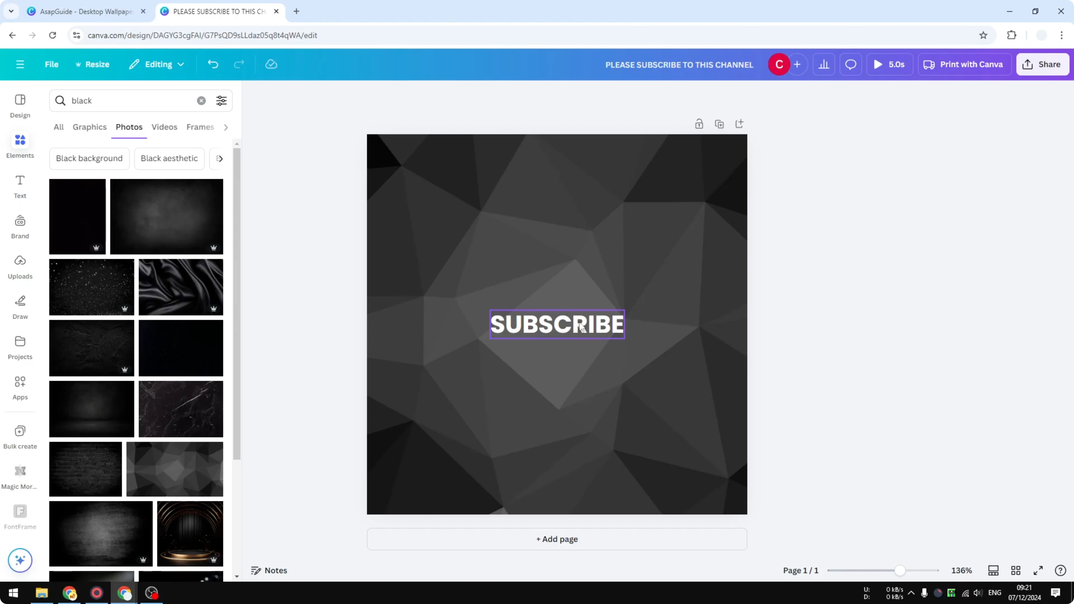
Select the text box you want to edit.
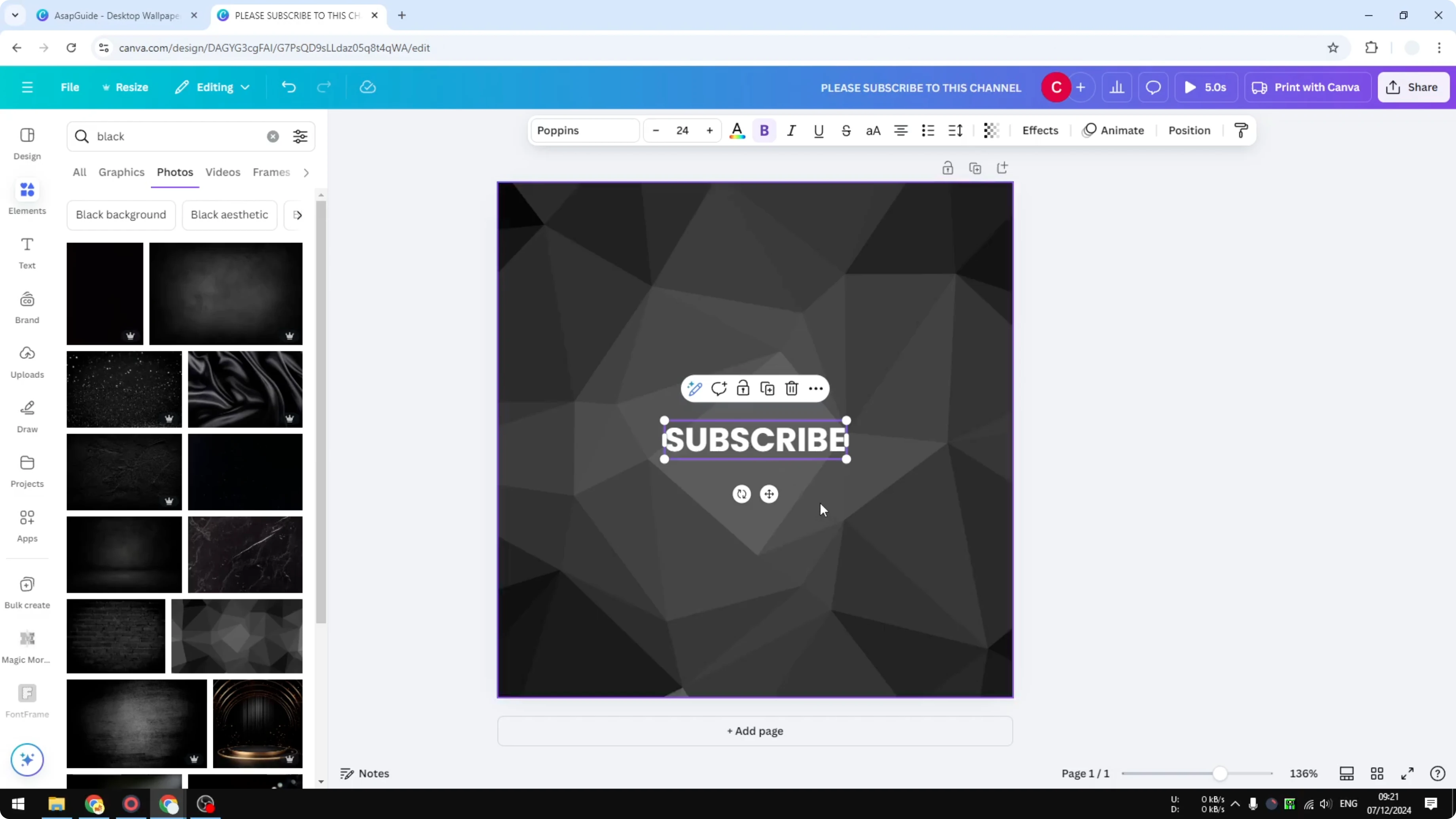
Click Spacing in the top toolbar.
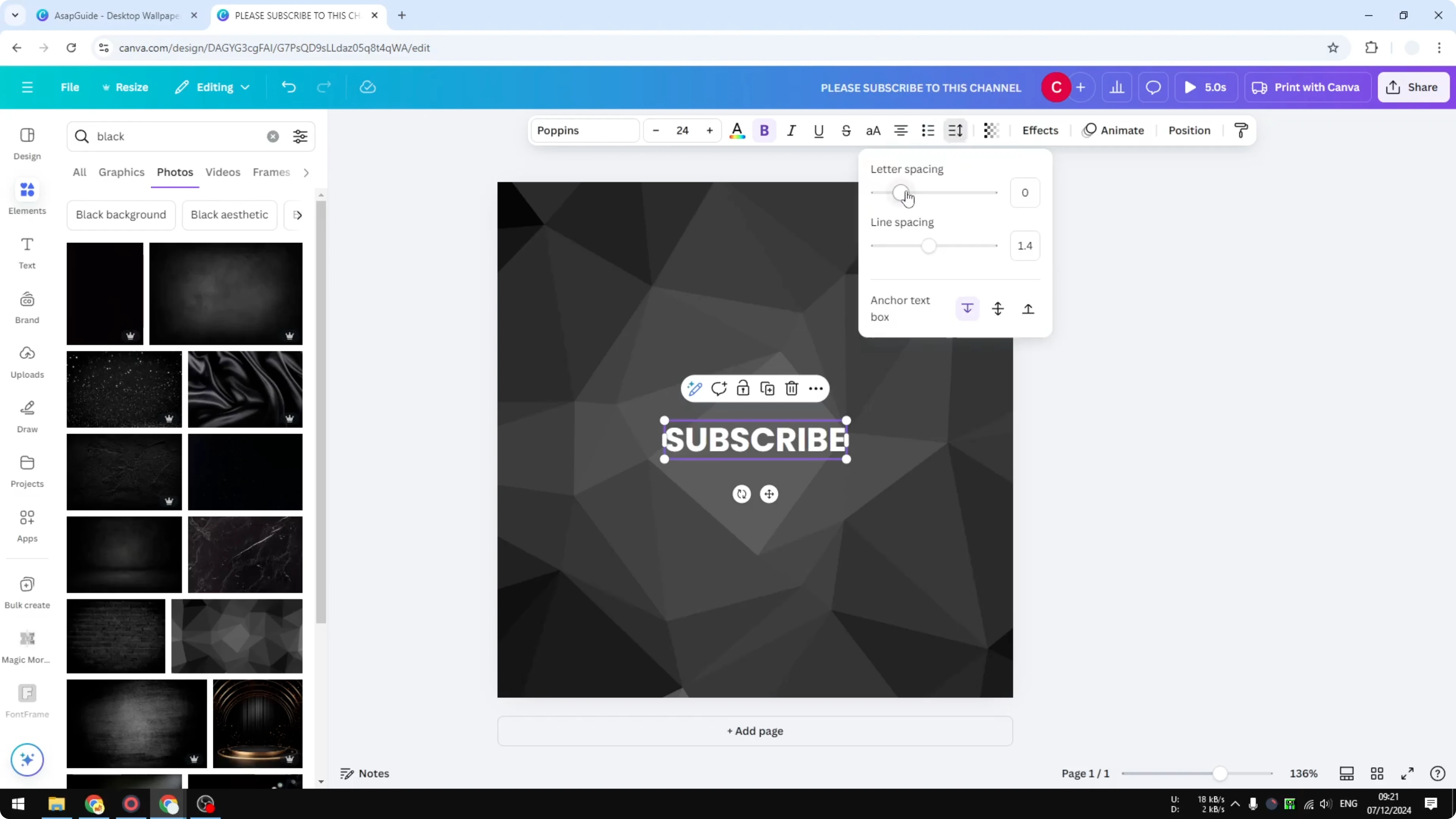
Under Letter spacing, drag the slider to the right to increase the distance between letters.
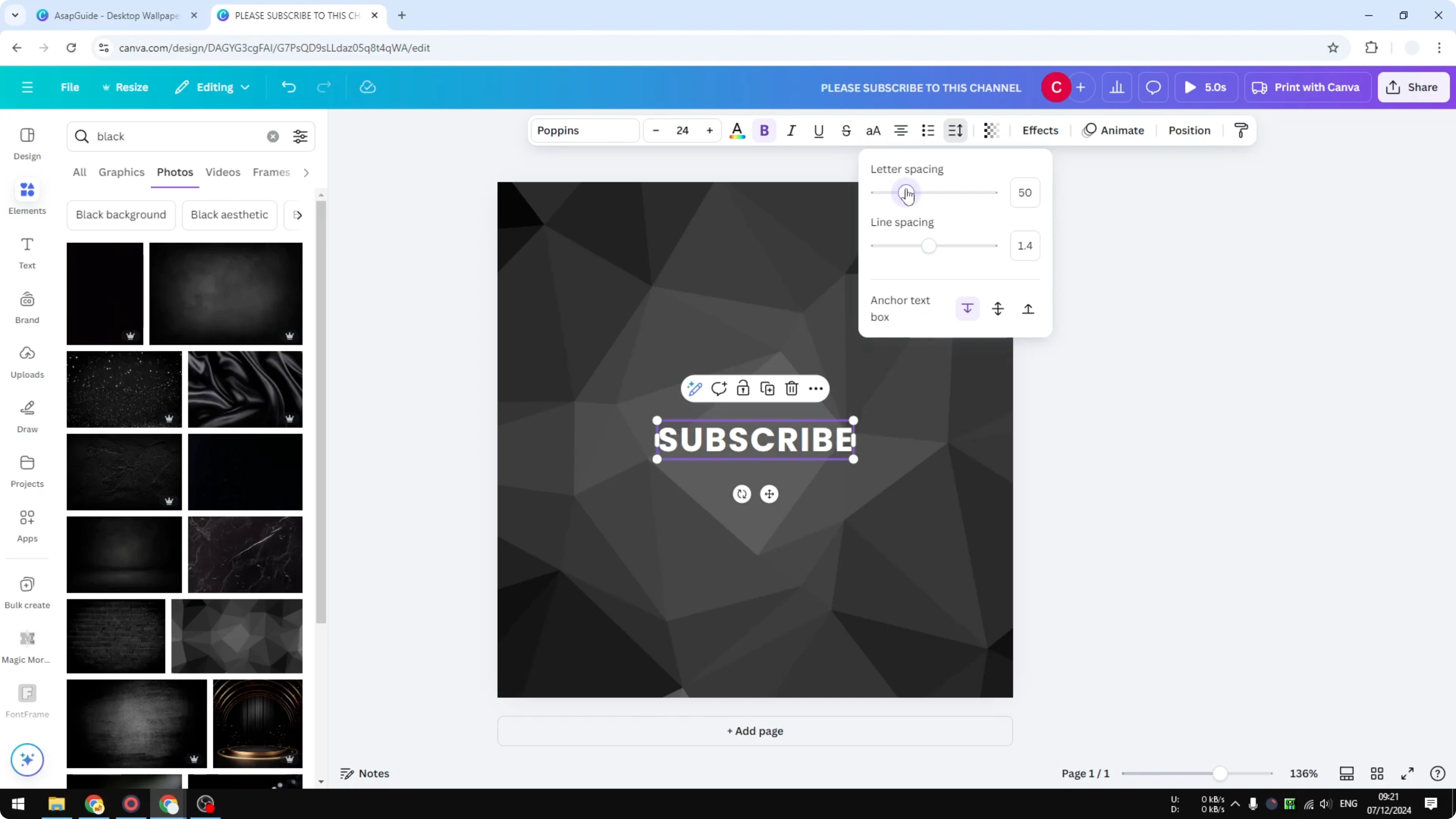
Stop when you reach the look you want.
If you are building layered styles, you can pair spaced letters with echoes and shadows. For a quick method, see this echo text effect tutorial after you set spacing.
Line spacing
Line spacing adjusts the vertical distance between multiple lines of text. This is helpful for headings with subtitles or any paragraph that needs more breathing room. You can also reduce it if you want a tighter block of text.
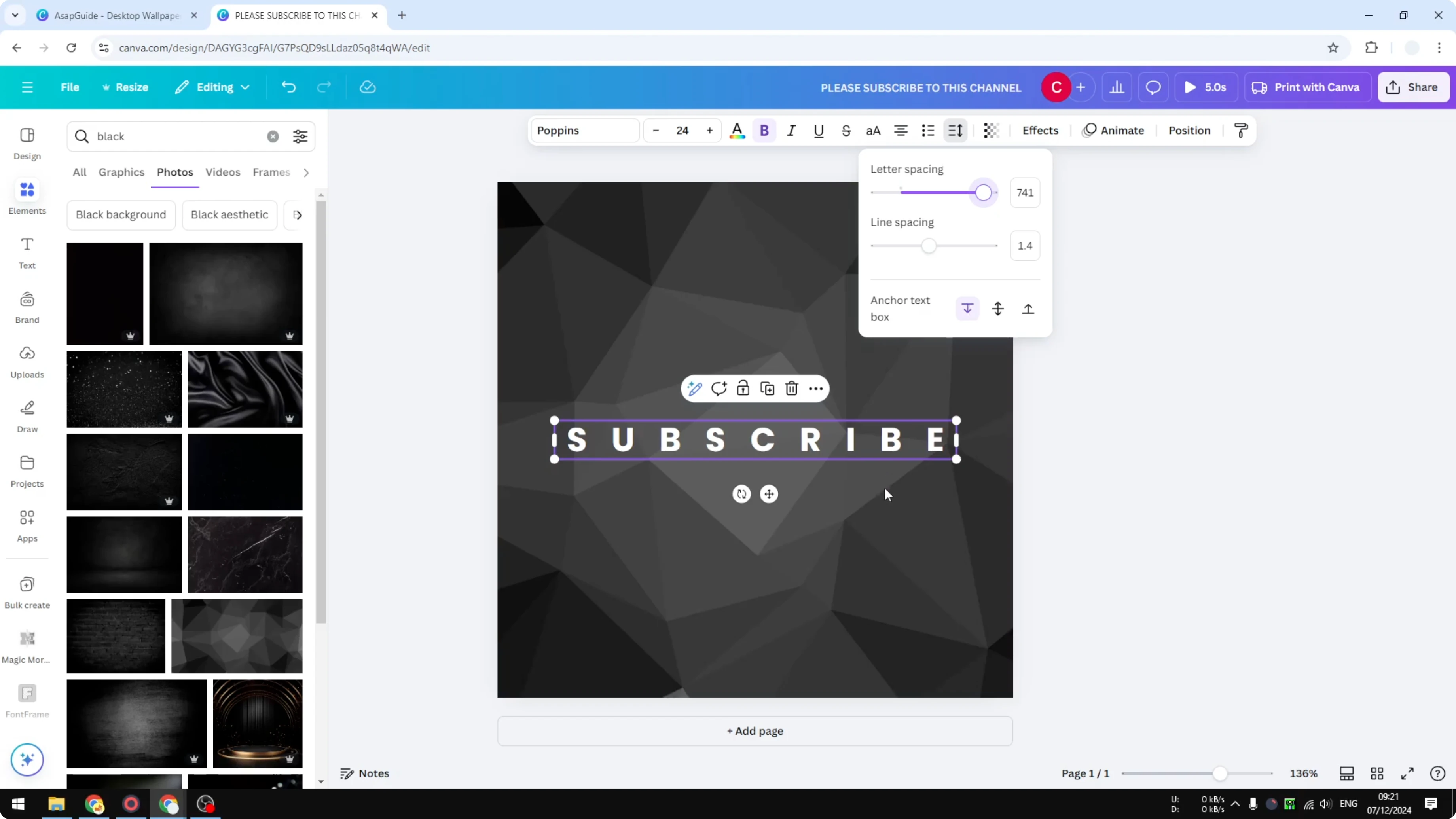
Type multiple lines inside your text box.
Select the text box and click Spacing in the toolbar.
Under Line spacing, drag the slider to the right to push lines farther apart.
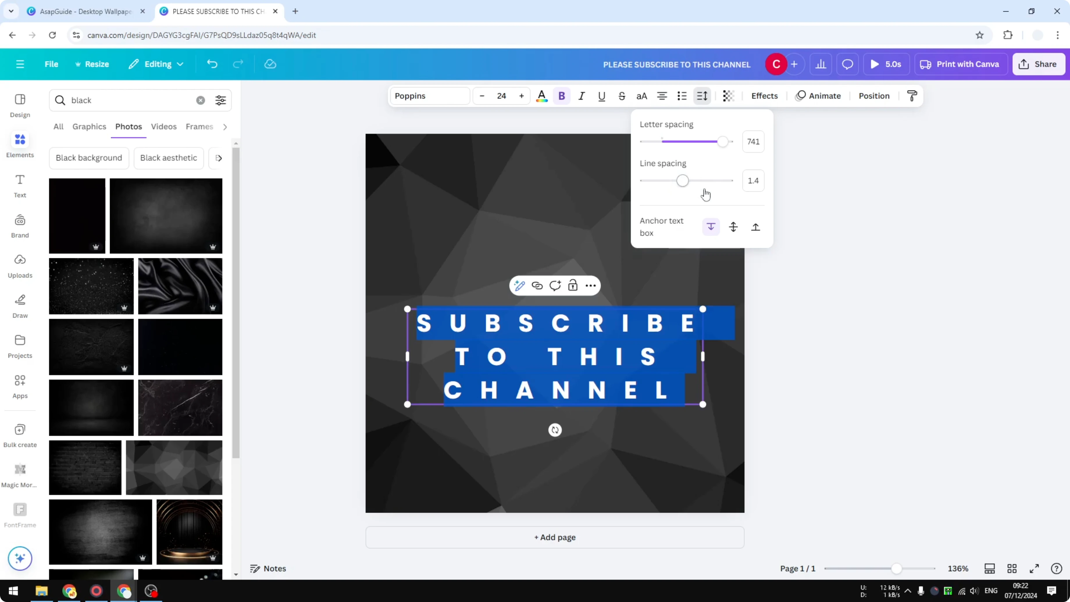
Drag to the left to bring lines closer together.
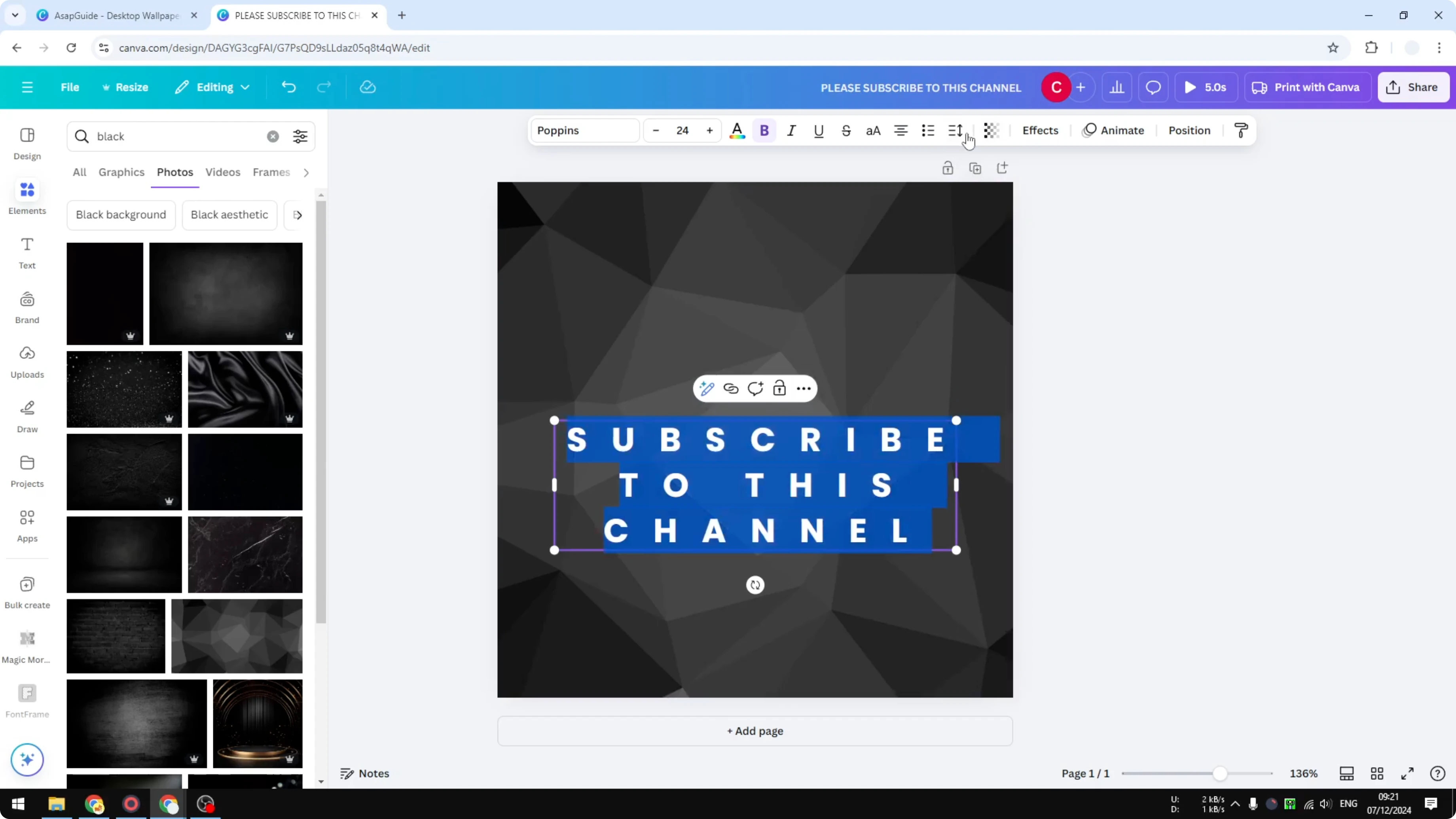
Style choices
Sometimes you want text to be very close. Slide letter spacing and line spacing to the left for a compact style. Slide to the right for a wide, minimal look.
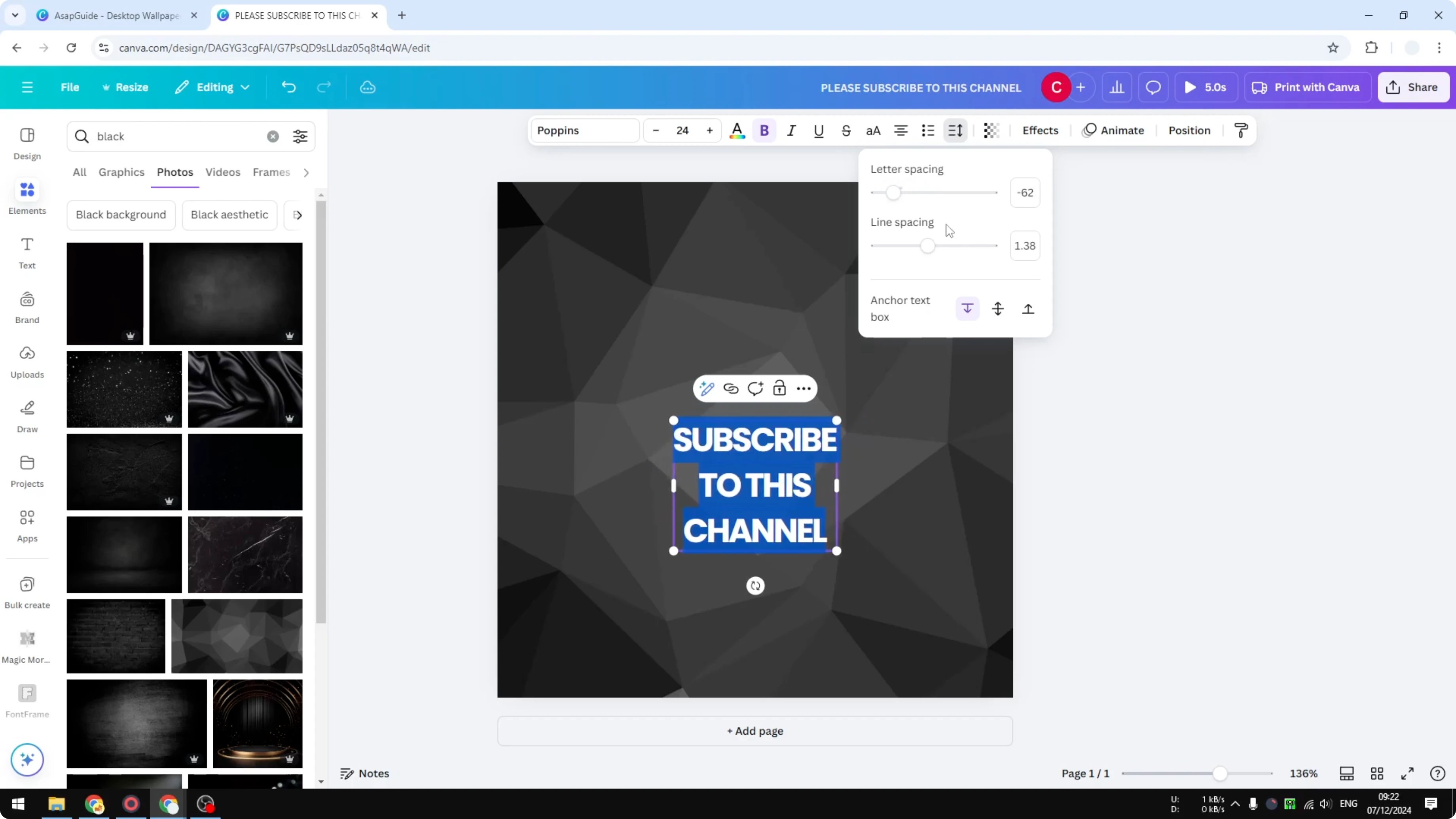
Test small changes and compare. Tiny adjustments often make a big visual difference.
Spacing vs stretching
Spacing changes the gaps around characters and lines. Stretching is different because it makes each character itself appear wider, not just farther apart. Use spacing for controlled gaps and stretching for wider letter shapes.
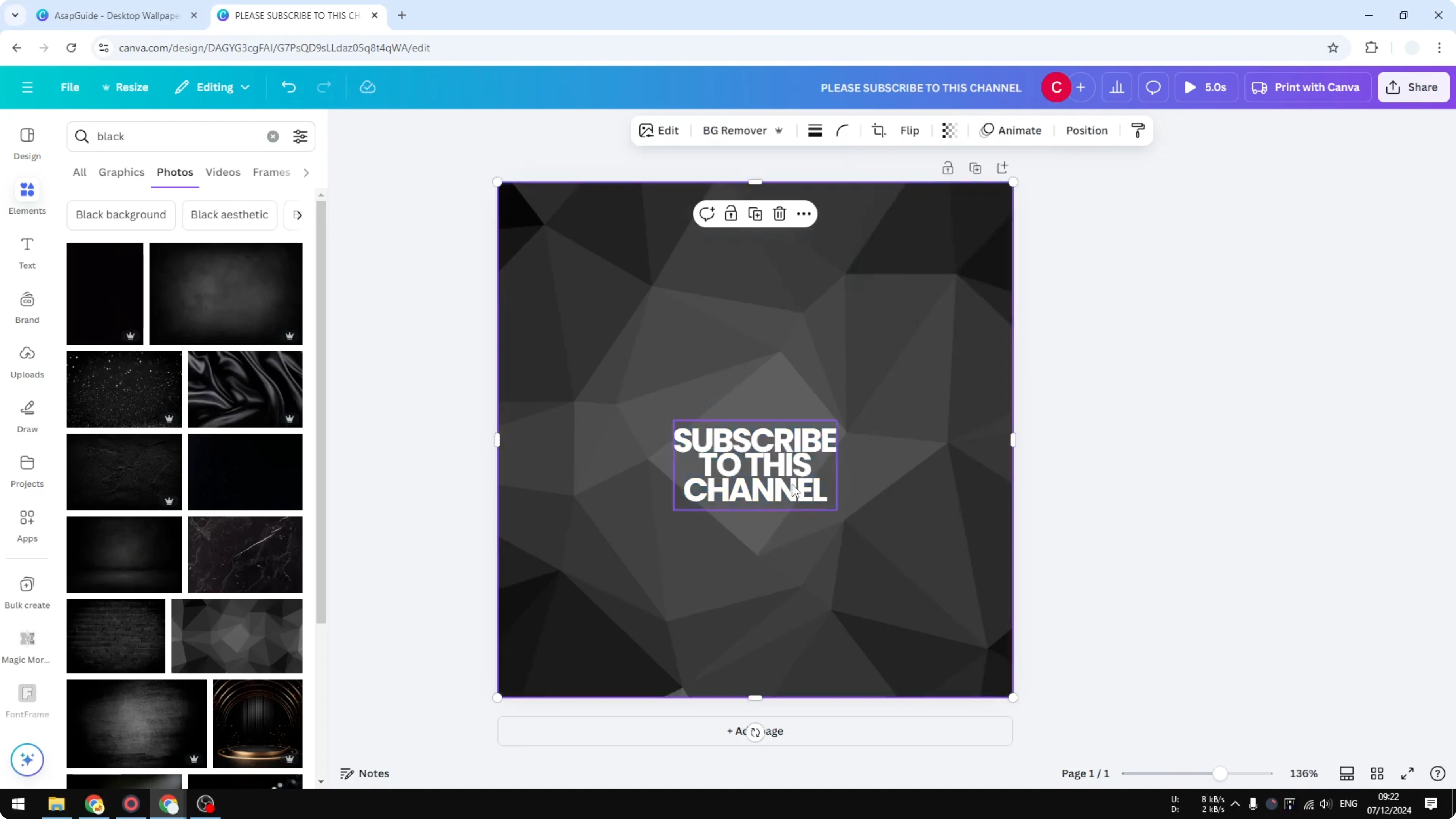
For a softer finish on headings or captions, try blending spacing with a subtle fade. You can follow this method to create a faded text effect once your spacing is set.
Final Thoughts
Letter spacing and line spacing give you precise control over how your text feels on the page. Move each slider slowly and stop the moment it looks right for your font. Small tweaks add up to a clean, polished result.
Recent Posts
How to Visualize Yourself as a Pixelized Character with AI?
How to Visualize Yourself as a Pixelized Character with AI?
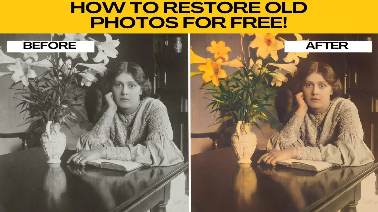
How to Revive Faded Memories and Enhance Image Clarity with AI?
How to Revive Faded Memories and Enhance Image Clarity with AI?
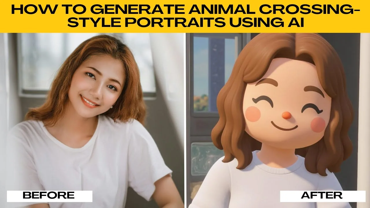
How to Visualize Yourself as an Animal Crossing Character with AI?
How to Visualize Yourself as an Animal Crossing Character with AI?