How to Create a Line Graph in Canva

I’m going to show you how to create a line graph in Canva. Open a new design, add a line chart, edit the data, and style it to match your project. The built-in data editor updates your chart automatically as you type.
Create a Line Graph in Canva
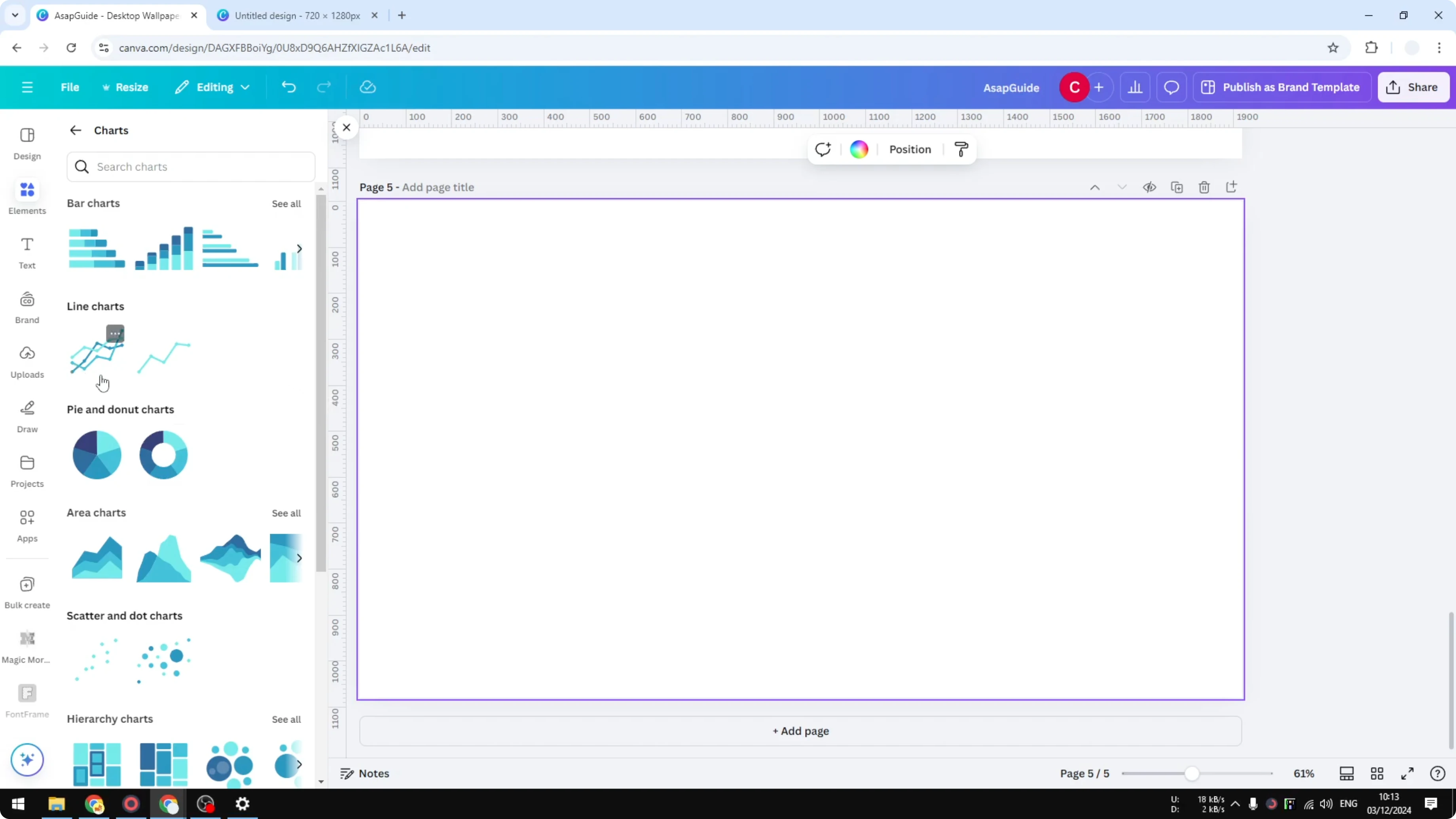
Add the chart
Open a new page in Canva. Go to Elements, scroll to the Charts section, and open it. Choose the Line Chart and pick either of the two options to insert a template you can edit later.
If you are building a design-heavy layout, a soft background can help your chart stand out. Try a simple bokeh effect to keep focus on the data.
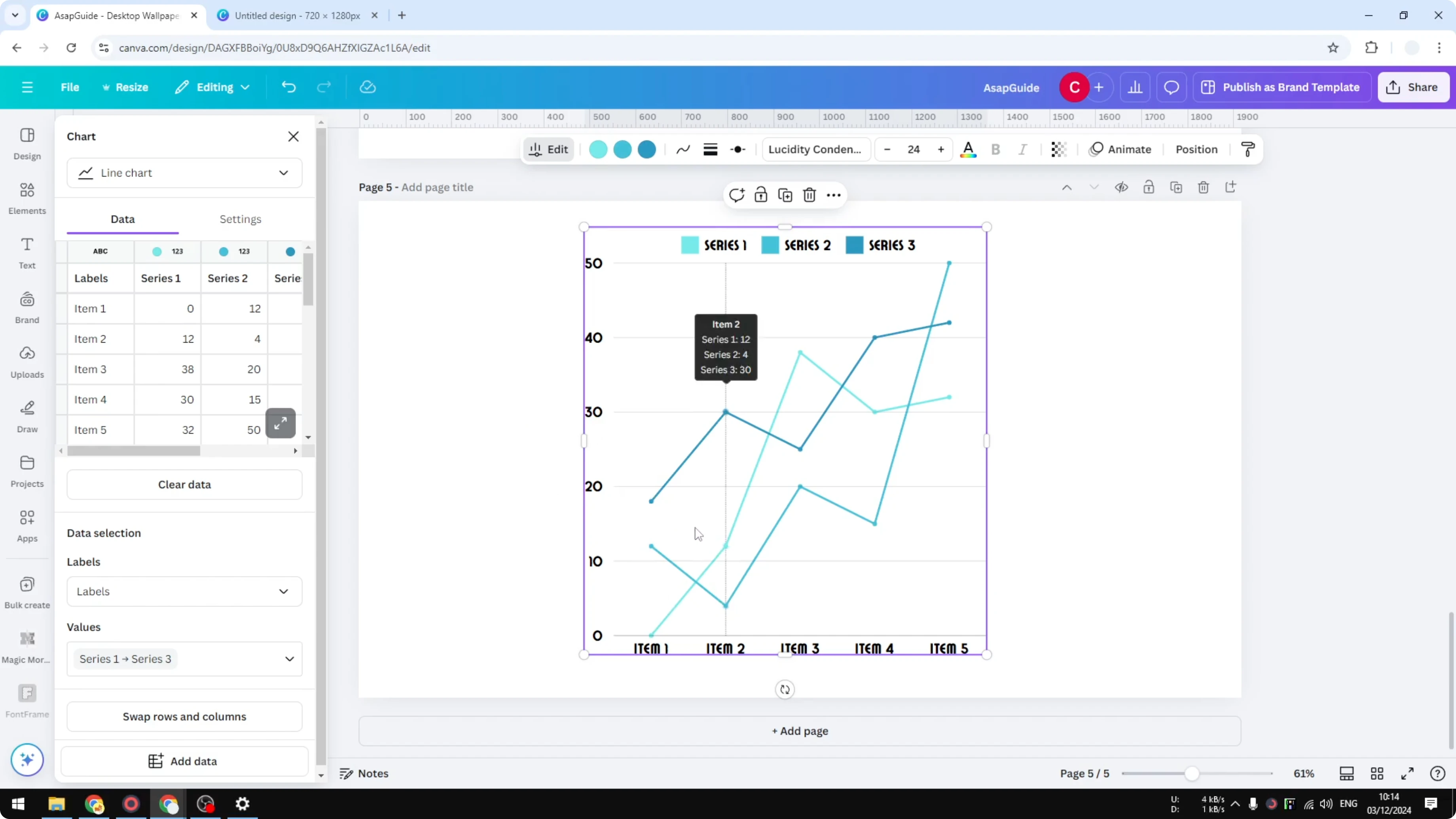
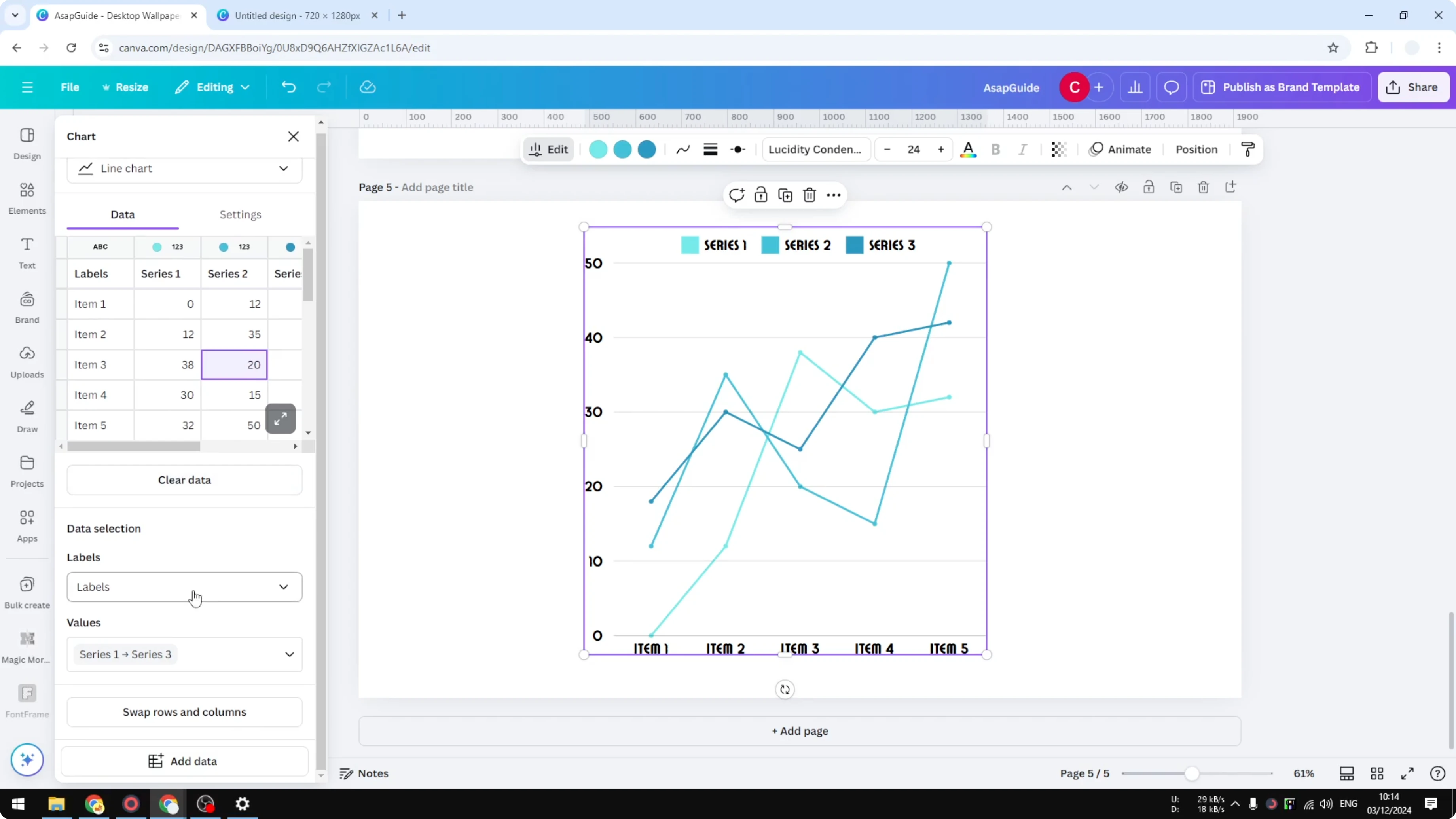
Edit data
Use the data panel on the left to modify values. For example, change Item 2 in Series 2 to 35 and press Enter, and the chart updates instantly. You do not need to edit points on the canvas, because the data panel controls the chart.
Labels and values
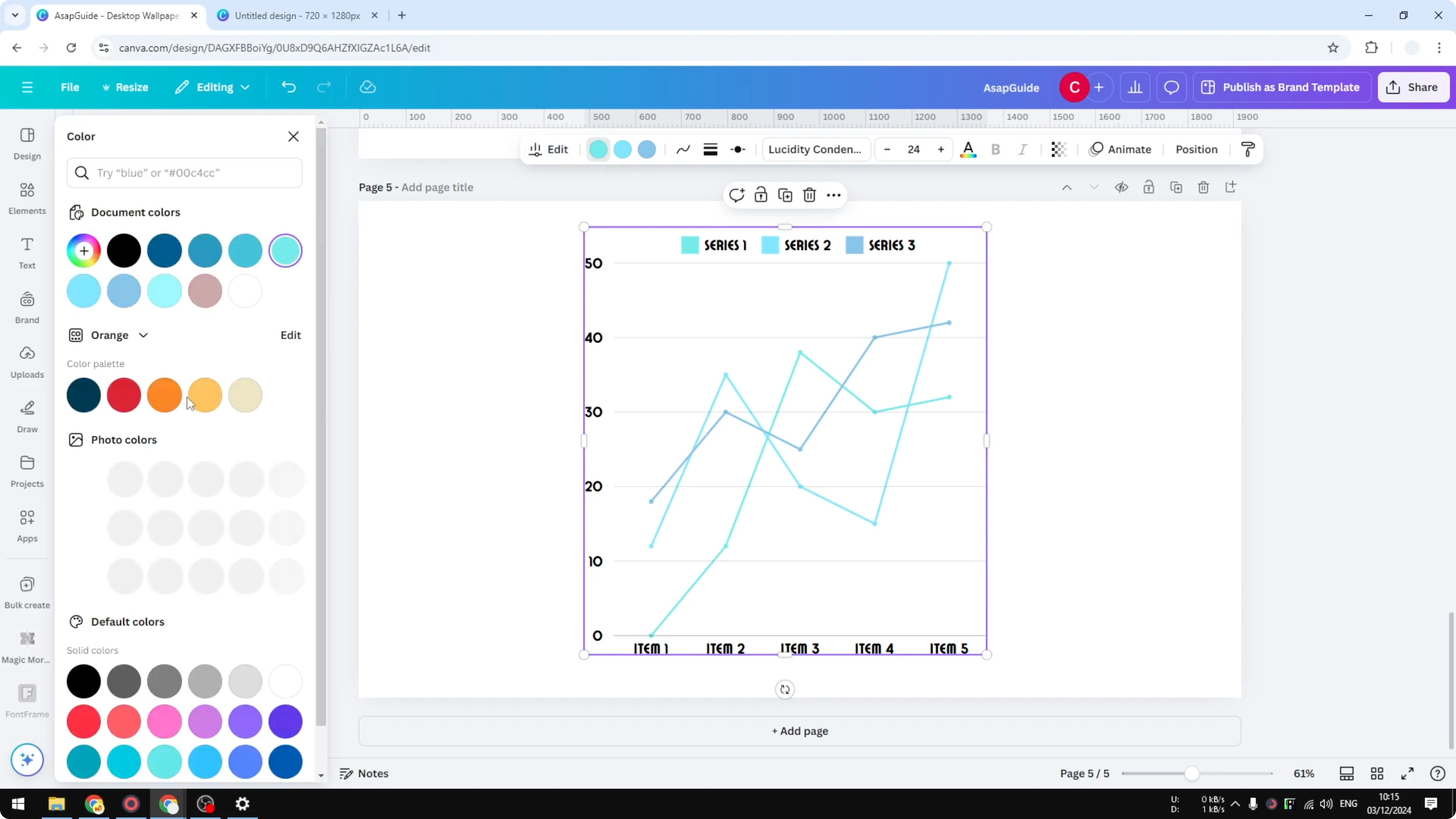
Choose which row to use as labels in the Labels control. The default labels might be Item 1 and Item 2, but you can switch to any row if it suits your data. Pick which rows supply Values, and remove any series you do not need, and the chart adjusts automatically.
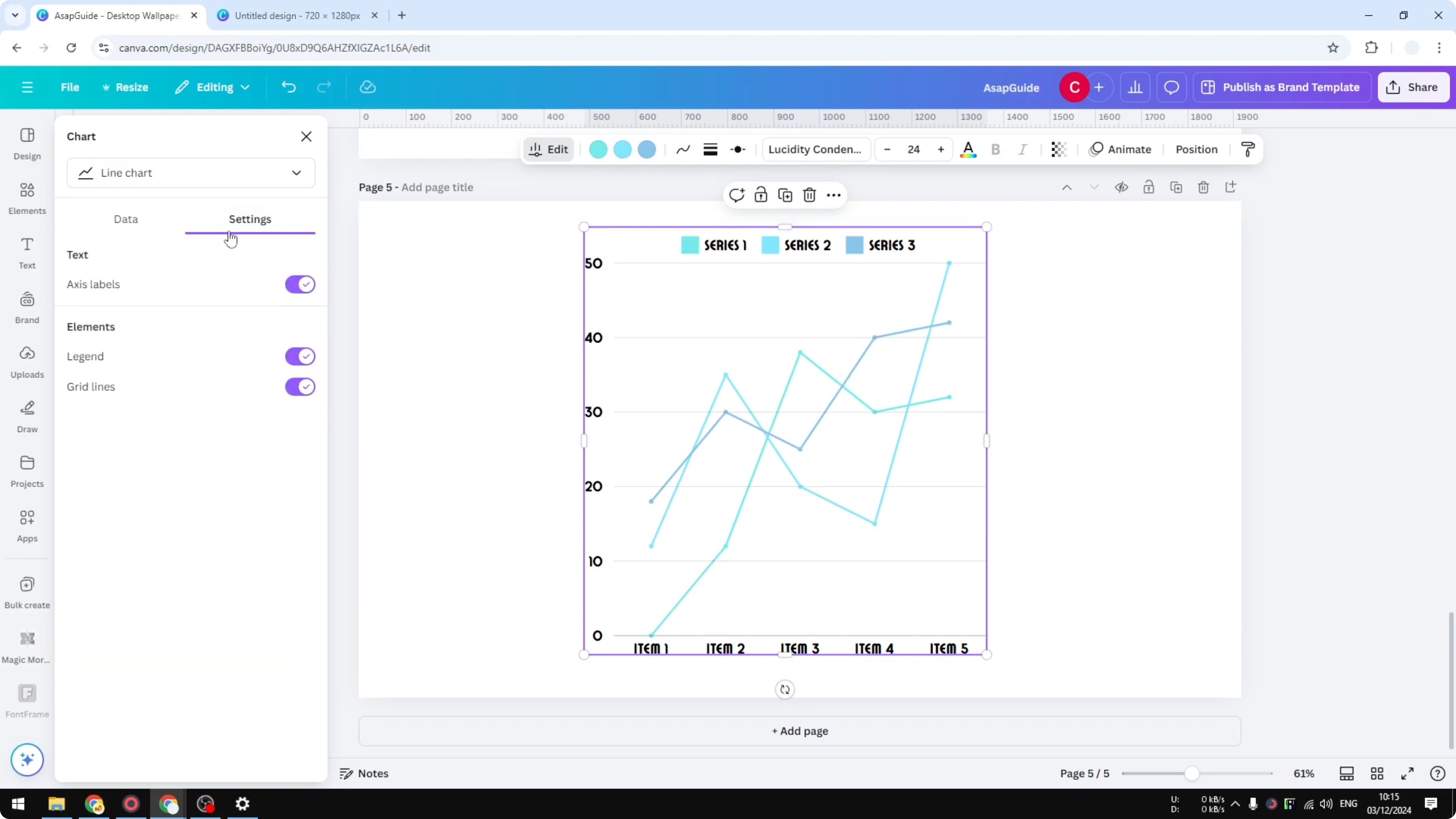
Style and settings
Open Settings to fine-tune the chart. Toggle the axis labels if you want a cleaner frame, and show or hide the legend to give viewers context. You can also remove grid lines, though I think it is better to keep them for readability.
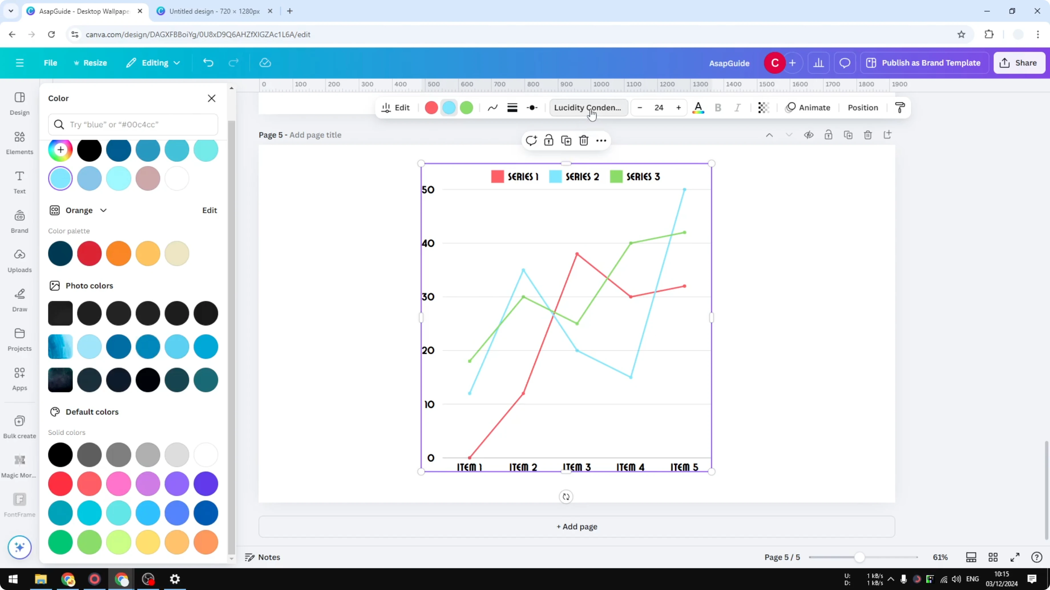
Change the series colors to match your palette. For example, set one series to orange, another to red, and another to green. That combination gives clear separation between lines.
If your chart includes dense text, balanced alignment can help. For multi-line blocks around the chart, see justified text.
Typography and markers
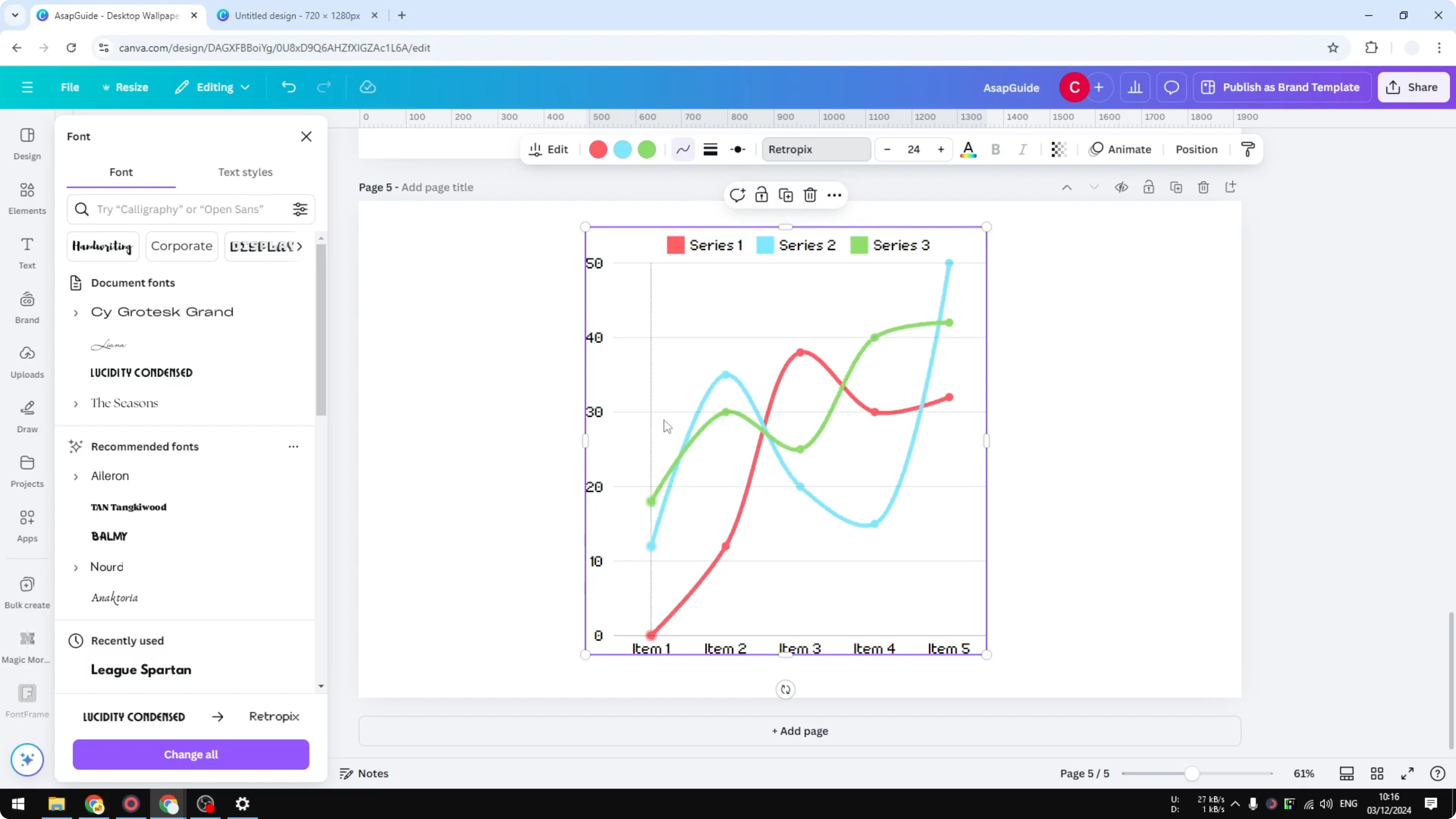
Switch the chart font from the default to something that fits your theme. I like a retro font for a more interesting look. Change the marker style and size, and a simple circle often reads best.
Increase the line weight to make trends easier to see. Thicker lines can help when the chart is small. Test a couple of weights to find the right balance.
Smoothing and size
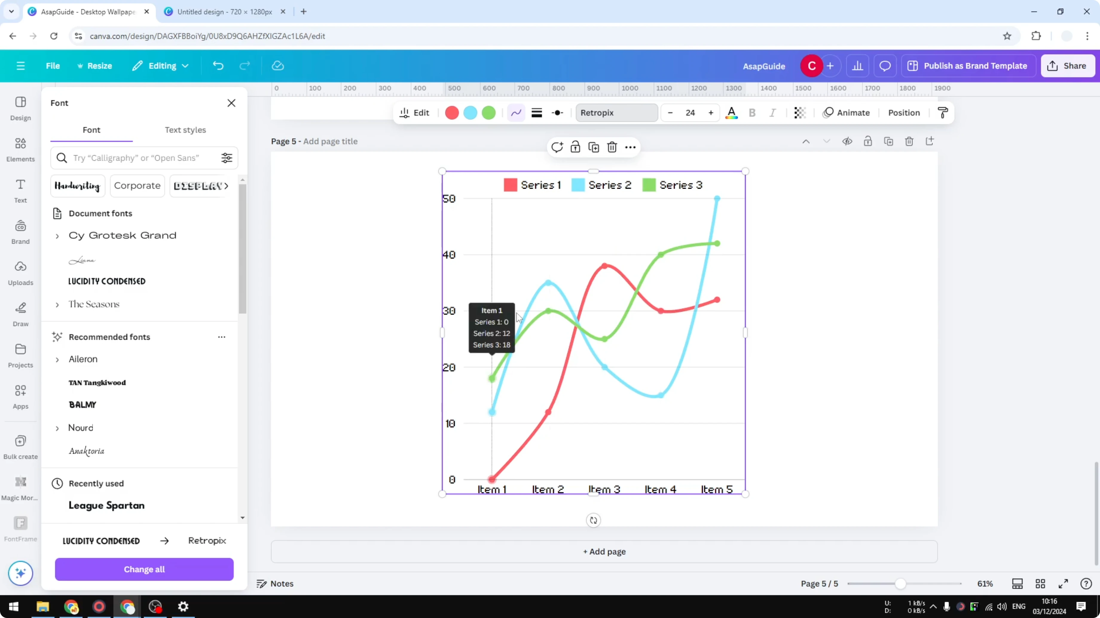
Enable Smoothing if the lines look too jagged. This softens angles and can make the chart look prettier without changing your data. Turn it off again if you want sharp inflection points.
Resize the chart by dragging its handles. Pull the edges outward to make it larger and improve legibility. Resize again after styling to keep proportions consistent.
For a bold title or callout near your chart, textured lettering can add contrast. Try a quick grass text treatment for display text.
Final thoughts
That is how to create a line graph in Canva from start to finish. Insert the line chart, feed your data through the left panel, then refine labels, colors, fonts, and smoothing. Toggle legends and grid lines for clarity, and size the chart to fit your layout.
Recent Posts

How to Visualize Different Hairstyles and Hair Colors with AI?
How to Visualize Different Hairstyles and Hair Colors with AI?

How to Transform Daytime Photos into Realistic Night Scenes with AI?
How to Transform Daytime Photos into Realistic Night Scenes with AI?

How to Visualize Yourself as the Opposite Gender with AI?
How to Visualize Yourself as the Opposite Gender with AI?