How to Create a Grass Text Effect in Canva
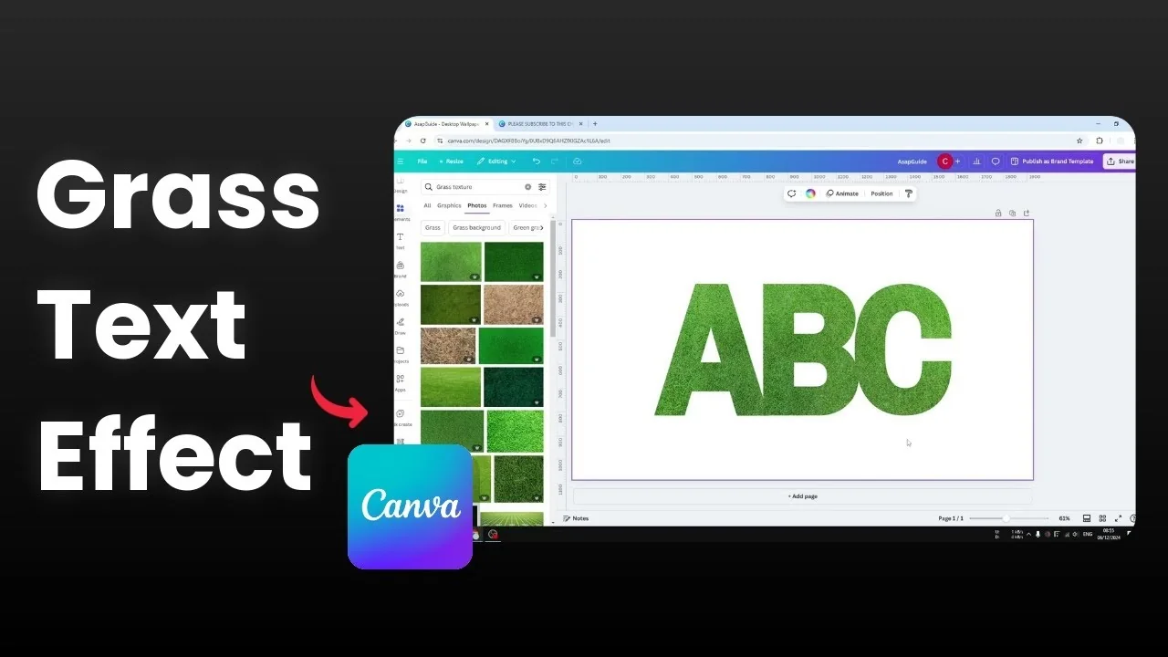
I’m going to show you how to create a grass text effect in Canva using two methods. The first uses letter frames filled with grass textures. The second uses an app in Canva to fill typed text with a texture and add finishing touches.
Both methods are quick, and you can choose the one that fits your design. I’ll keep the steps simple and clear. Let’s get started.
Create a Grass Text Effect in Canva with Frames
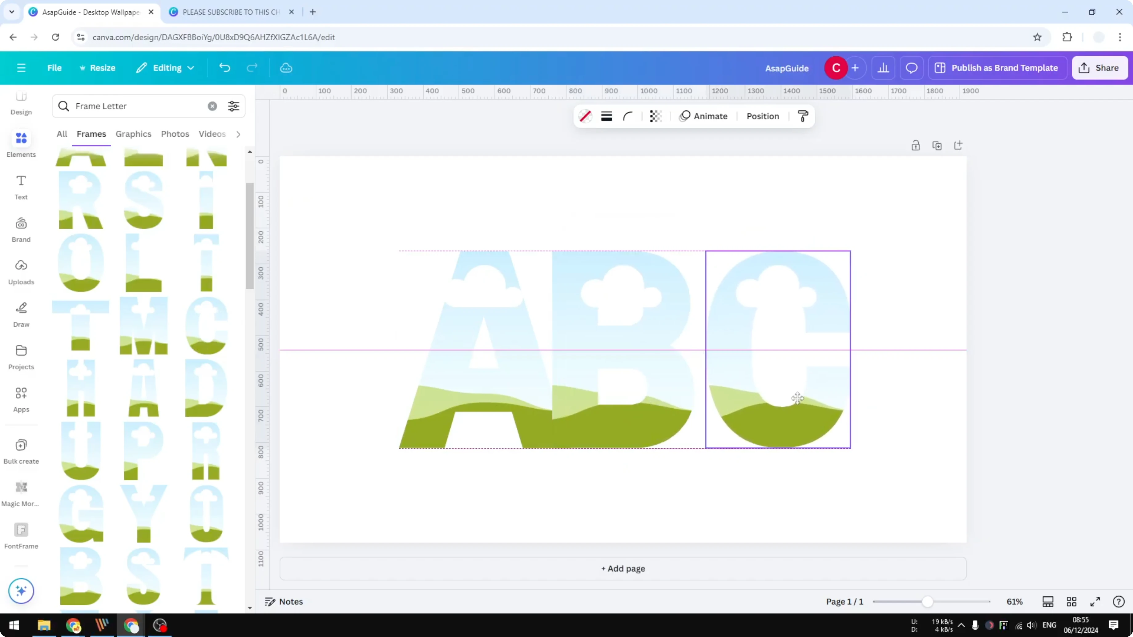
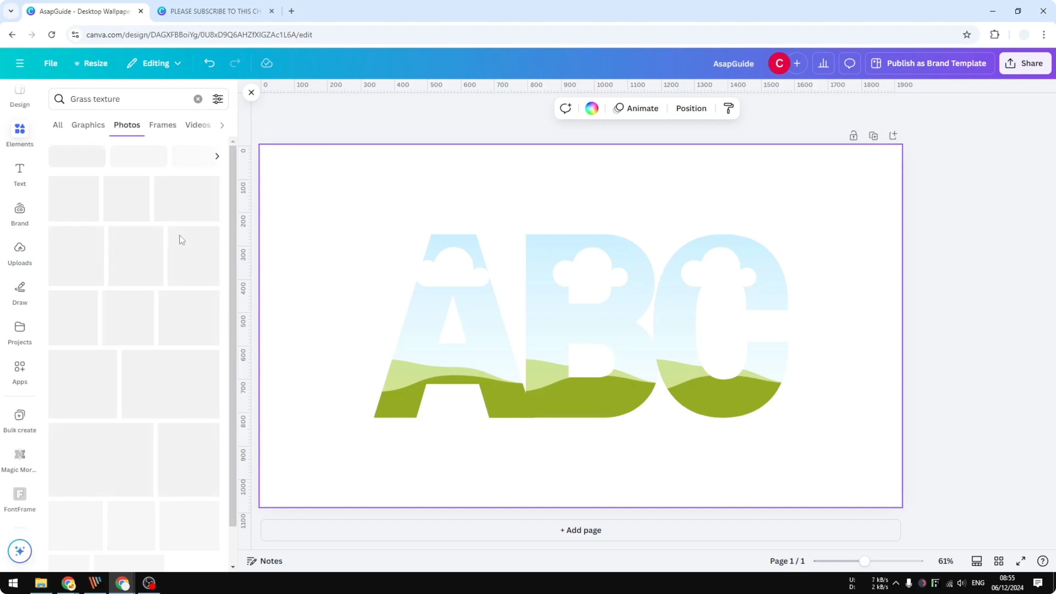
Set up letter frames
Open Elements and search for frame letter. Go to the Frames section and pick the letter styles you like. Insert the letters you need, place them close together, and center them on the page.
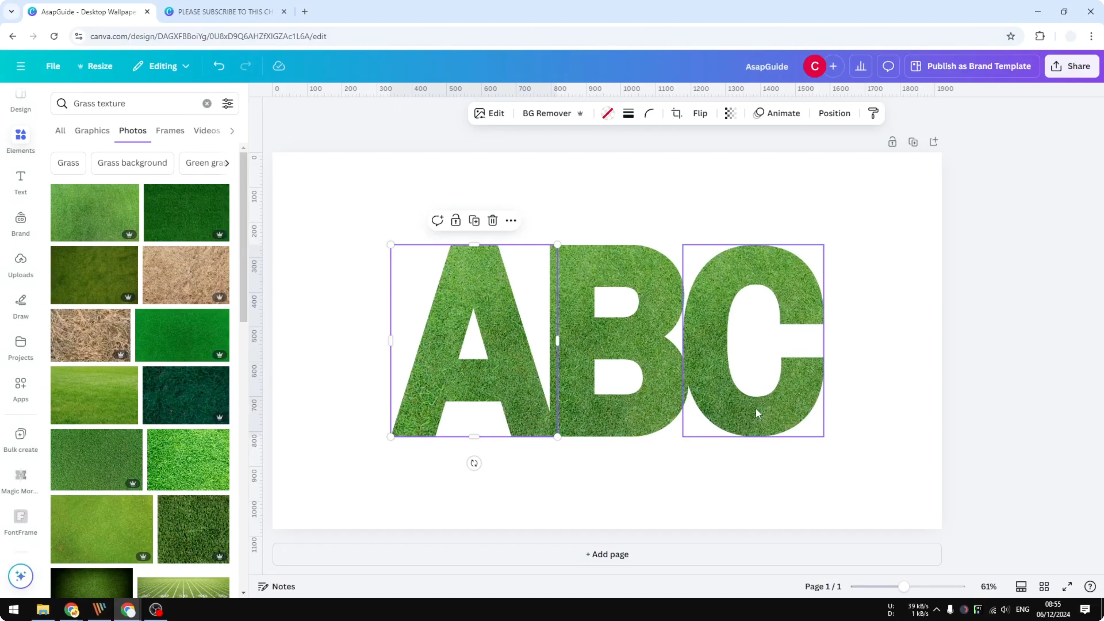
Add grass textures
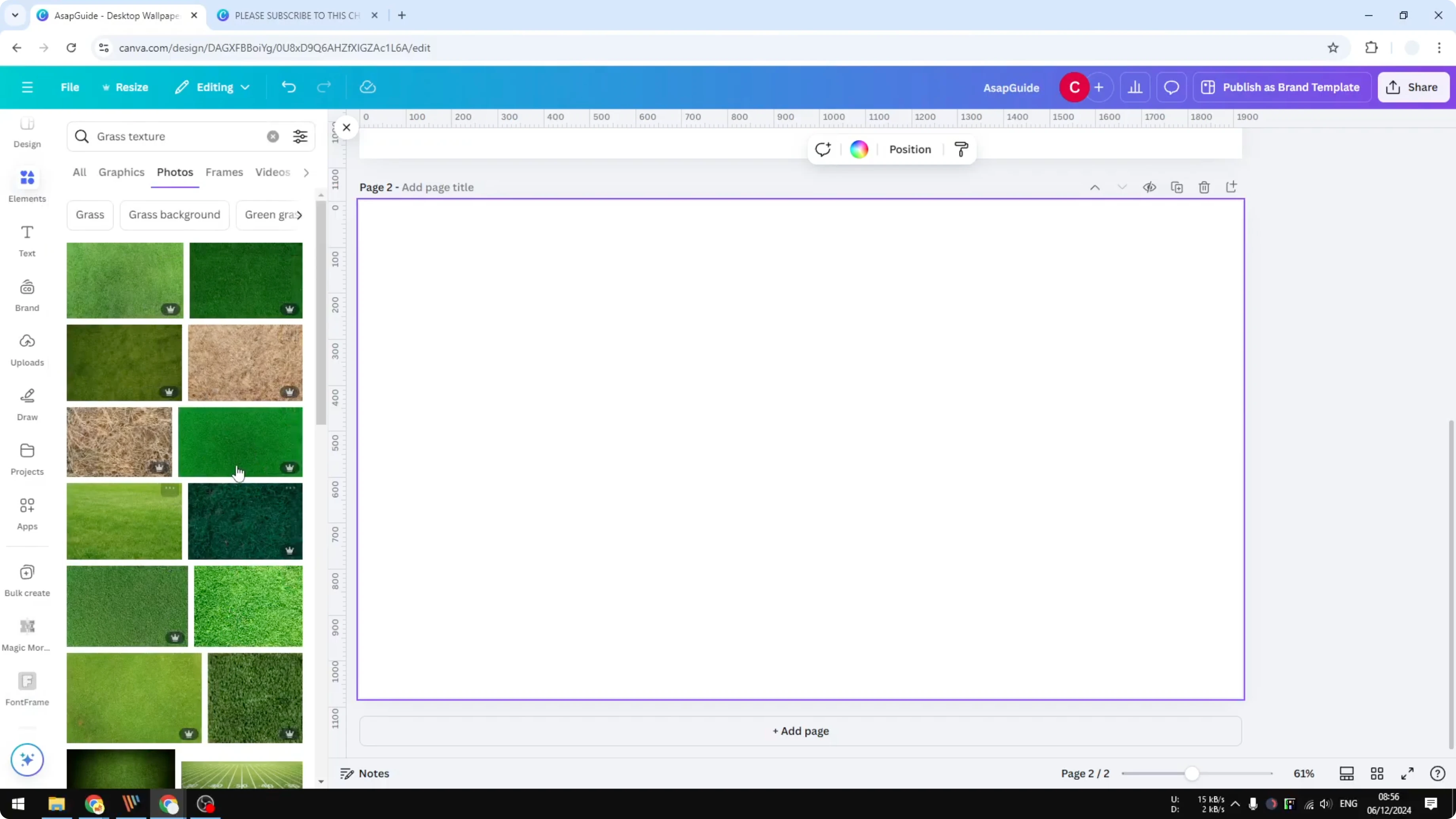
Go to Elements again and search for grass texture. Switch to Photos, then drag and drop a grass image into each letter frame. Double click a letter to reposition the image so each letter shows a unique section.
If you want a clean, aligned look for regular text layouts too, see justified text.
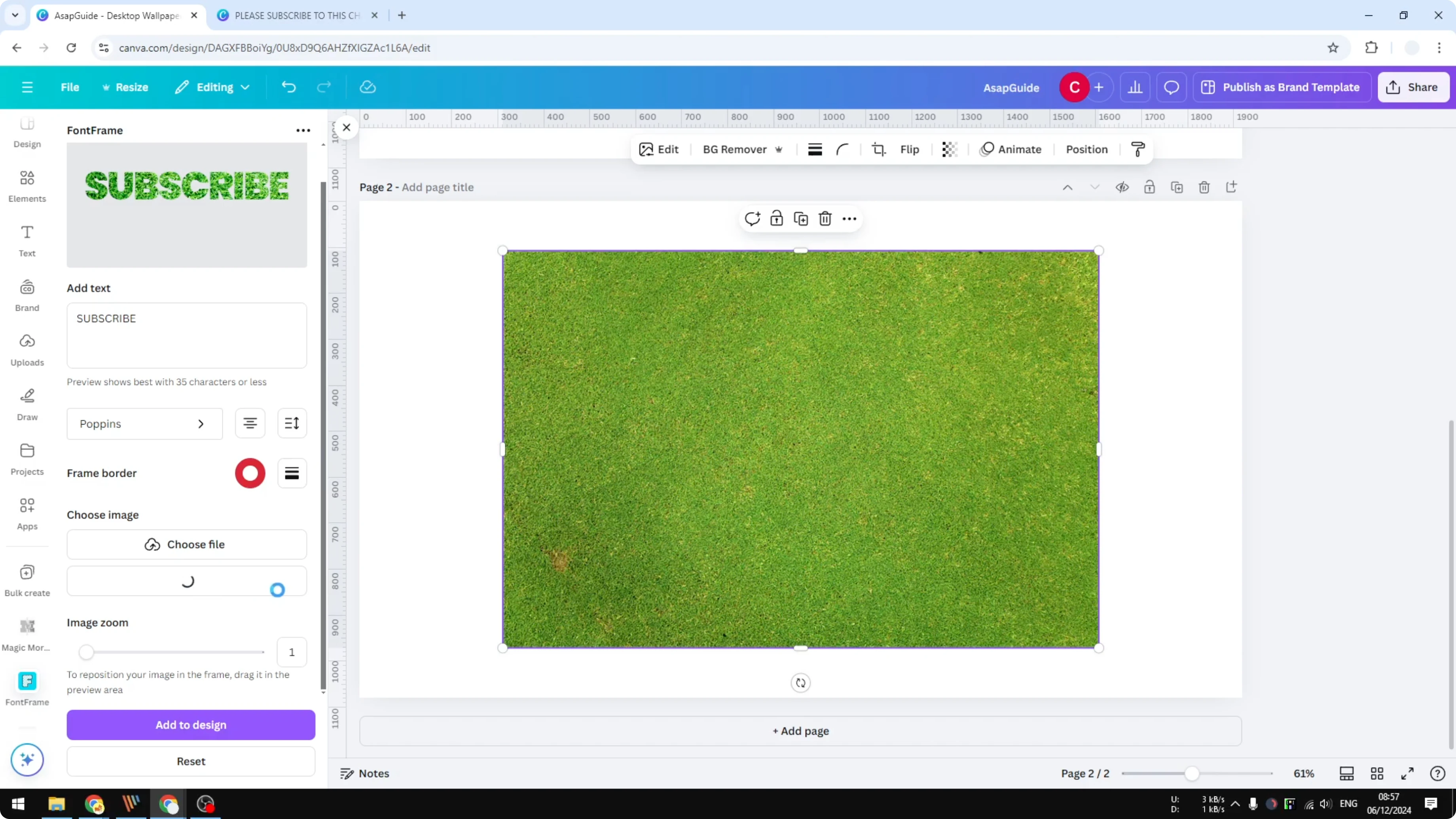
Create a Grass Text Effect in Canva with Font Frame
Prepare the texture
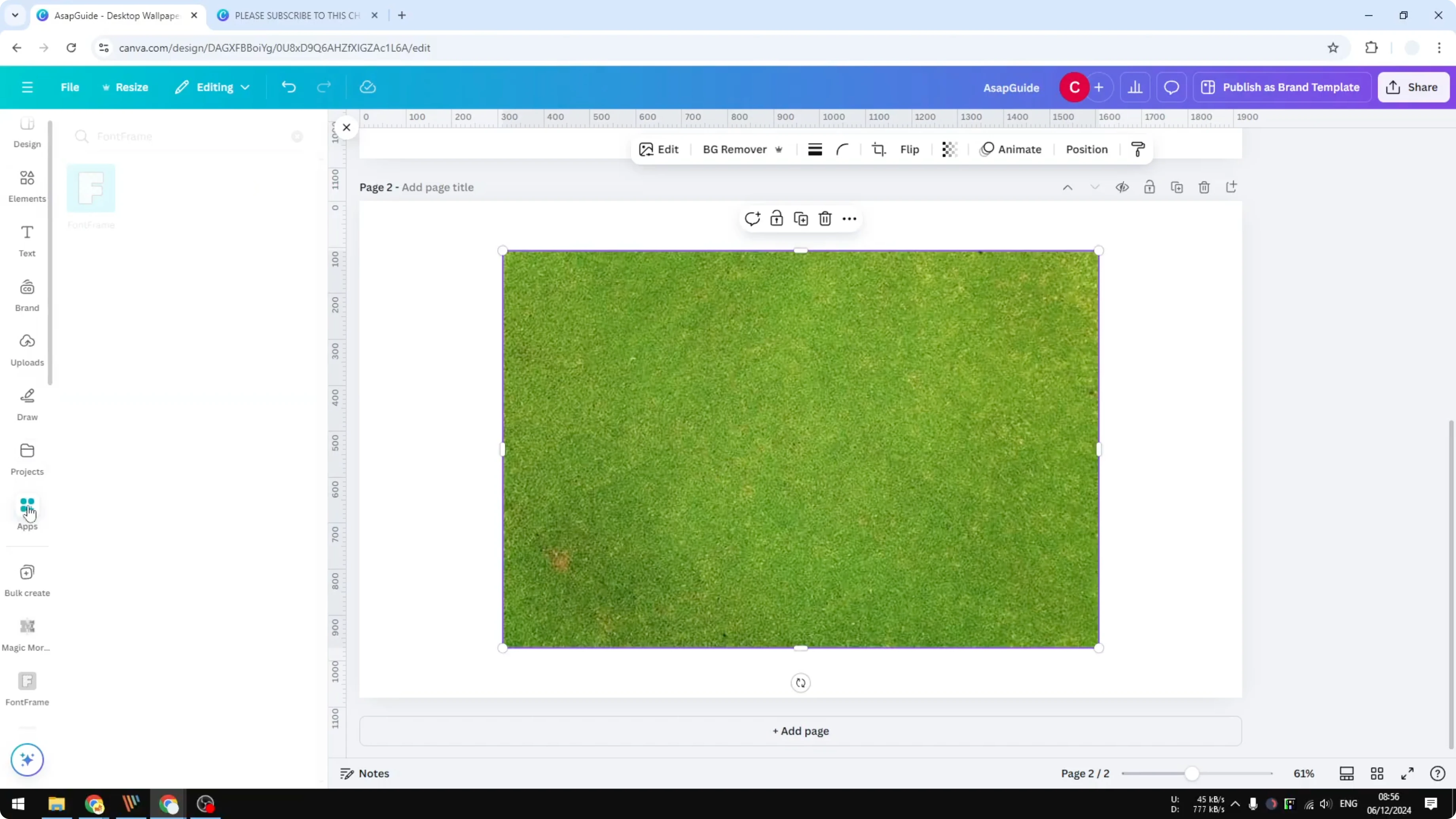
Add a grass texture image to your page first. This will be the texture source for the text. Make sure it’s selected and visible.
Build the text in Font Frame
Go to Apps, search for Font Frame (no space), and open it. Type your text, choose the font style, and adjust alignment for multi-line text. Tweak letter spacing and line spacing as needed.
You can add a border by enabling Border weight. Set it from 1 to 200 to show the outline, or set it to 0 to remove it. I kept the border at 0 for a cleaner look.
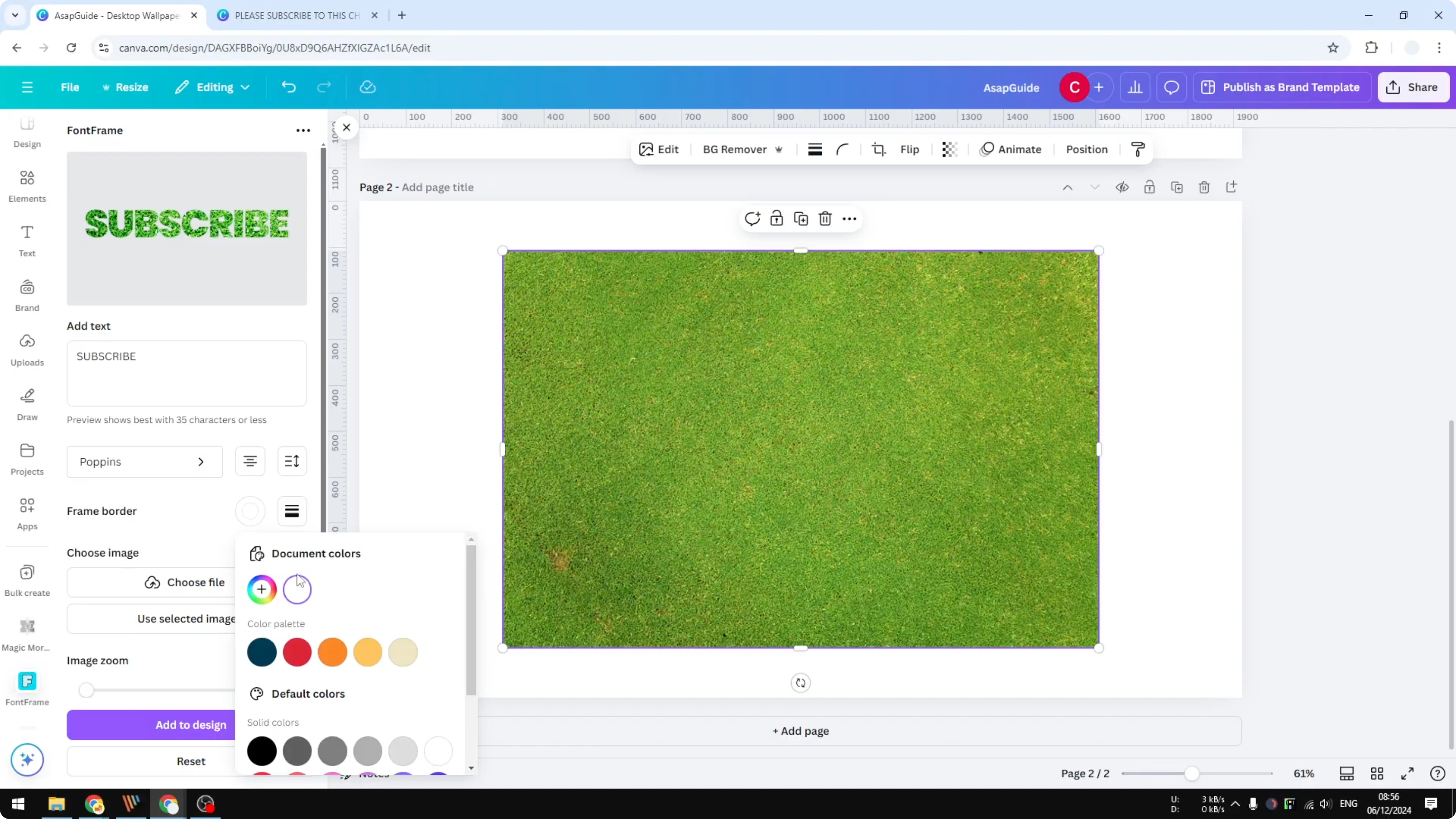
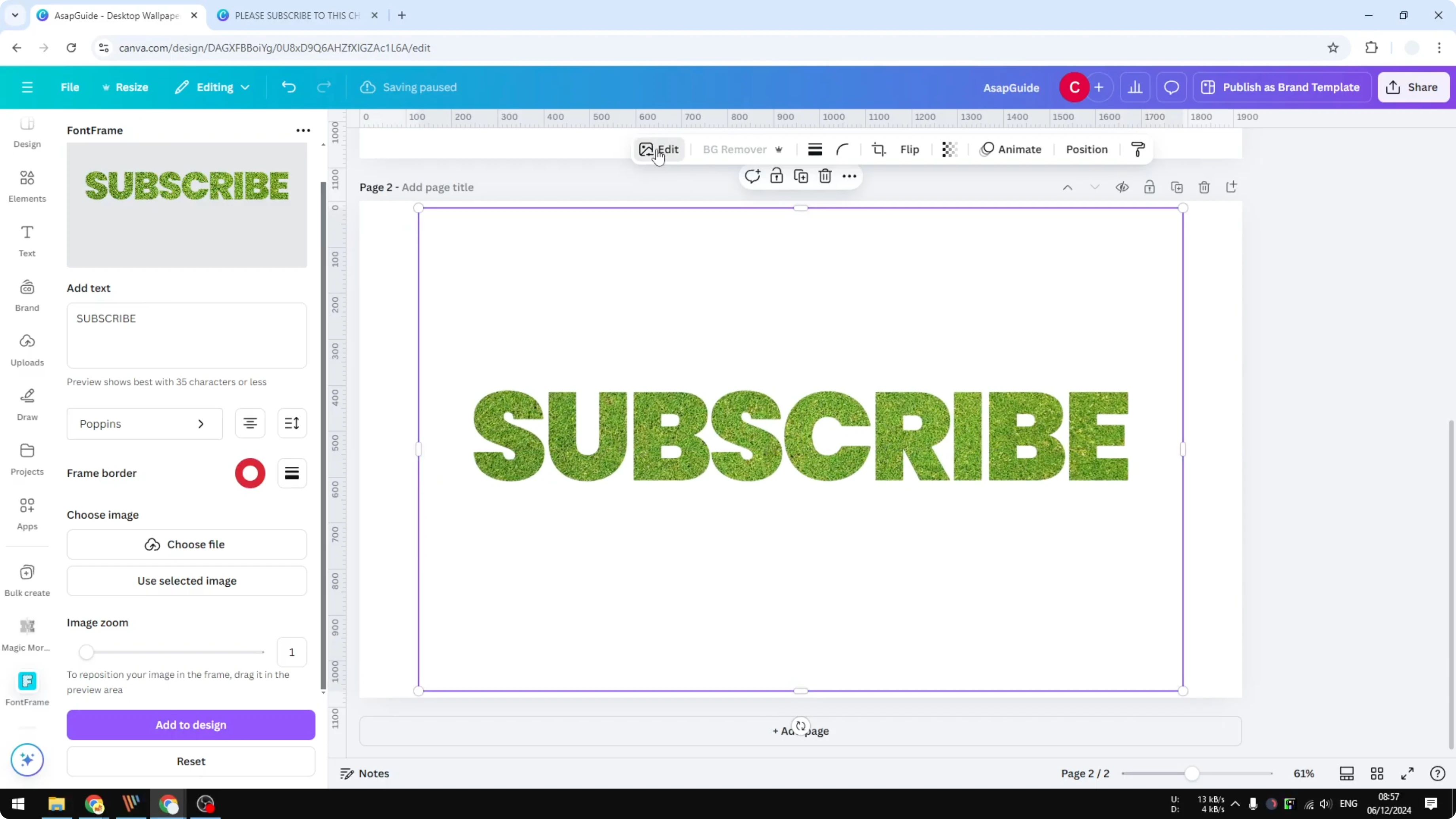
Apply the texture and add to the canvas
Click the grass image and choose to use the selected image as the text texture. Adjust the zoom to control which part of the image appears in the text. Click Add to design to place the textured text on your page.
If the text looks hidden behind another image, delete or move the overlapping element. The textured text should stand out clearly. For a related style, try overlay text.
Finish with shadow
Select the textured text and click Edit. Open Shadows, choose Drop Shadow, and reduce Distance and Intensity. Stop when the depth looks natural and clean.
Final thoughts
Frames are great if you want full control over each letter and texture placement. Font Frame is faster for full words with easy spacing and optional outlines. For background flair that pairs nicely with textured text, explore a soft bokeh effect.
Recent Posts
How to Visualize Yourself as a Pixelized Character with AI?
How to Visualize Yourself as a Pixelized Character with AI?
How to Revive Faded Memories and Enhance Image Clarity with AI?
How to Revive Faded Memories and Enhance Image Clarity with AI?
How to Visualize Yourself as an Animal Crossing Character with AI?
How to Visualize Yourself as an Animal Crossing Character with AI?