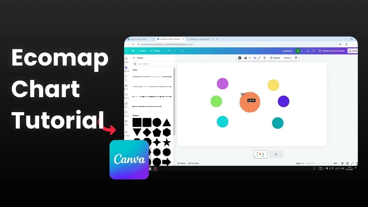
How to Create an Ecomap Chart in Canva
An ecomap is very similar to a bubble map, but it describes the relationship between one item and another. I like to place a person in the middle and map the relationships with family members around. You can represent different strengths or directions of relationships with different line styles or by simply using color.
Some connections can be strong, others weak or reciprocal. You can keep it simple by using color to describe each relationship. I will show you how to build the core shapes, lines, and labels in Canva.
Create an Ecomap Chart in Canva
Start blank
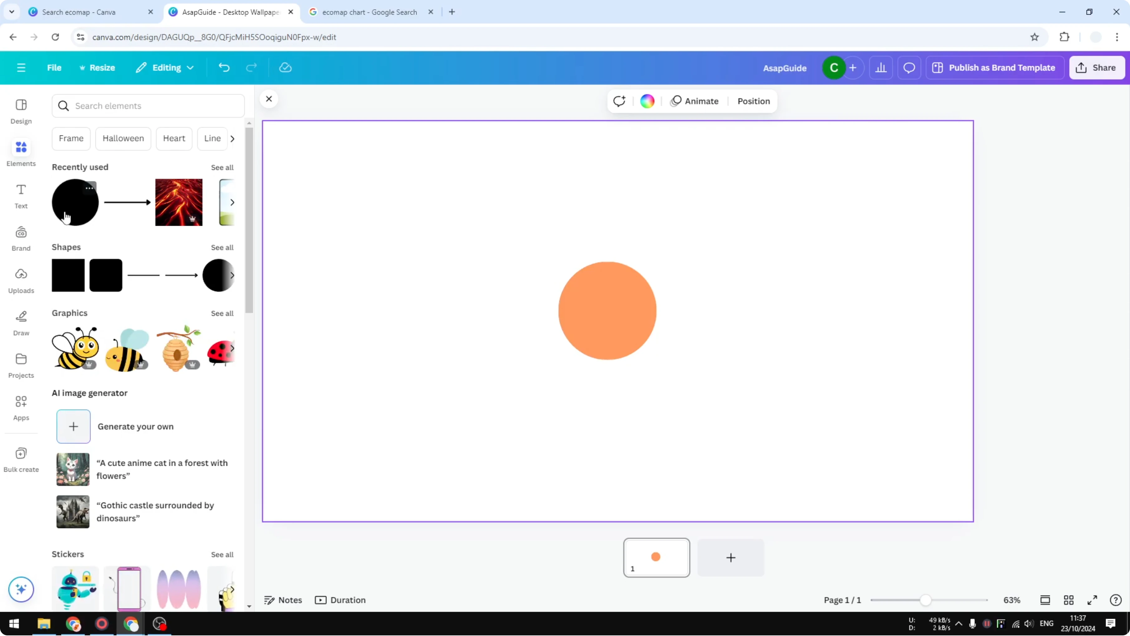
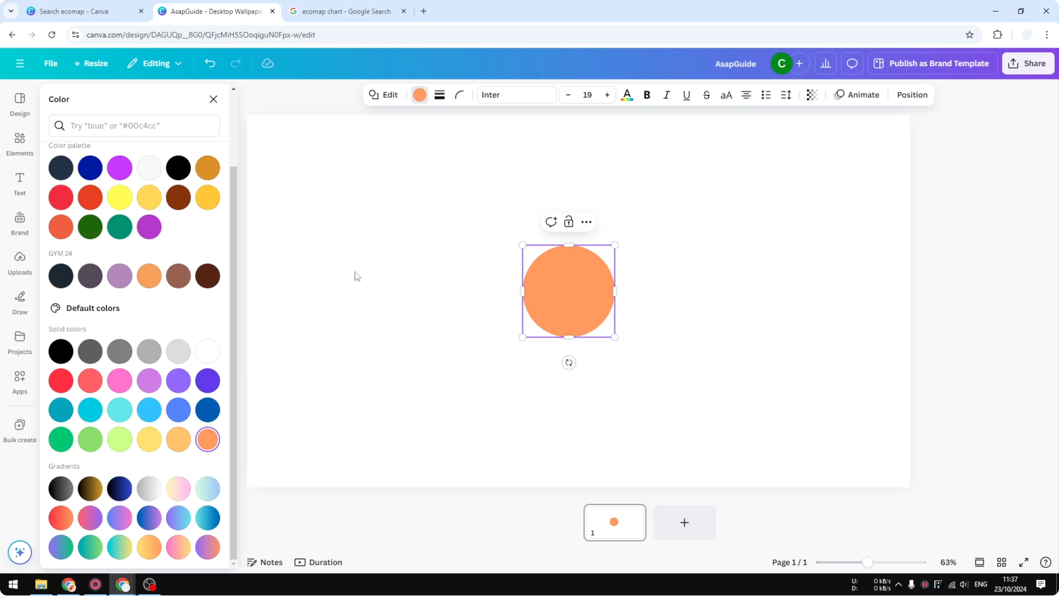
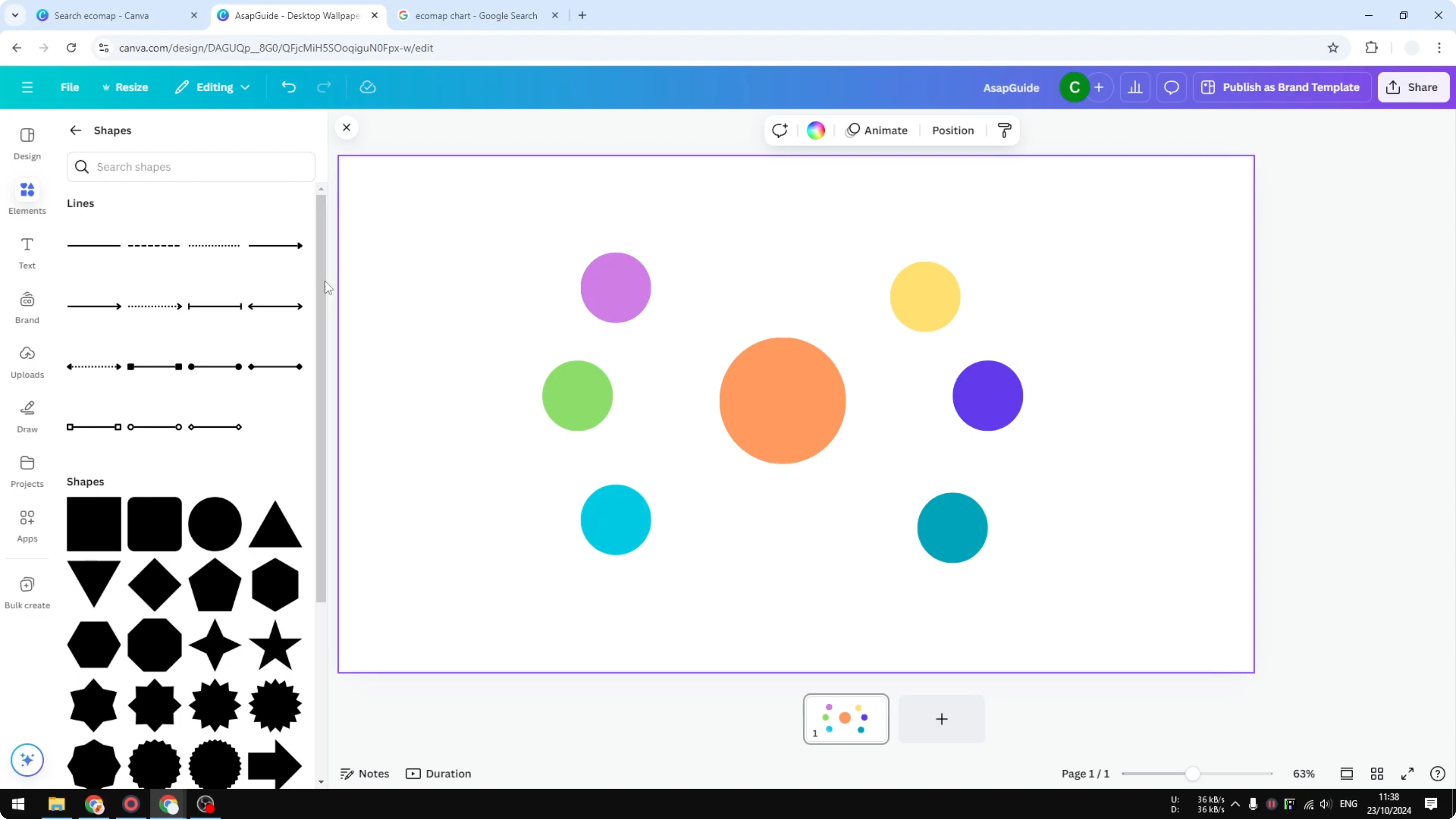
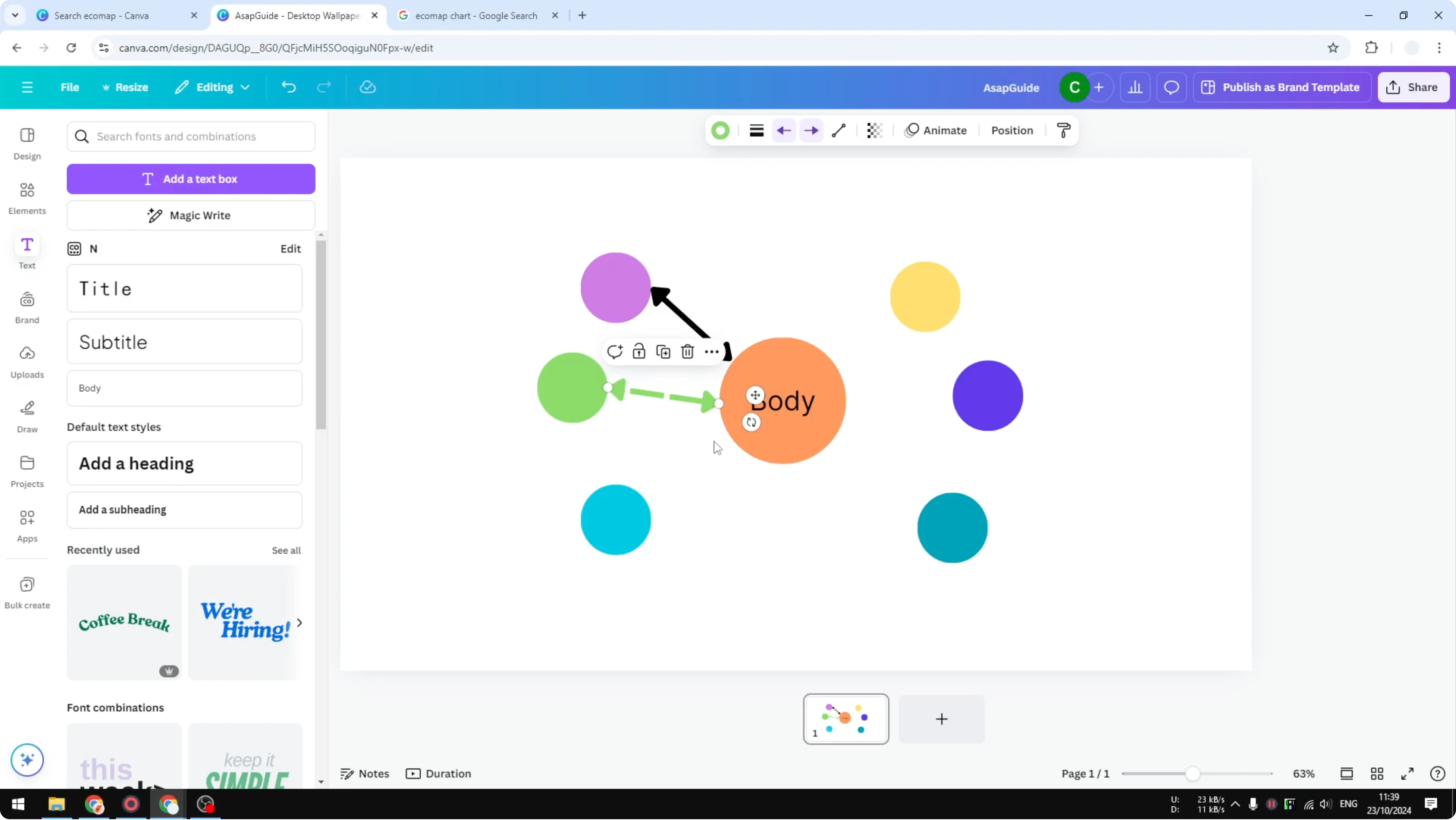
Open Canva and start with a blank template. Go to Elements, open Shapes, and click See all. Insert a circle and change its color to orange.
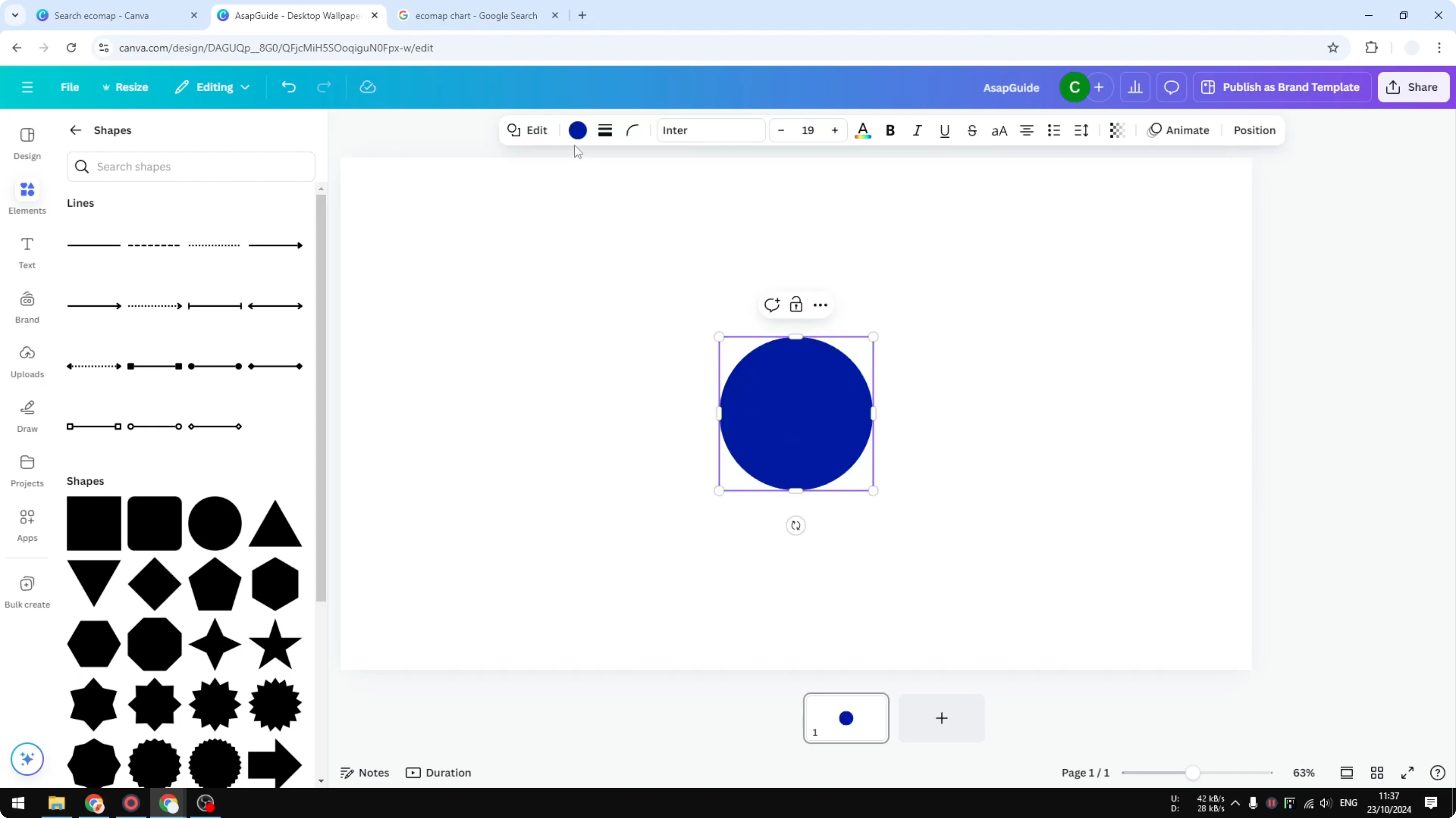
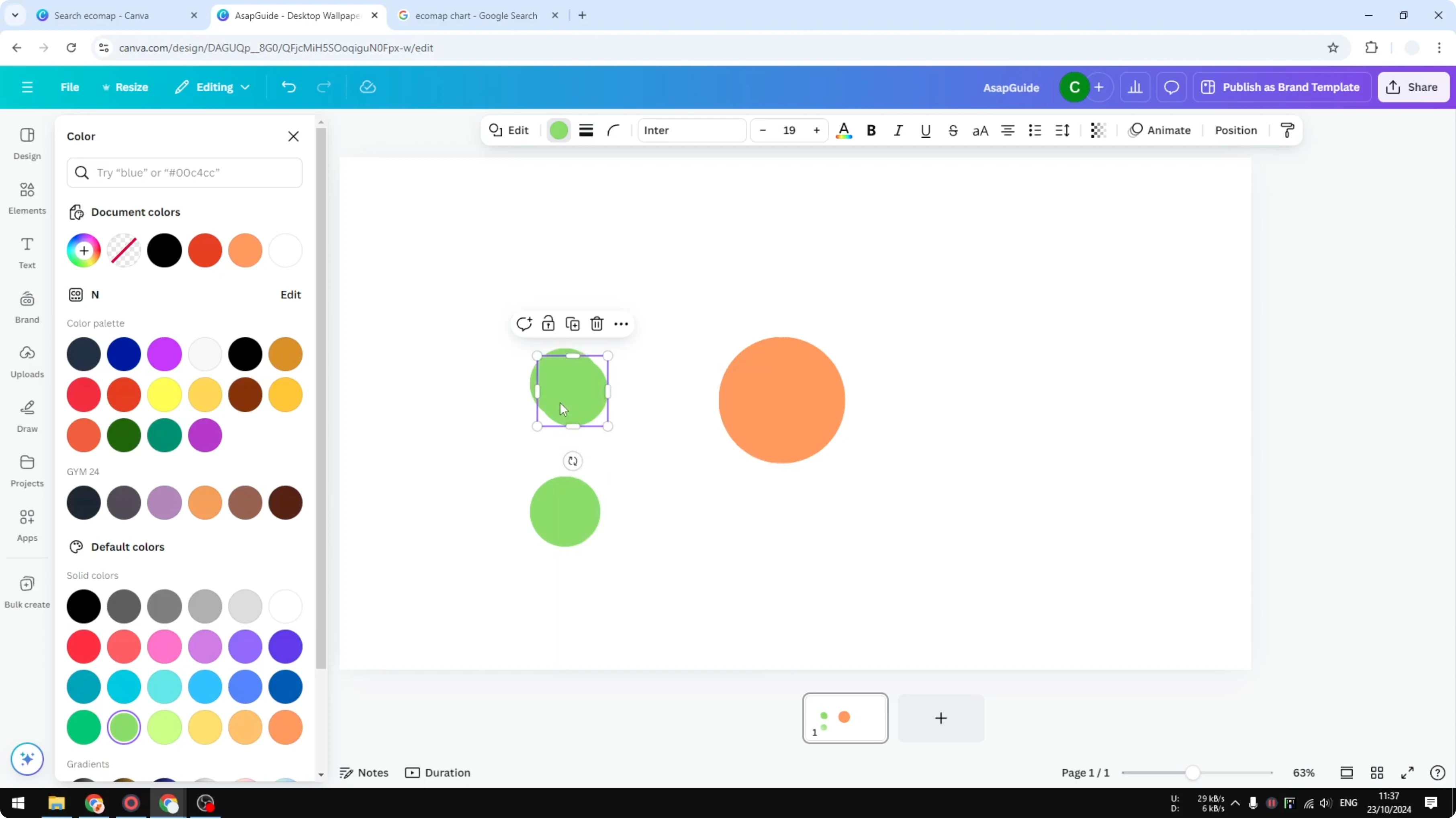
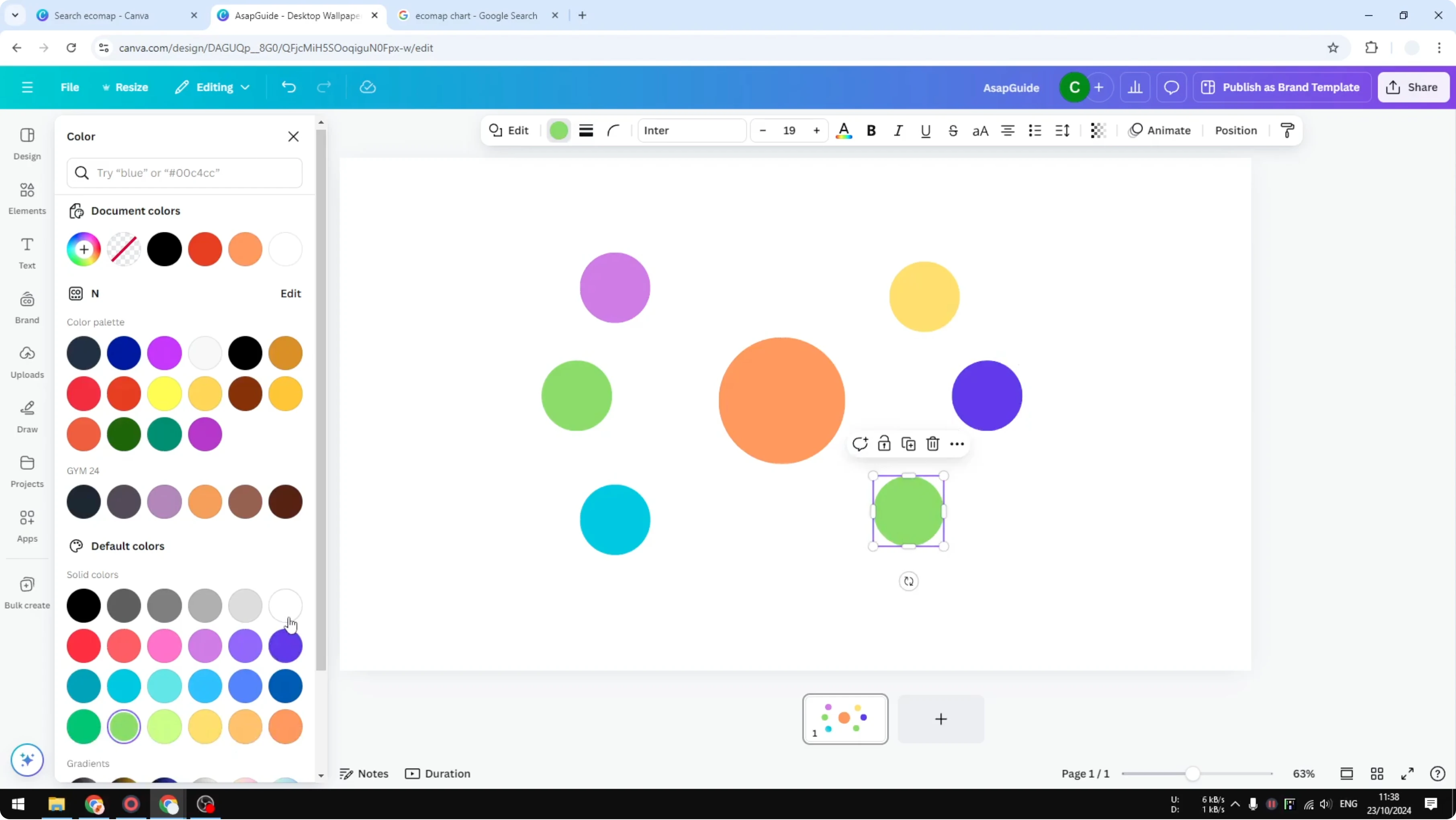
Insert more circles to surround the center circle. Grab the circle from Recently used or Elements again. Change a circle to green to distinguish items.
Duplicate circles to speed up the layout. Position the duplicates around the central circle. You can always change the colors later to fit your relationships.
If you are also charting data in Canva, you can create a pie chart with the same Elements workflow. It is a quick way to visualize distribution alongside your ecomap.
Connect with lines
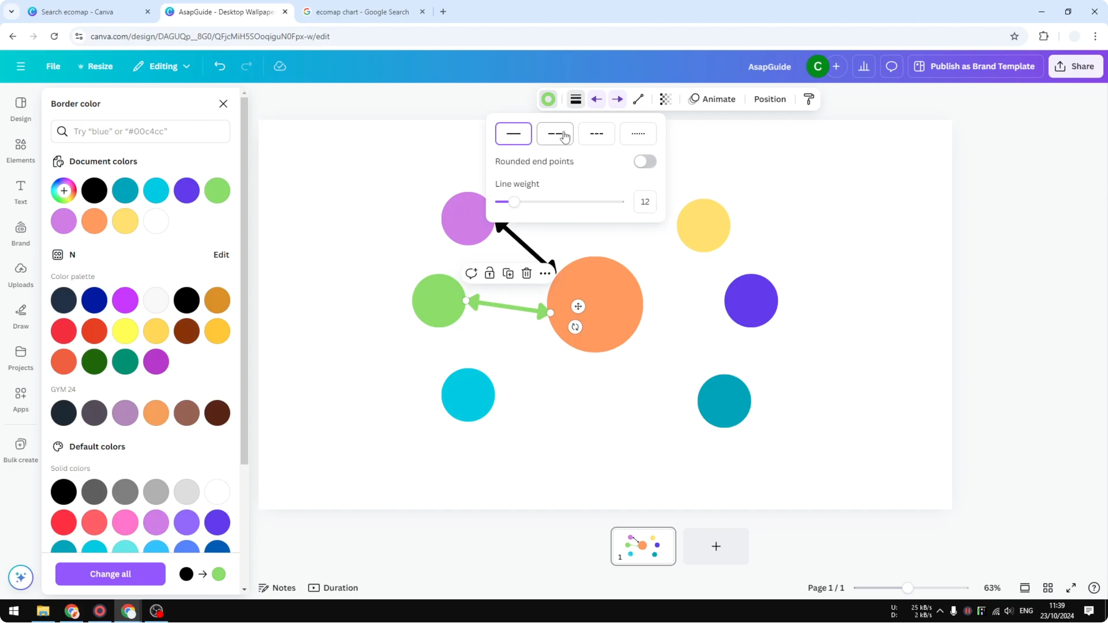
Go to Elements, open Shapes, and insert a simple line. Connect the center circle to one outer circle. Notice the line start and line end controls for arrowheads on both ends.
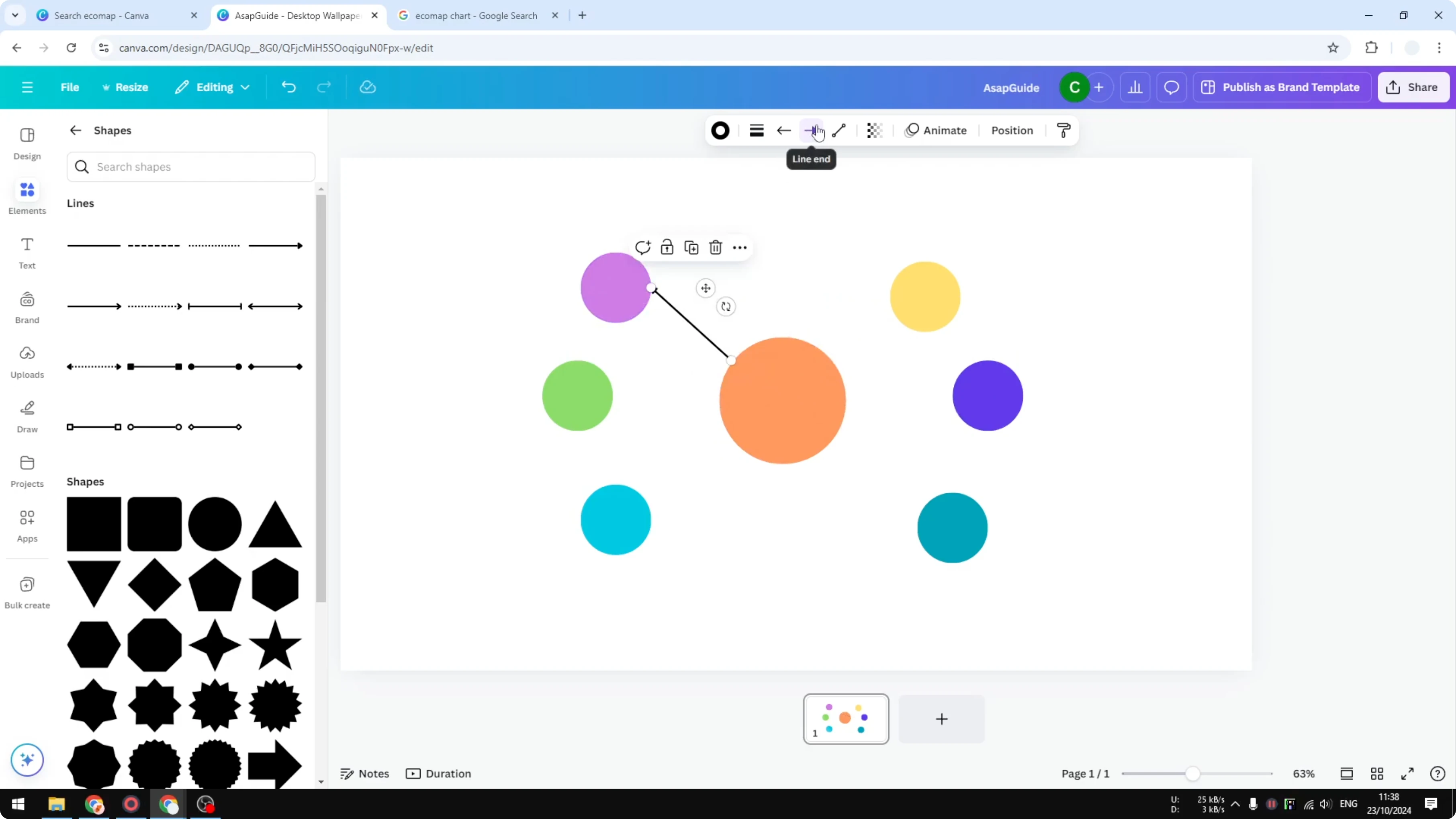
Increase the height of the line to match your layout. Duplicate the line to reuse it for other connections. Drag each duplicate to connect the center to different circles.
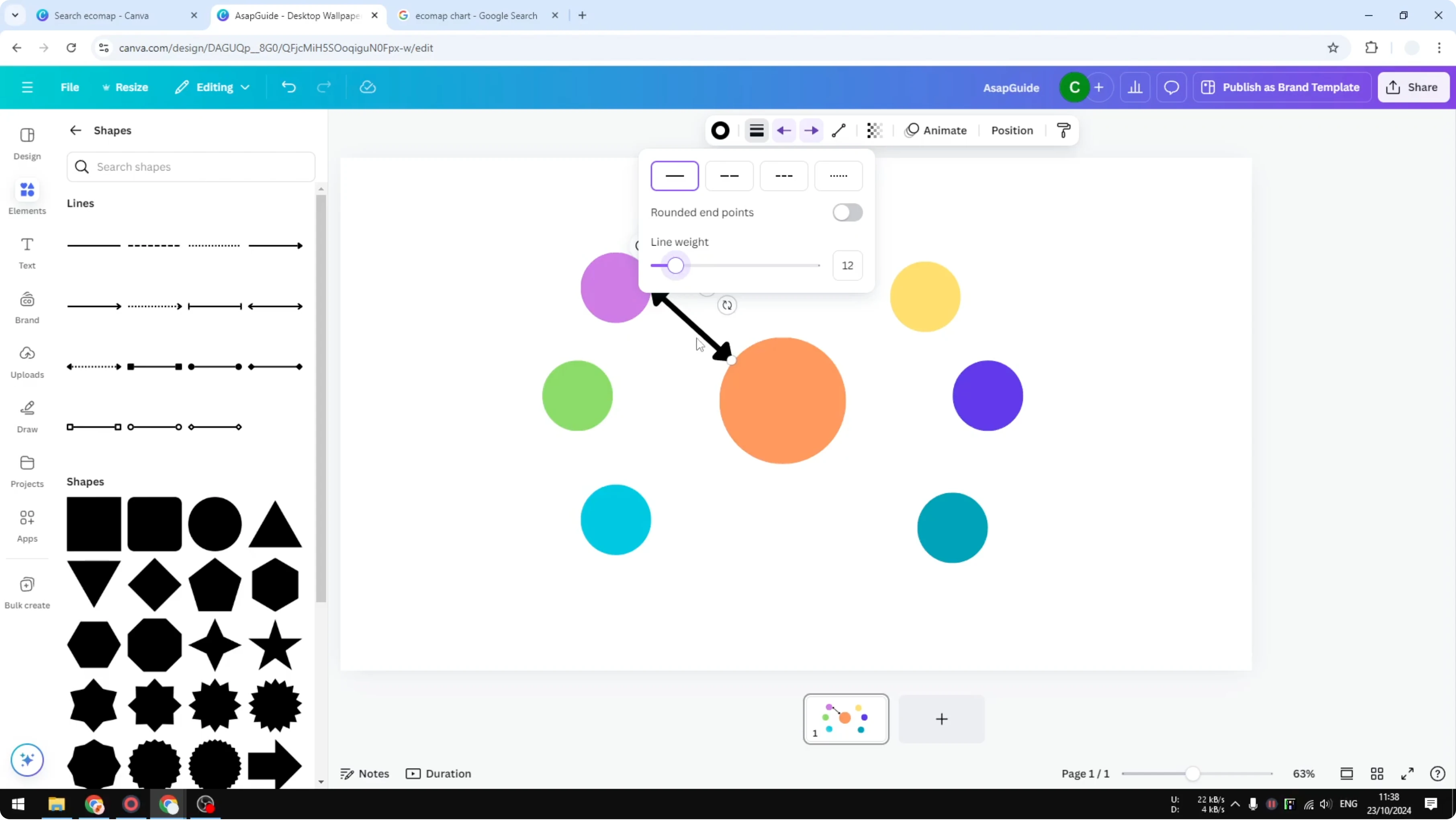
Change the line color if you want it to match the circle color. Switch the line style to solid, dashed, or dotted to represent meaning. Stay consistent so the map stays readable.
Label the chart
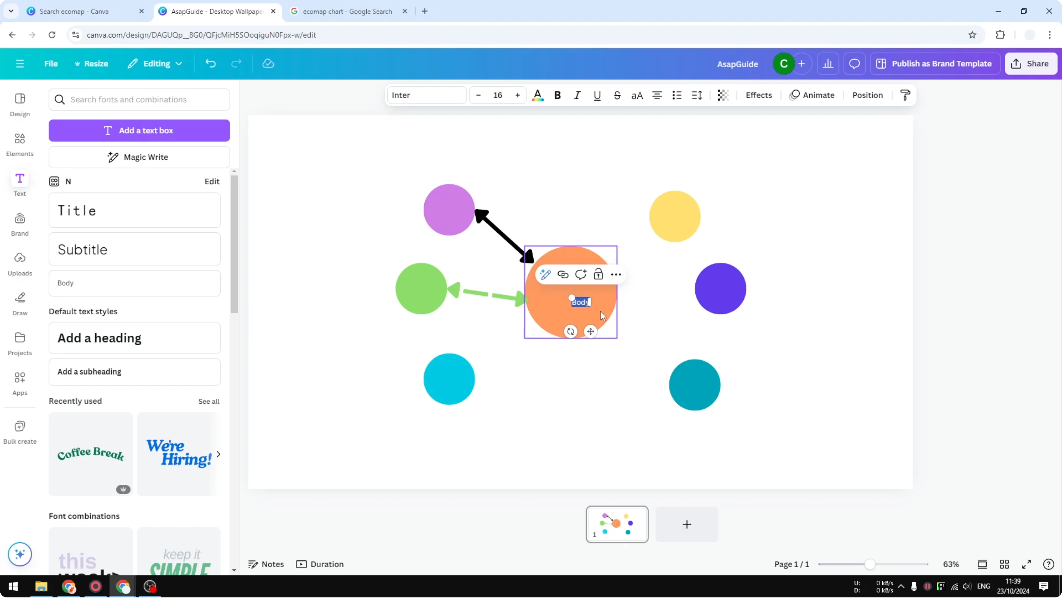
Add text to describe each item. Type the names of people or items near their circles. Keep labels short so they do not cover lines.
For styled headings or callouts, try a playful balloon text effect in Canva. It pairs well with simple circle labels.
Finish and customize
You can replace multiple line types by using color to describe relationships. Adjust circle and line colors to create a simple, readable legend. Tweak sizes so important items stand out.
This quick build gives you a basic ecomap you can extend. Continue adding circles and connections as needed. Refine styles until the relationships are clear.
If you want a soft background that does not compete with the chart, try a subtle bokeh effect in Canva. Keep contrasts high so lines and labels remain legible.
Final thoughts
You now have the steps to create an ecomap chart in Canva using circles for items, lines for connections, and simple styling for meaning. Duplicate shapes, reuse lines, and fine-tune colors to keep everything clear. Build on this base until your relationships are mapped the way you need.
Recent Posts
How to Visualize Yourself as a Pixelized Character with AI?
How to Visualize Yourself as a Pixelized Character with AI?
How to Revive Faded Memories and Enhance Image Clarity with AI?
How to Revive Faded Memories and Enhance Image Clarity with AI?

How to Visualize Yourself as an Animal Crossing Character with AI?
How to Visualize Yourself as an Animal Crossing Character with AI?