How to Create a Pie Chart in Canva

I’m going to show you how to create a pie chart in Canva. Add a chart, edit the data, and adjust labels, values, colors, Legend, and fonts.
Create a Pie Chart in Canva
Add the chart
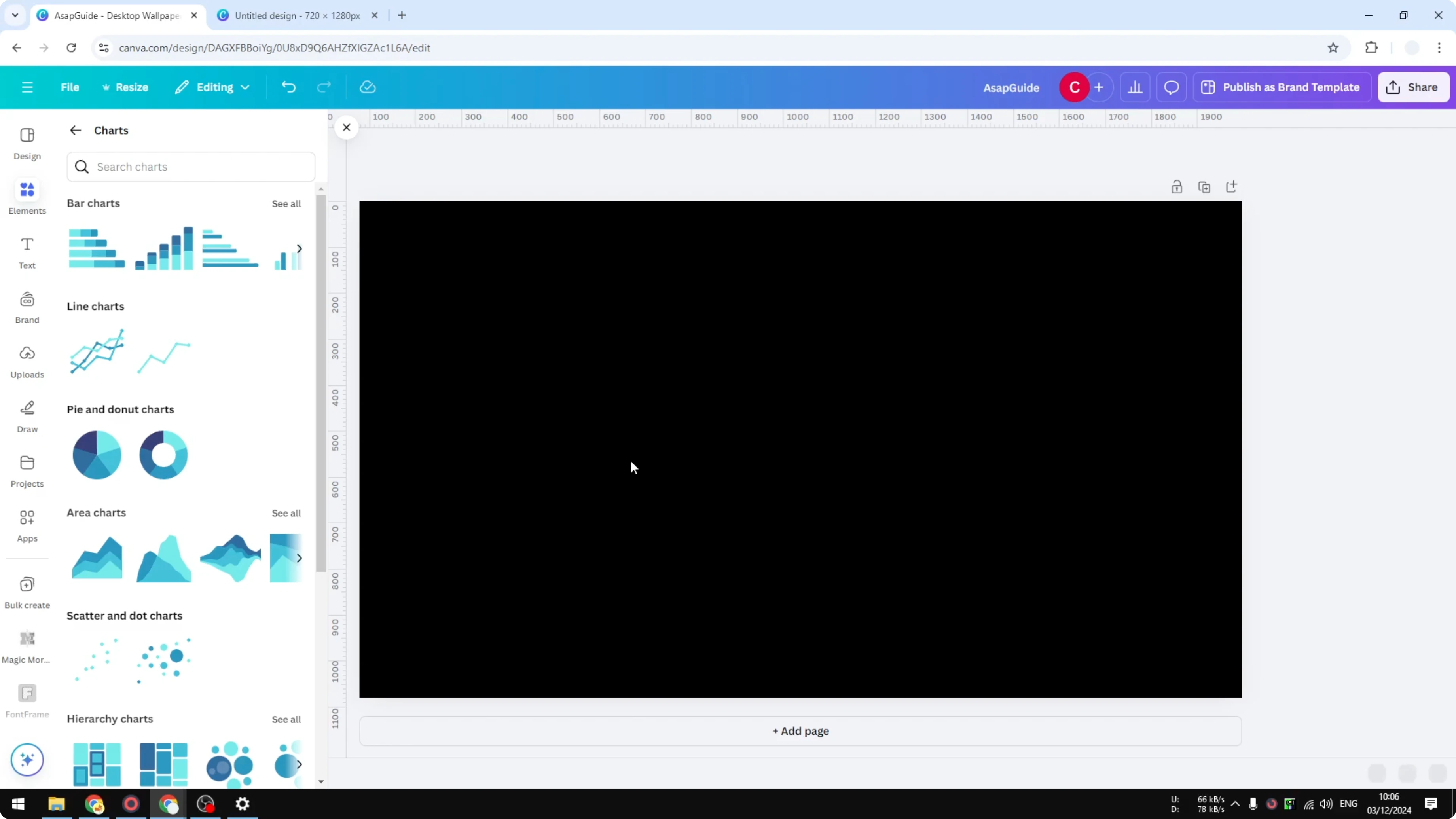
Go to the Elements menu. Scroll down to the Charts section and click it. You will see pie and donut charts you can use in your presentation or Canva design.
Choose the pie chart you want. The chart is interactive. If you hover the cursor, it changes color.
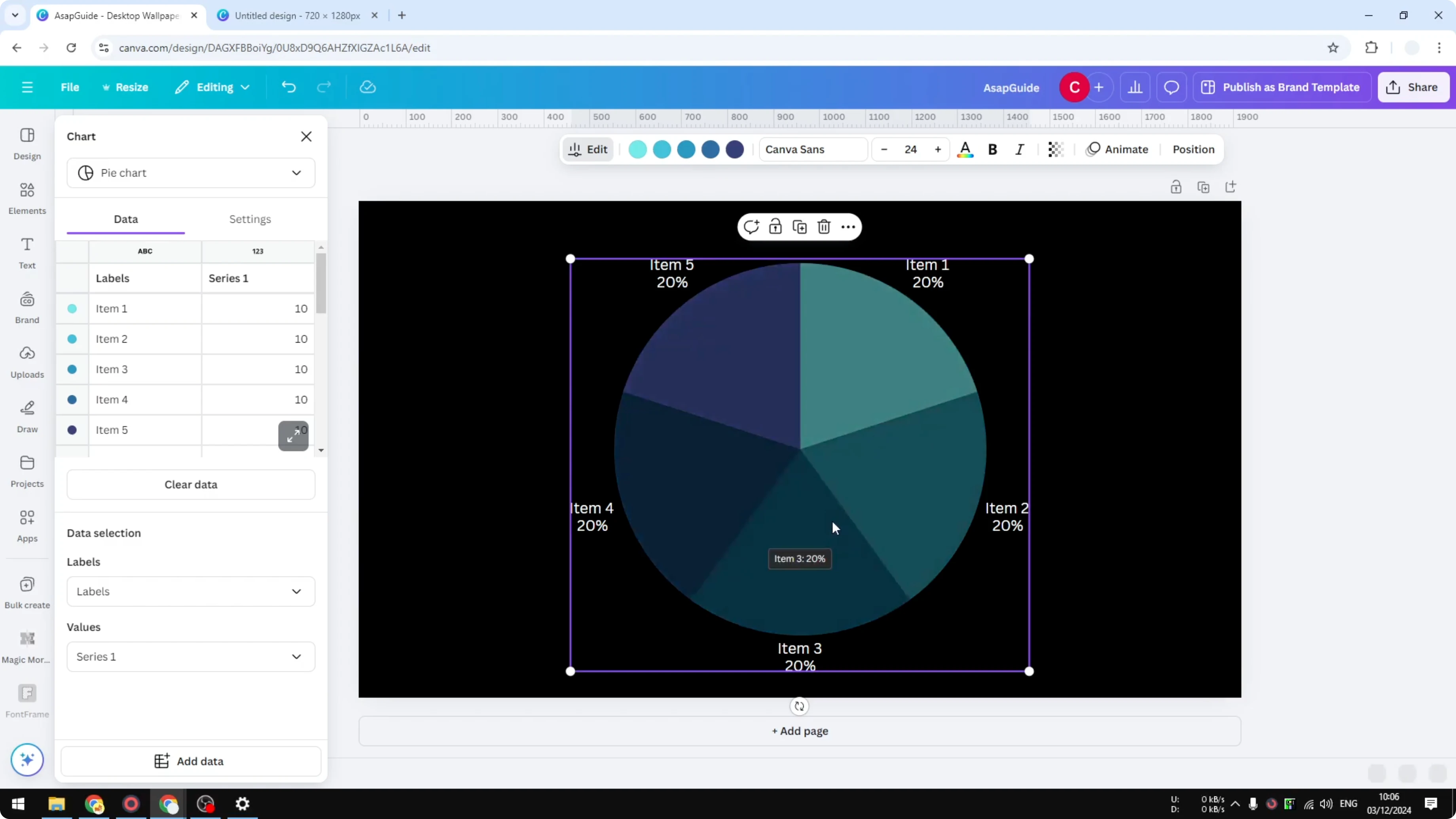
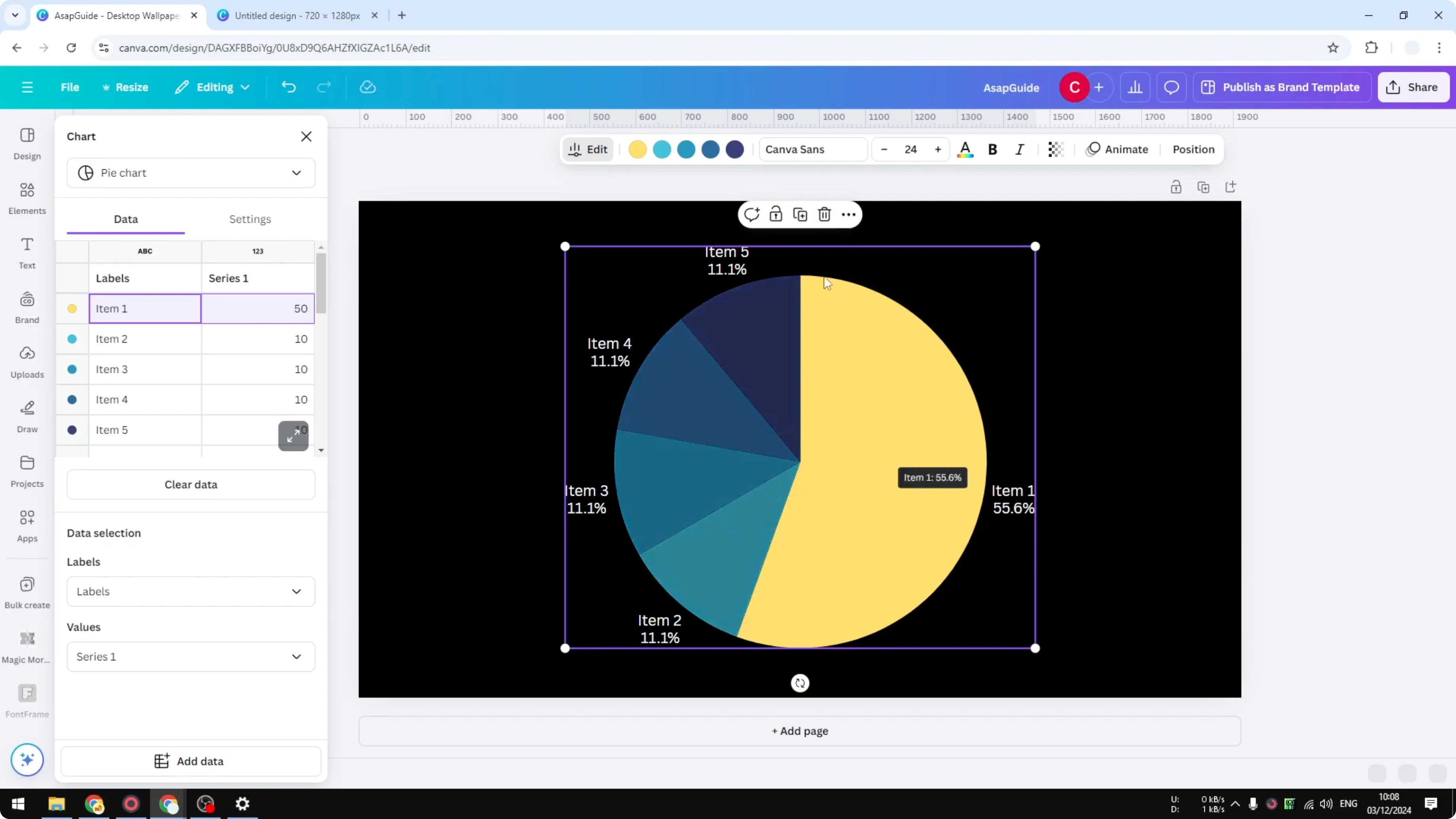
Edit the data
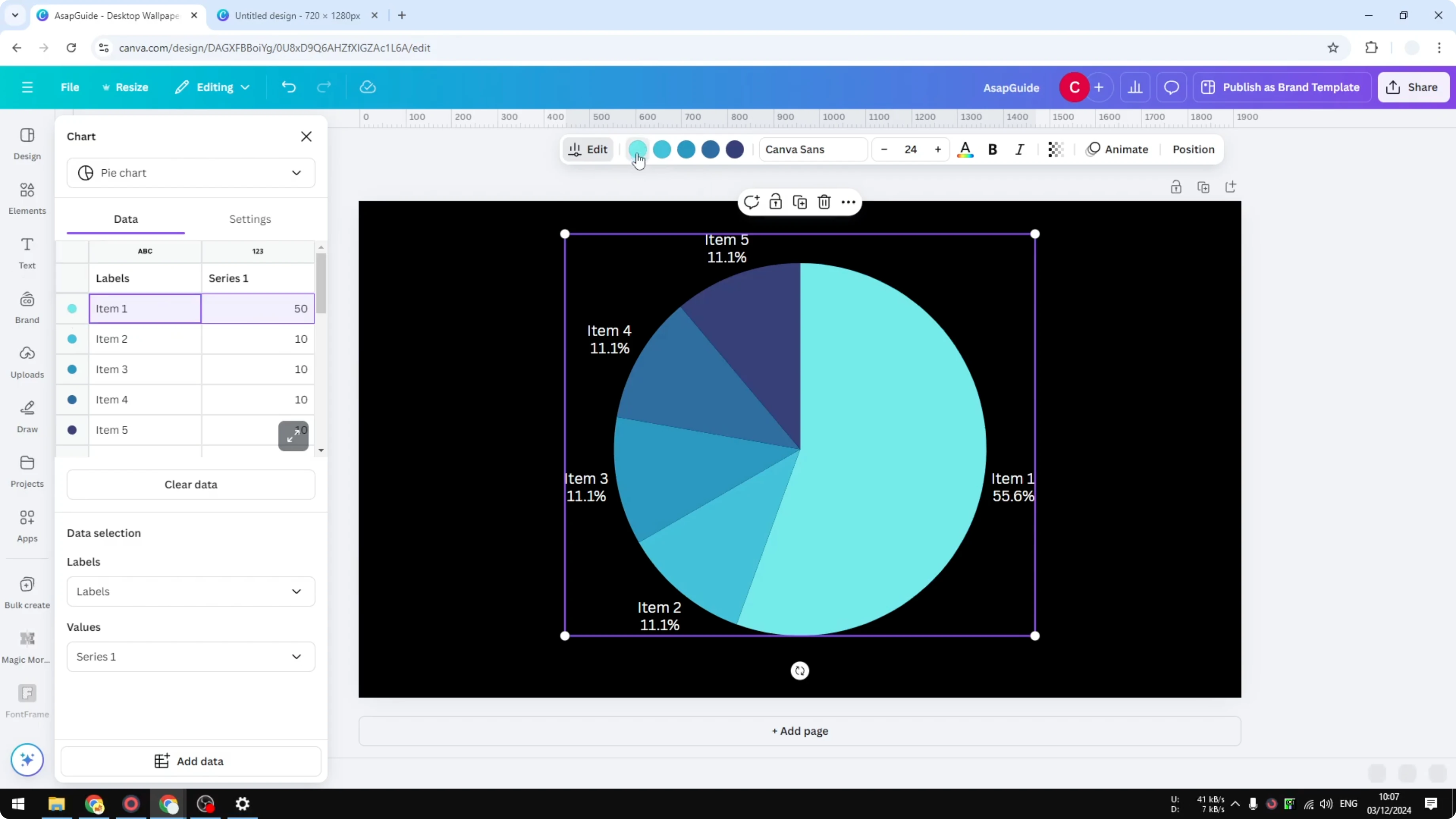
You can change the value of each section of the chart. On the left side, use the data panel to change the numbers. For example, change Item 1 from 10 to 50 and press Enter to update the proportions automatically.
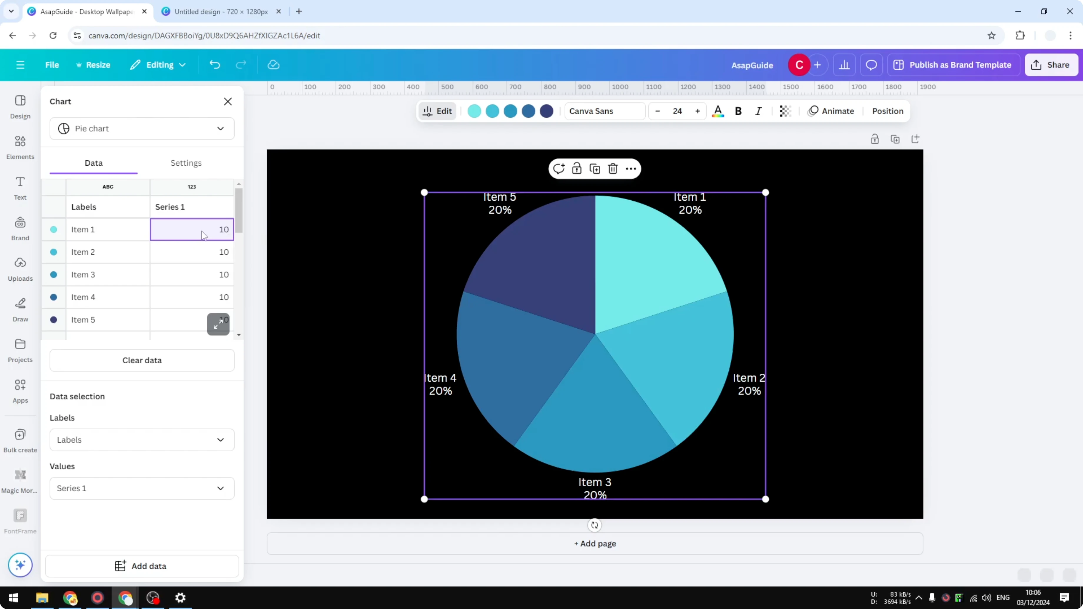
You don't have to manually adjust sizes with shapes or graphics. The chart is integrated with the data. That makes updating fast and accurate.
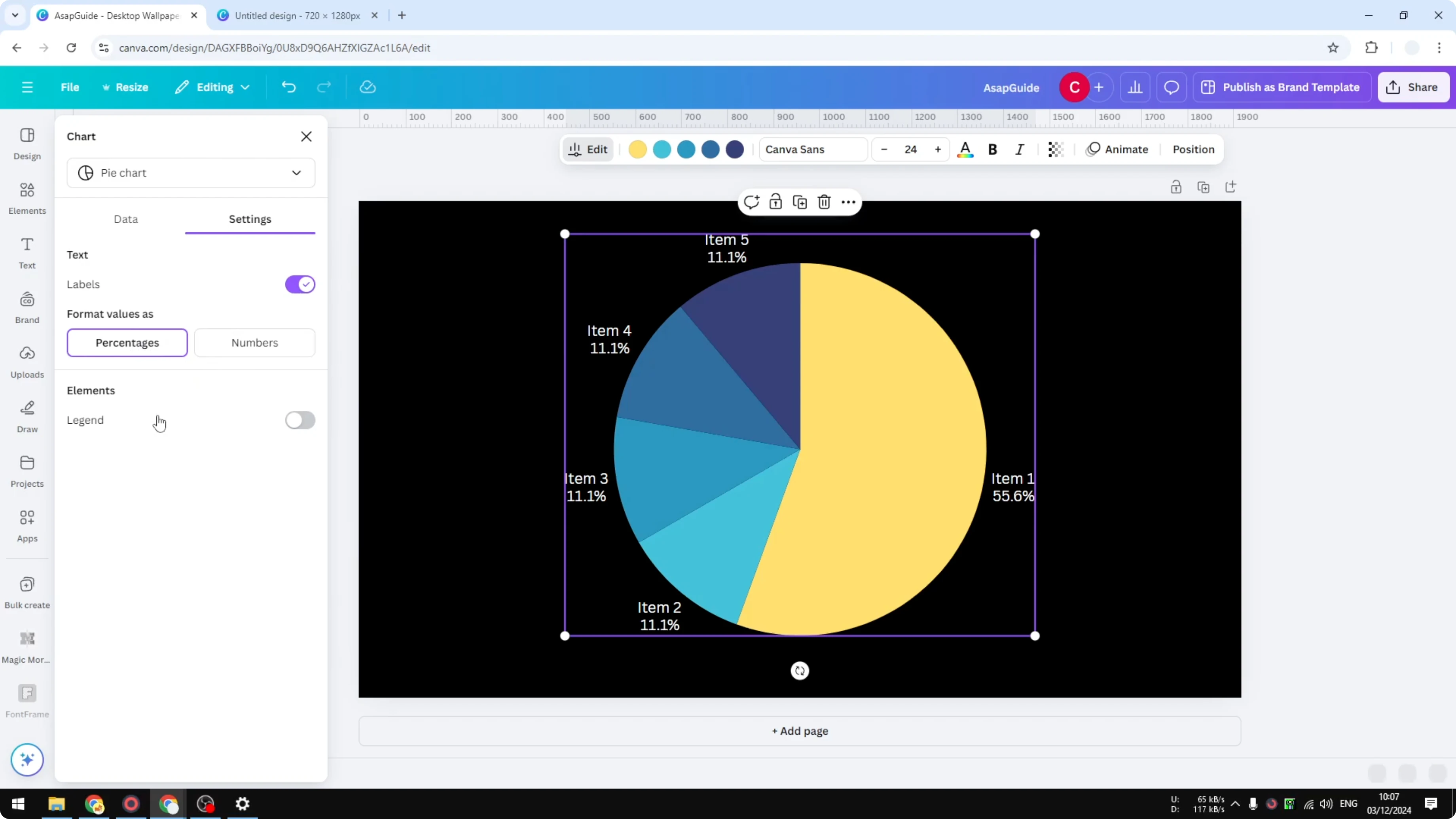
Format values and labels
Use the Labels control to choose which rows of your data appear as labels. Choose which rows in the data you want to use as the value. This affects what text and numbers show on the chart.

Open the Settings menu. Choose Percentages or Numbers for the value format. This changes how values display without changing the proportions.

Colors
You can change the color of each segment. Select a segment and pick a new color, for example red. You can change it to any color you want.
Legend and labels
Enable Legend to show the names of the categories. You can remove labels so only the Legend appears. Usually you use either labels or the Legend based on what looks best.
Fonts
You can change the font of the data. Click the chart, then choose a font that fits your chart. There are many options to pick from.
Final thoughts
That’s how you can create a pie chart in Canva. Add it from Elements, edit the data, and format labels, values, colors, Legend, and fonts. The chart updates automatically as you change the data.
Recent Posts
How to Visualize Yourself as a Pixelized Character with AI?
How to Visualize Yourself as a Pixelized Character with AI?
How to Revive Faded Memories and Enhance Image Clarity with AI?
How to Revive Faded Memories and Enhance Image Clarity with AI?
How to Visualize Yourself as an Animal Crossing Character with AI?
How to Visualize Yourself as an Animal Crossing Character with AI?