How to Create a Donut Chart in Canva
You can create a donut chart in Canva without any third party app or plugin. The chart is interactive, you can hover over a segment to highlight it, and you can change the color or the value for each part. Here is how I set it up from a blank page.
Create a Donut Chart in Canva: Insert the chart
Add a new page in your Canva design.

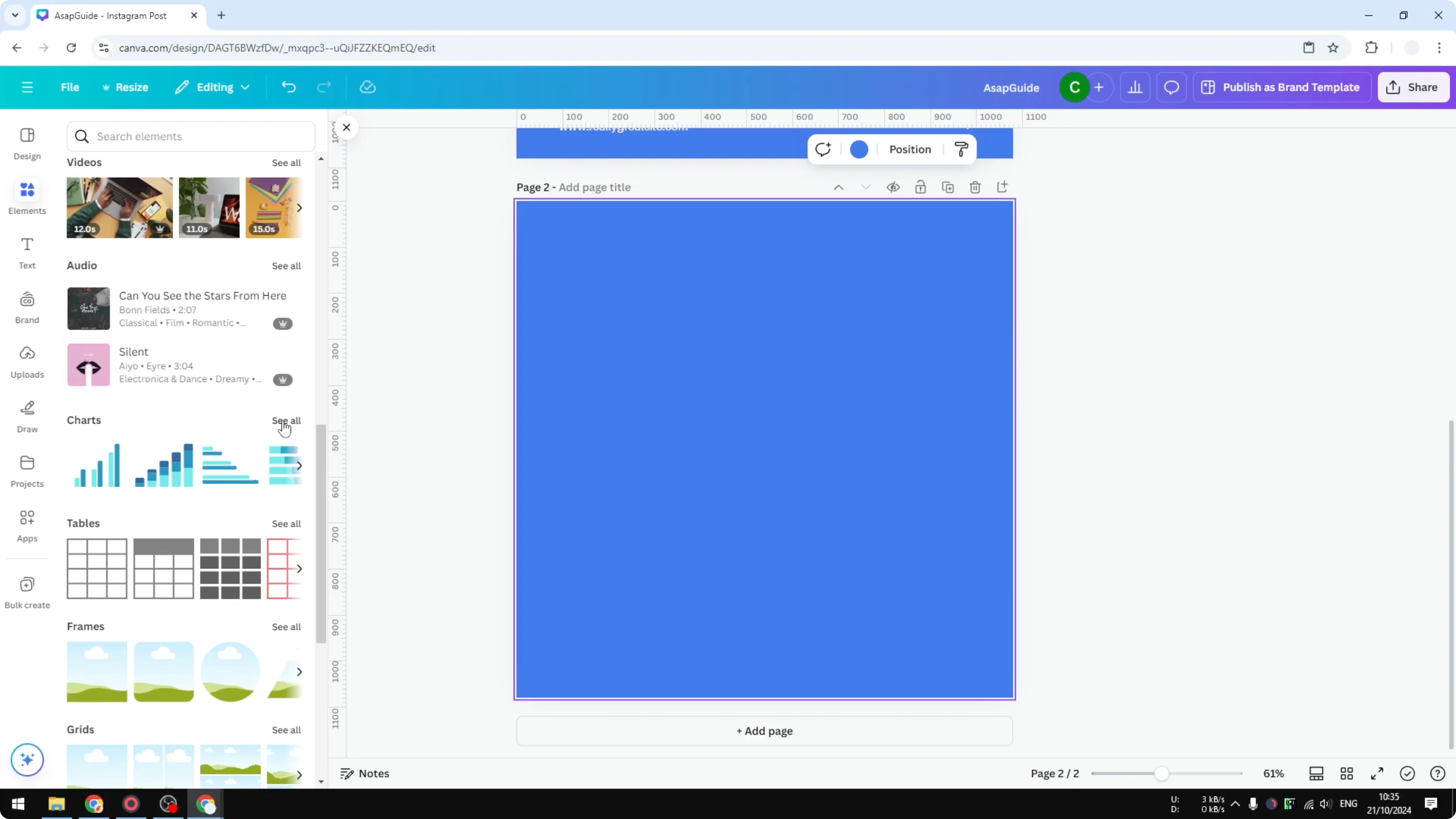
Open Elements, go to the Charts section, and click See all.
Select the Donut chart. Canva inserts a basic template you can modify.
If you prefer a classic circle without a hole, this pie chart guide walks through that option in Canva.
Create a Donut Chart in Canva: Add data
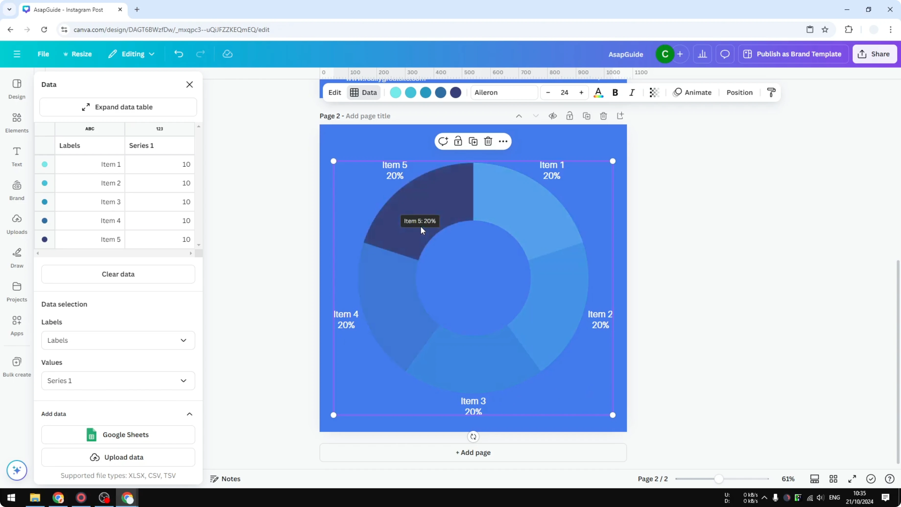
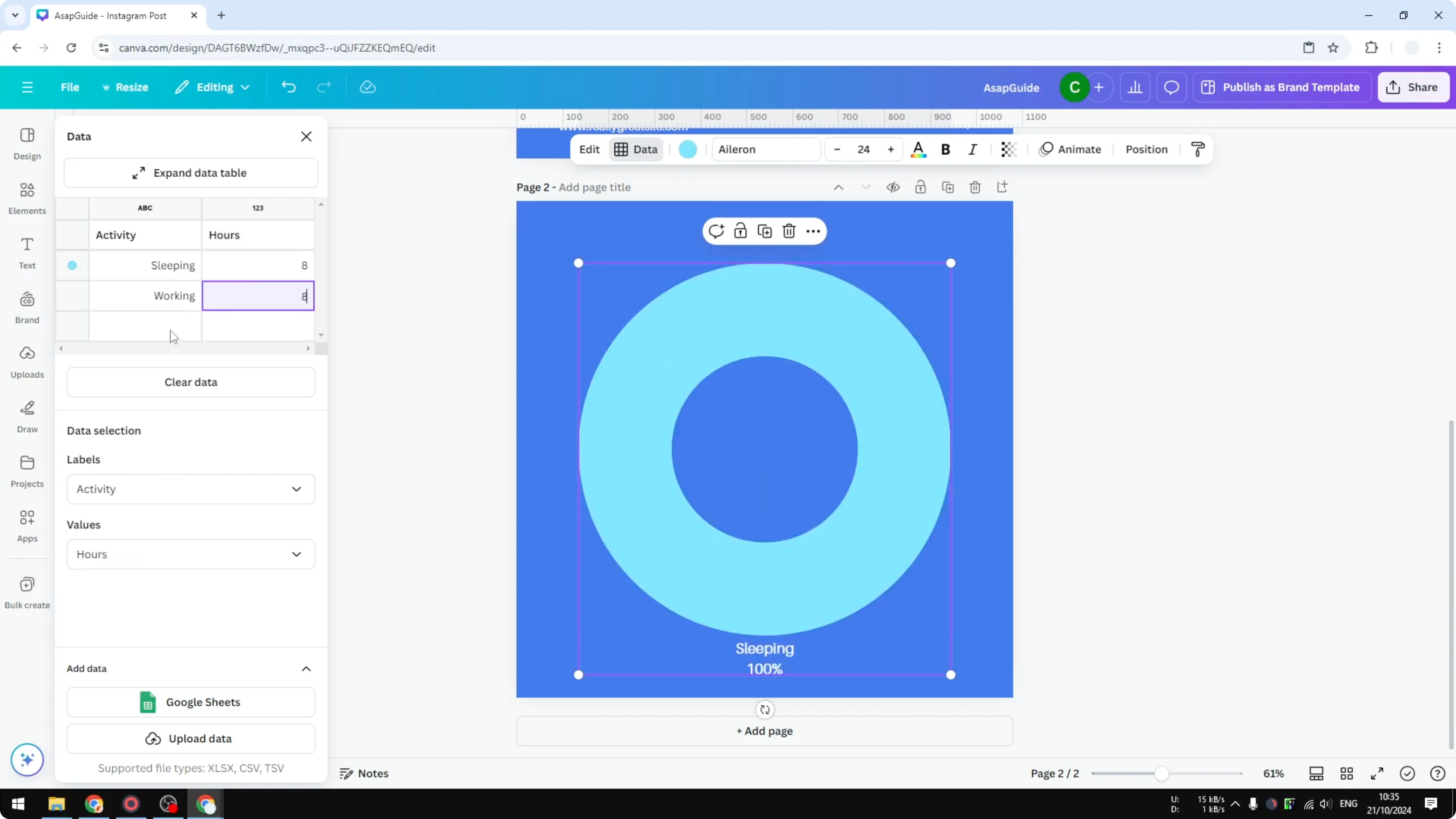
Click the chart to open the data table, then clear all values and labels using Clear data.
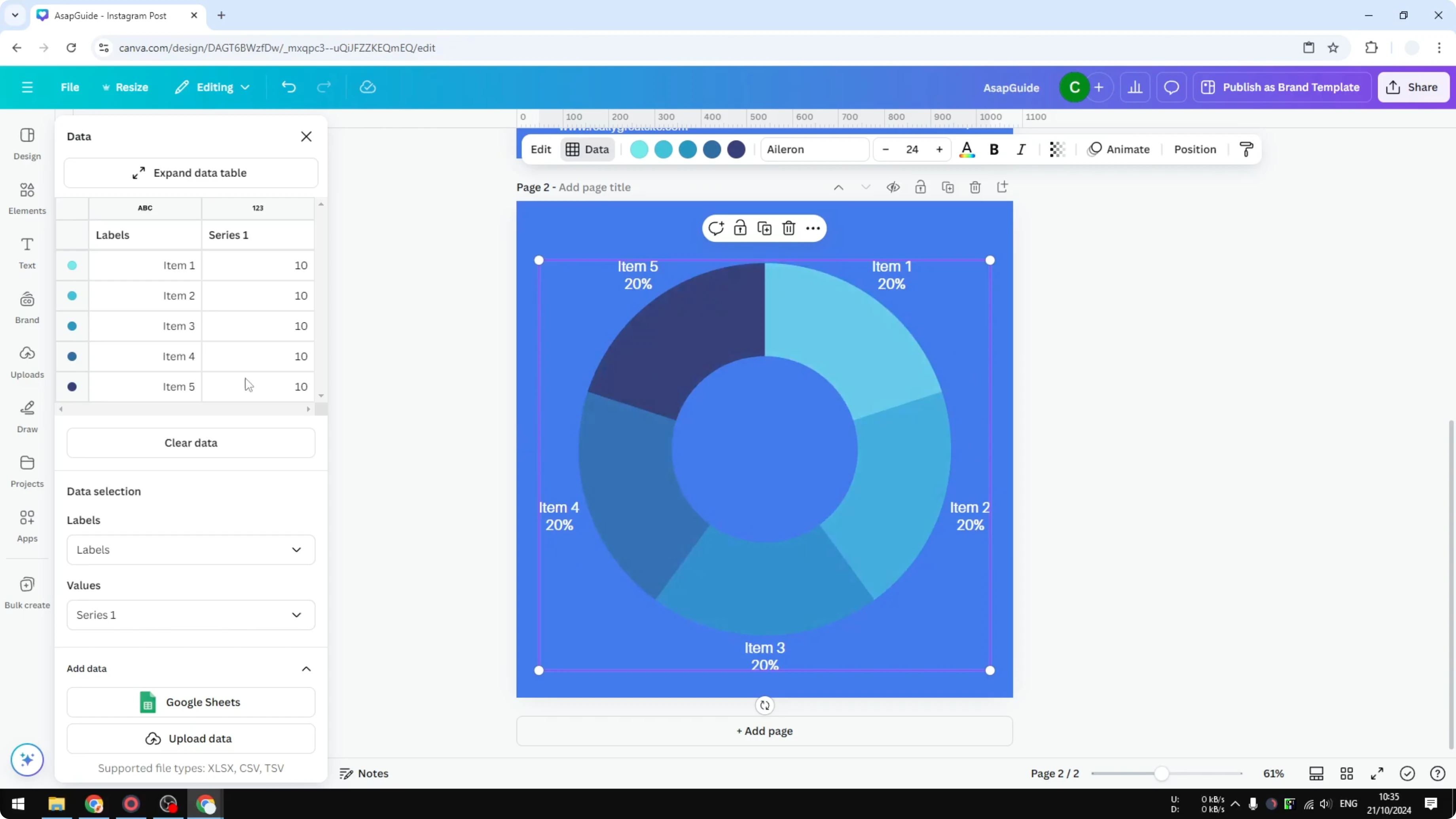
Create two columns named Activity and Value. This Value column is how many hours you assign to each activity.
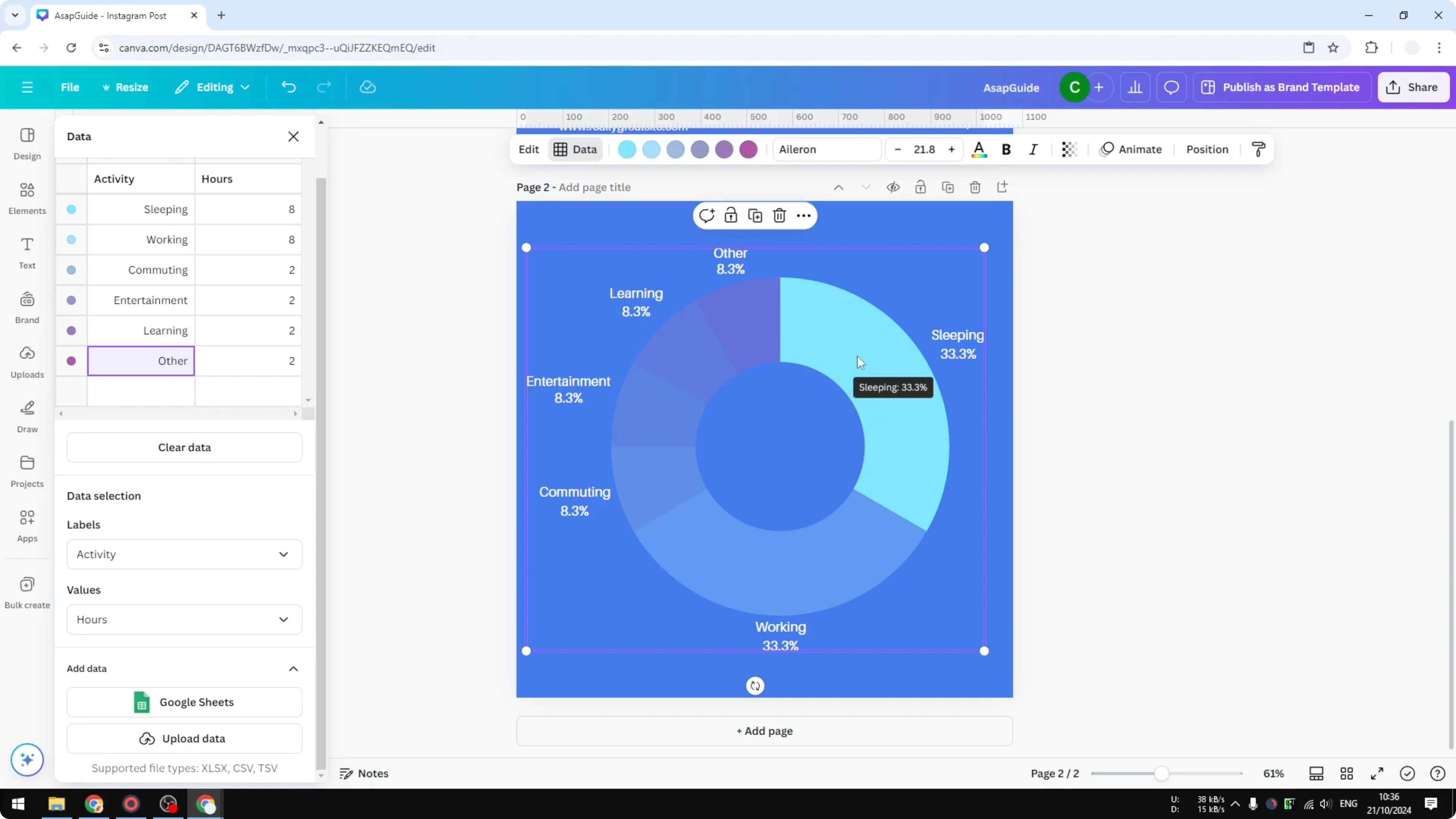
Enter rows like these to show a full day. Sleeping 8. Working 8. Commuting 2. Entertainment 2. Learning 2. Others 2.
The total is 24 hours. Canva automatically calculates the percentages for each slice. Sleeping becomes about 33 percent, which is roughly one third of a day.

Create a Donut Chart in Canva: Adjust colors
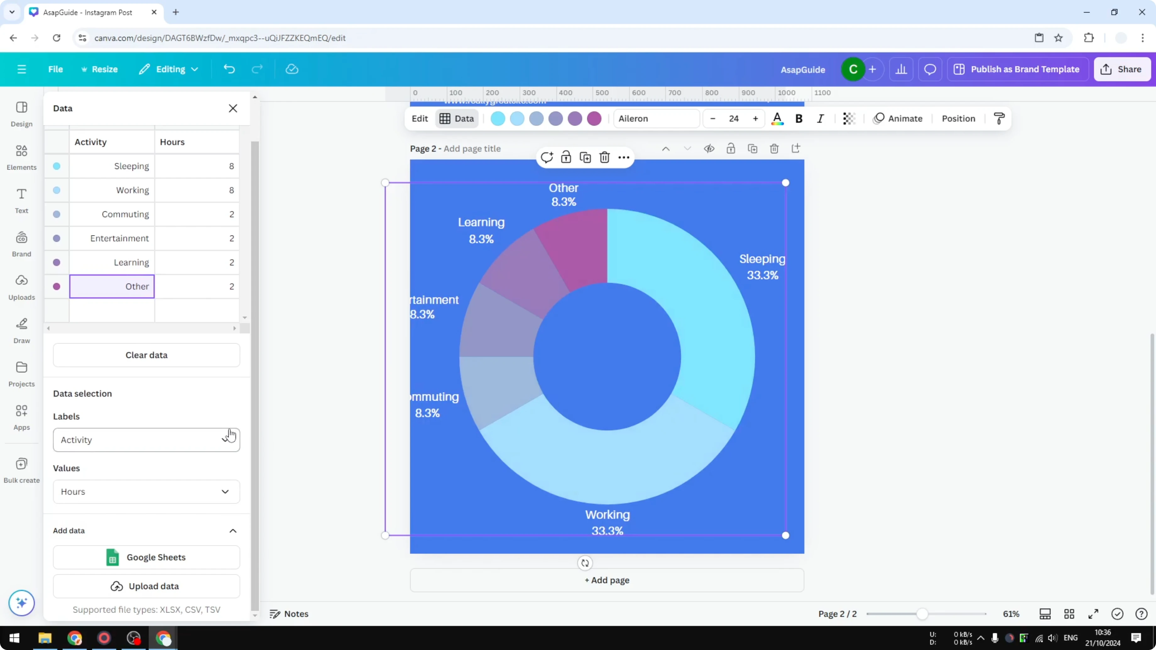
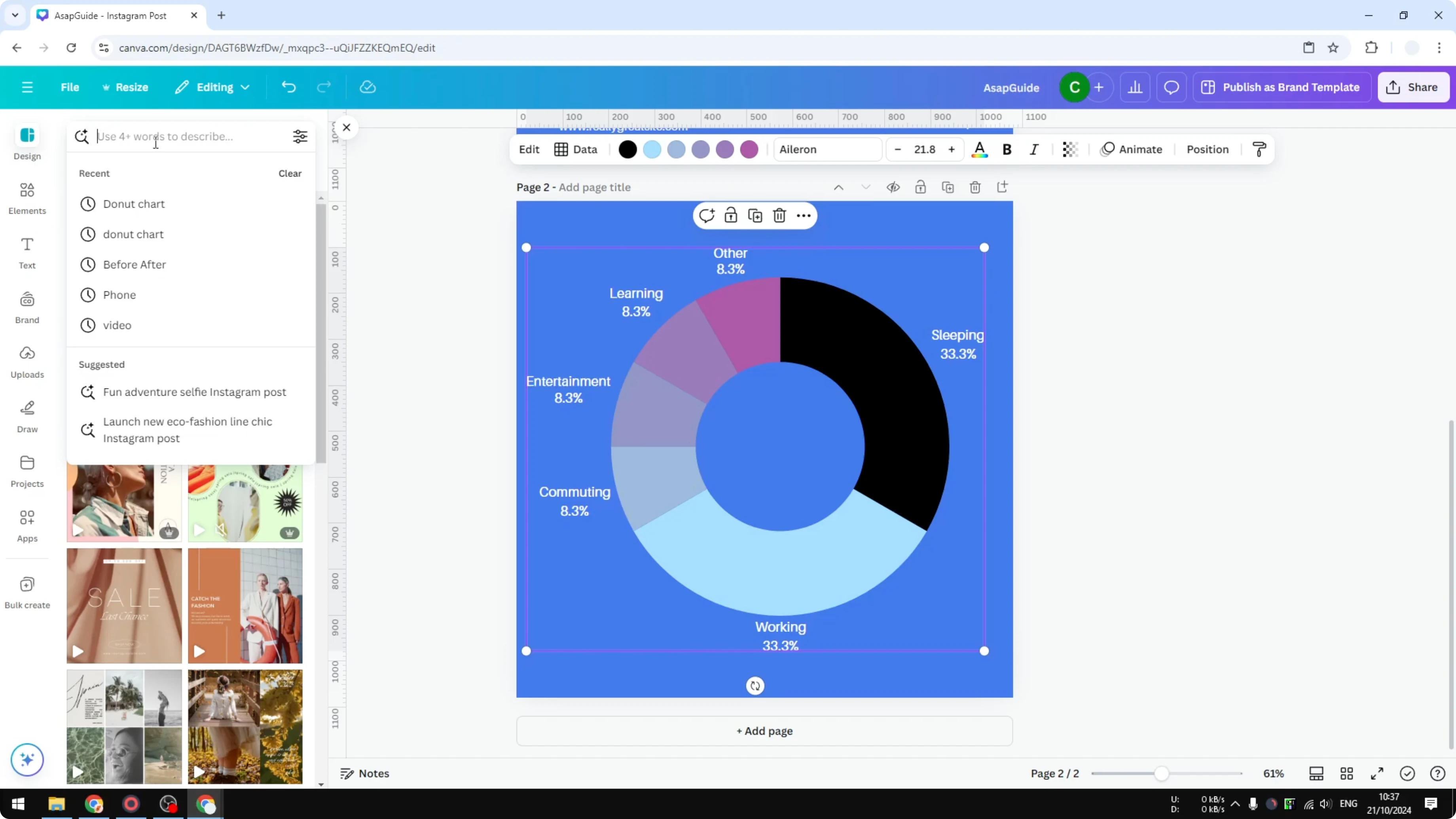
Select the chart, then click the color swatch for the segment you want to change.
Pick a new color that fits the activity. For example, I set Sleeping to black so it reads as a night activity.
Repeat for the other segments until the palette matches your theme or brand.
Create a Donut Chart in Canva: Import data
You can add data from Google Sheets or upload a file from your computer. Canva turns that data into the donut chart automatically.
This is helpful when your numbers update often or you already have a spreadsheet ready. If your project needs a relationship map rather than a time split, you can also build an ecomap chart in Canva.
Create a Donut Chart in Canva: Templates and styling
For a faster start, search for donut chart templates in Canva. Many pro templates already have strong color choices, fonts, and layouts.
Pick a template you like, swap in your data, and adjust the colors to match your content. For a playful headline or label near the chart, try adding a balloon text effect.
Final Thoughts
A donut chart in Canva takes just a few steps to insert, label, and style. Clear the sample data, enter your values, and let Canva handle the percentages. Finish by refining colors or starting from a template to get a polished look in minutes.
Recent Posts
How to Visualize Yourself as a Pixelized Character with AI?
How to Visualize Yourself as a Pixelized Character with AI?
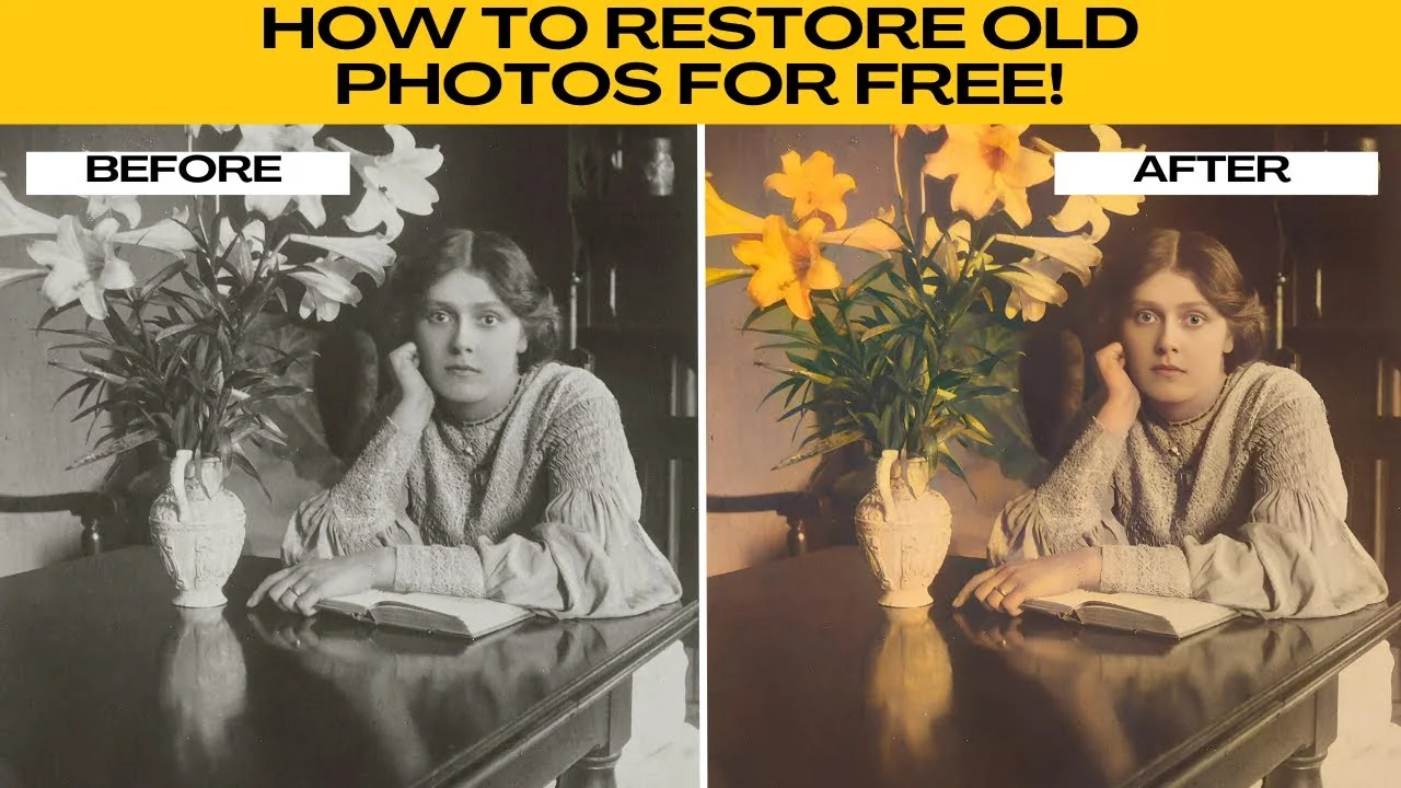
How to Revive Faded Memories and Enhance Image Clarity with AI?
How to Revive Faded Memories and Enhance Image Clarity with AI?

How to Visualize Yourself as an Animal Crossing Character with AI?
How to Visualize Yourself as an Animal Crossing Character with AI?