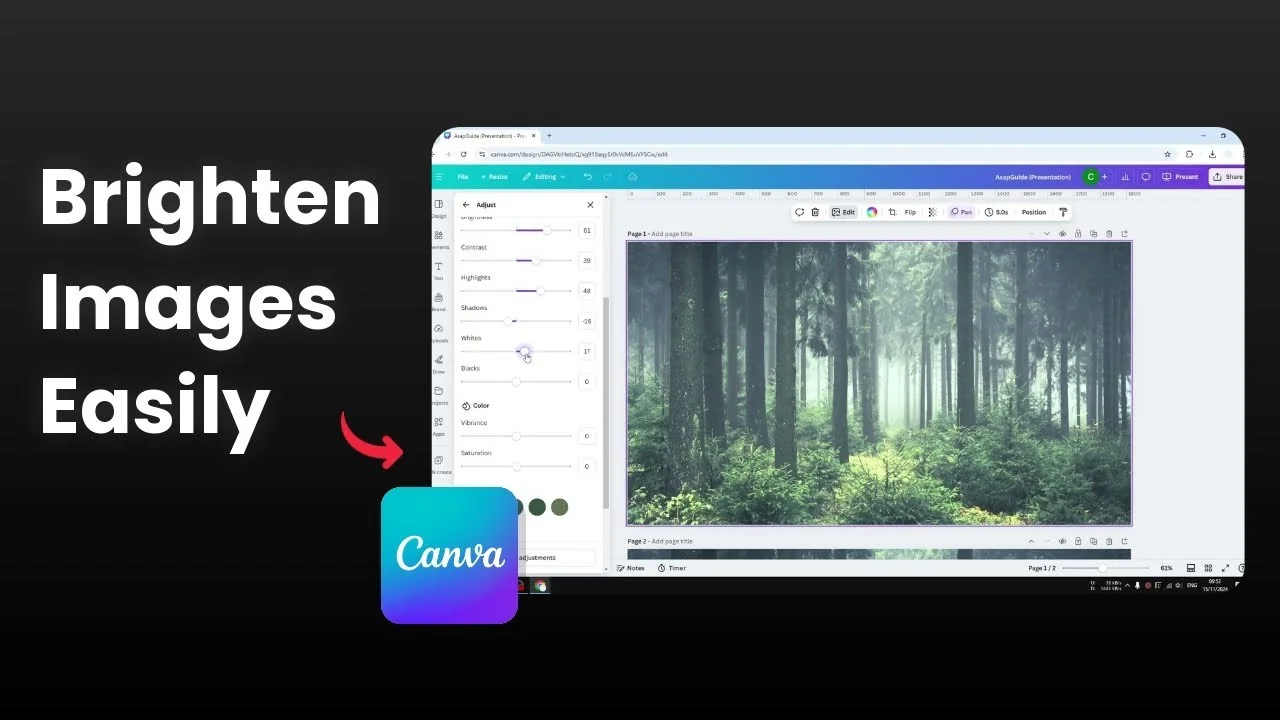
How to Brighten Image in Canva
Here is how I brighten a photo in Canva. The process is simple, and the exact numbers depend on each photo. I will show the core sliders I adjust and the ranges that work for me.
Brighten Image in Canva
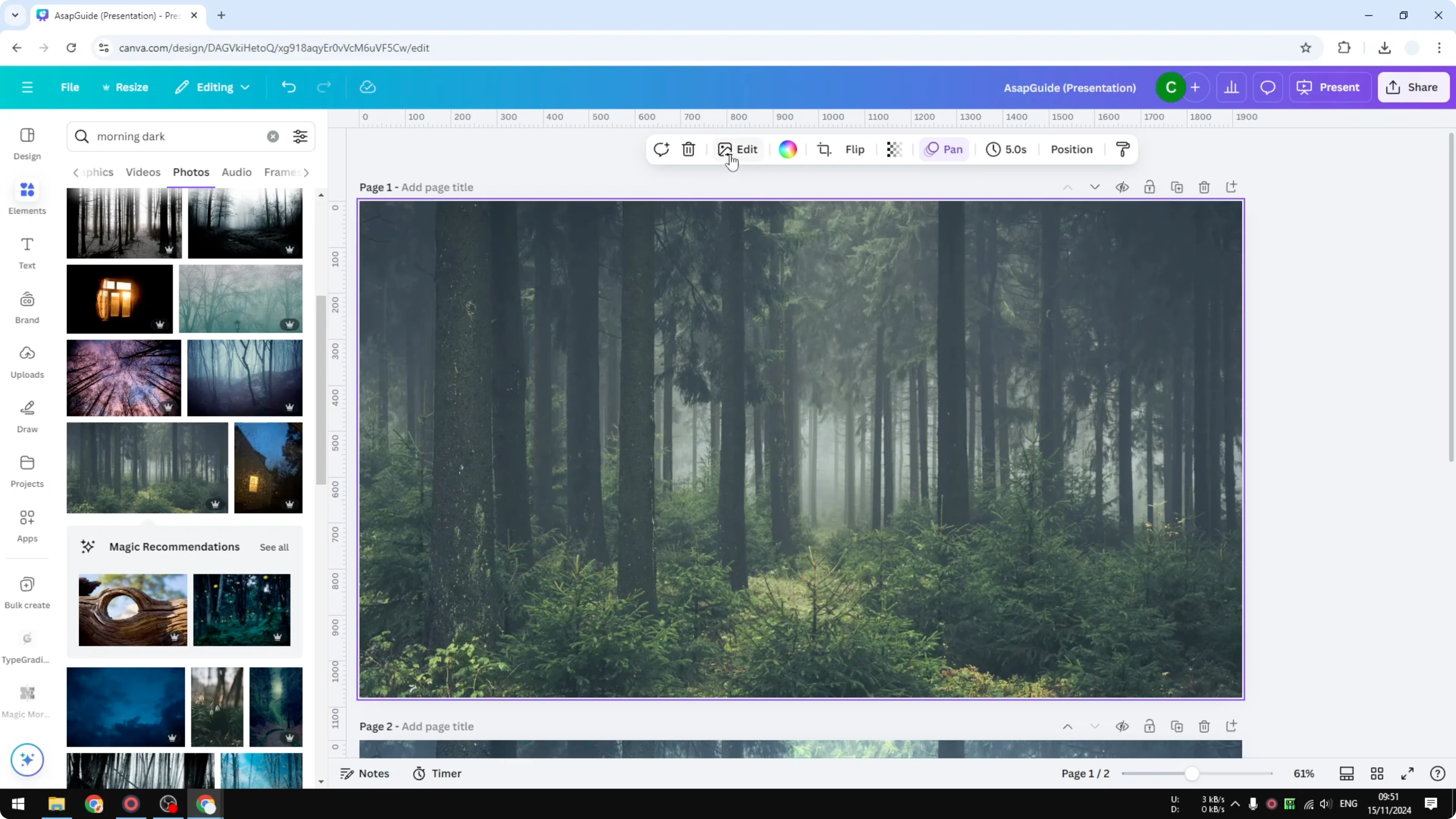
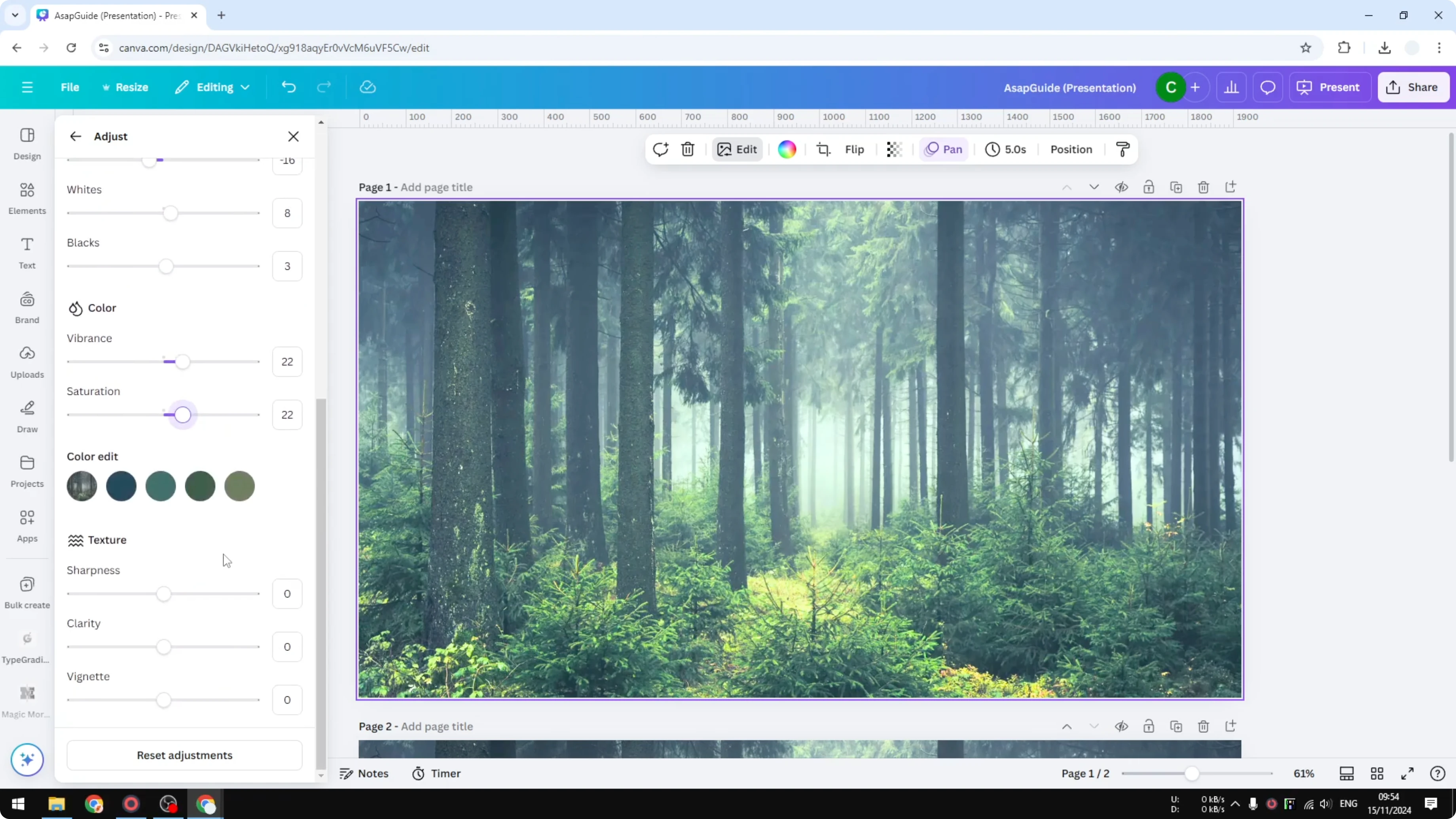
I start with a photo that is too dark, like a forest shot taken in the morning that still looks dim. I want to make it brighter while keeping it natural.
Quick steps
Upload your photo to your Canva account.

Open a new document and insert the photo.

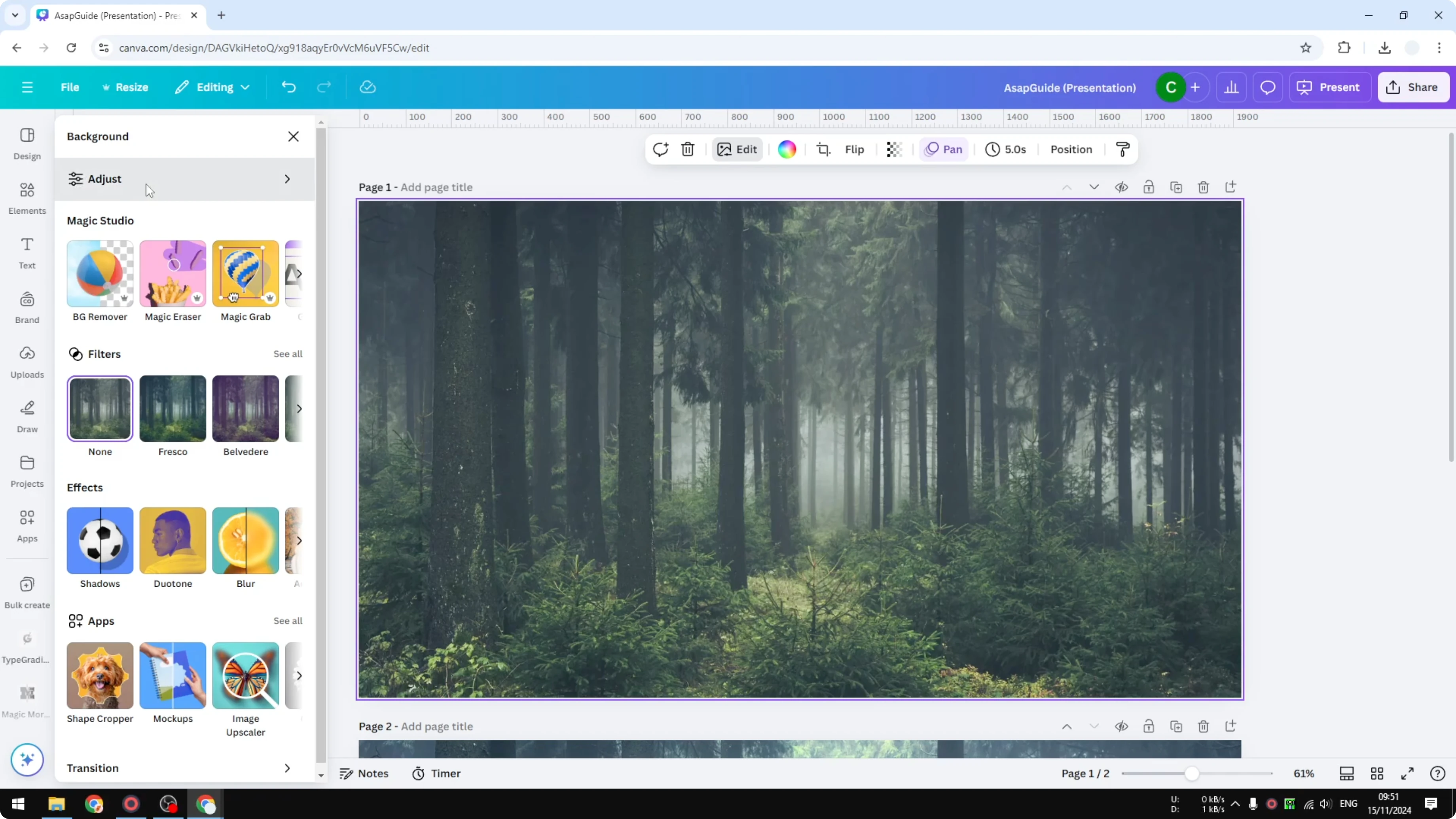
Select the photo and click Edit.
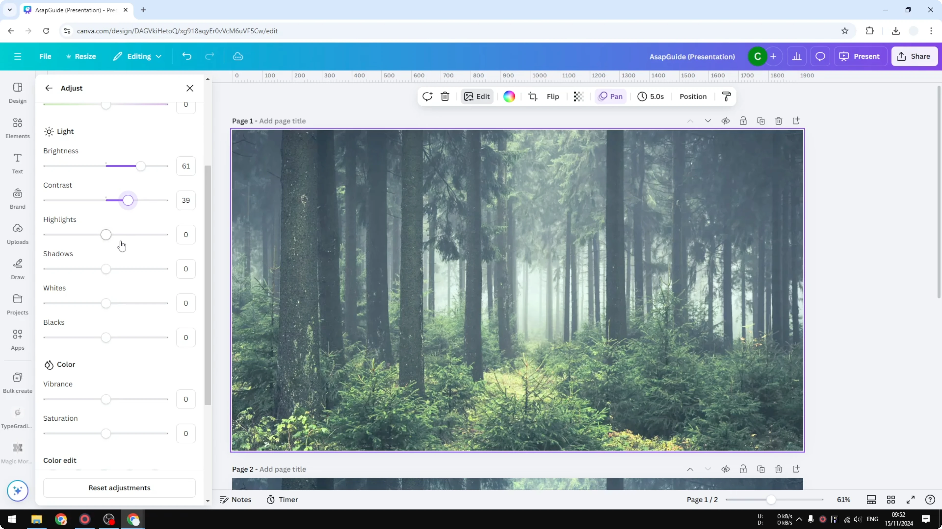
Open the Adjust panel and scroll to the Light section.
Light adjustments
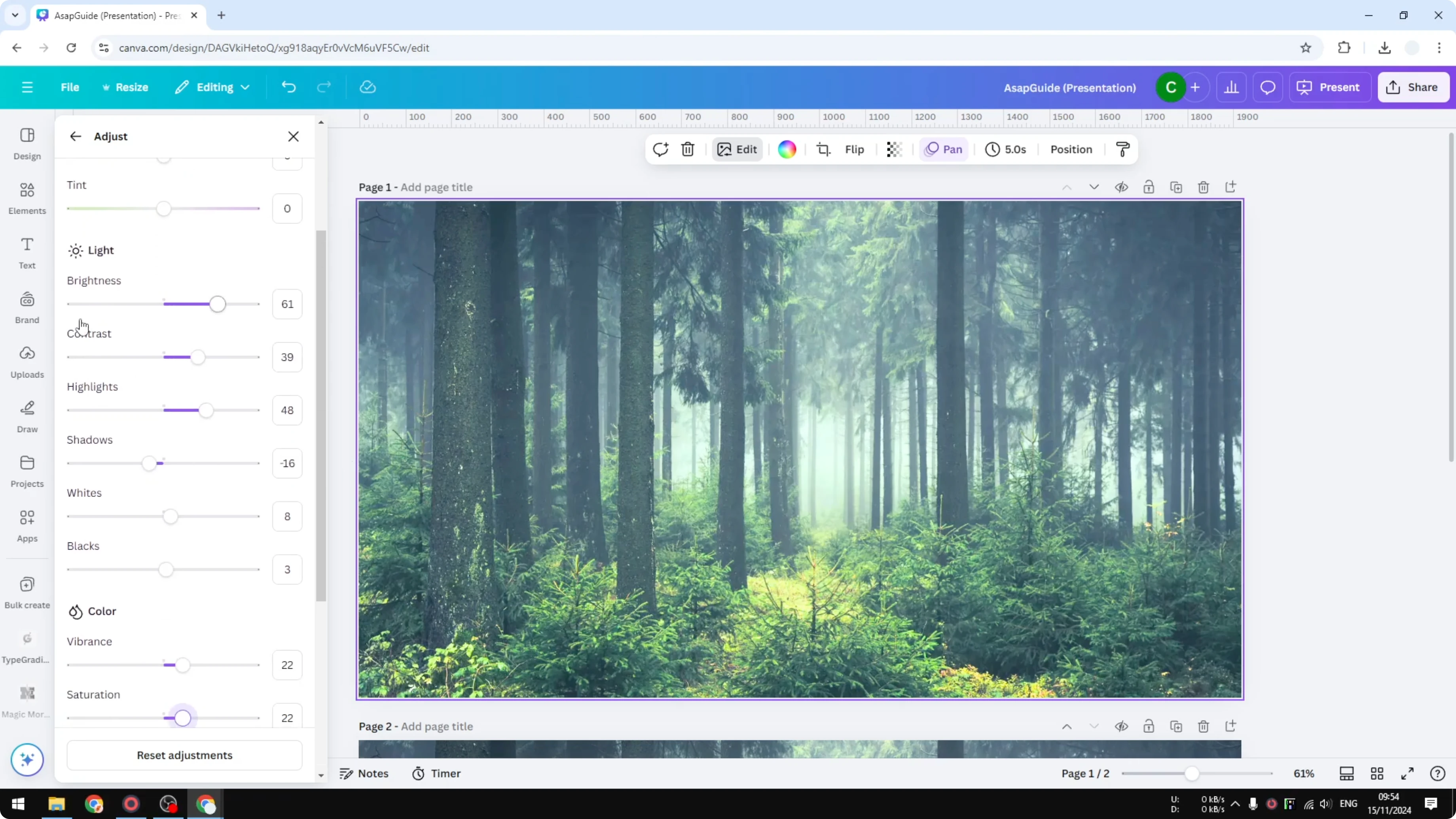
Increase Brightness first, but keep it moderate. Pushing it too far makes things look weird, so I raise it just enough to lift the scene.
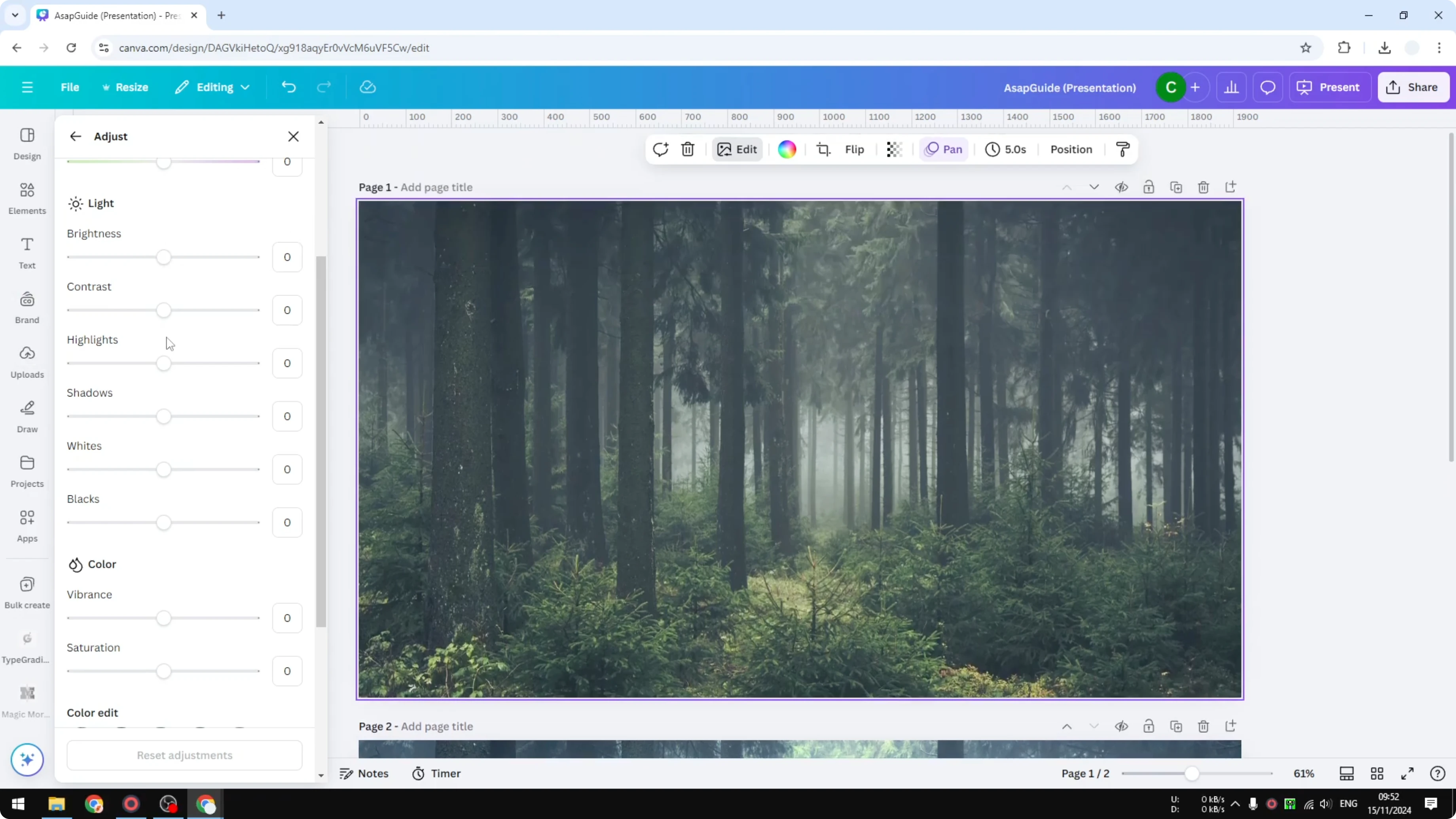
After raising Brightness, increase Contrast. Brightening usually lowers perceived contrast, so adding some contrast helps the image keep its depth.

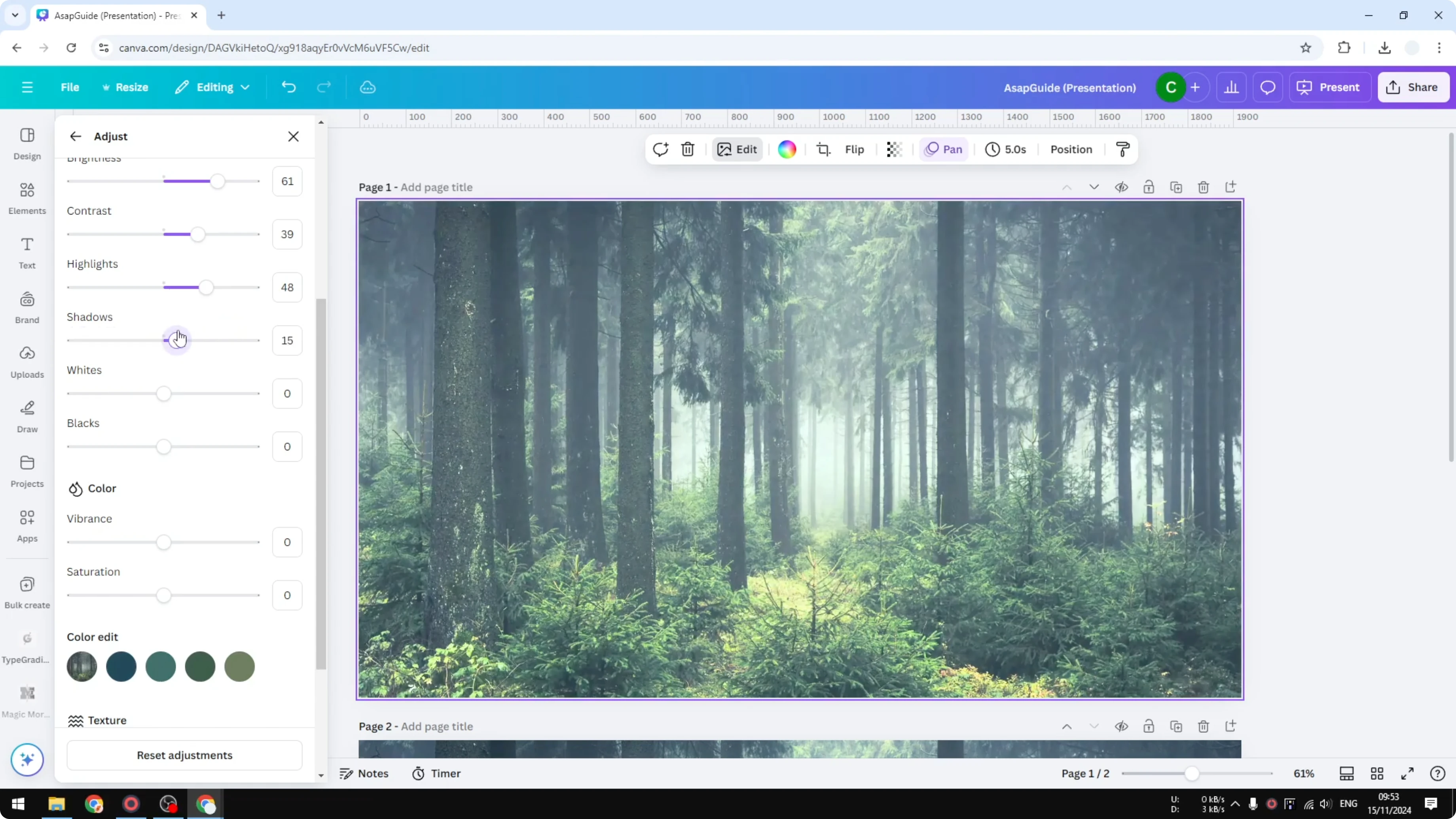
Highlights affects the bright areas. I often set Highlights around 40 to 50 to bring out light elements, like fog, without blowing them out.
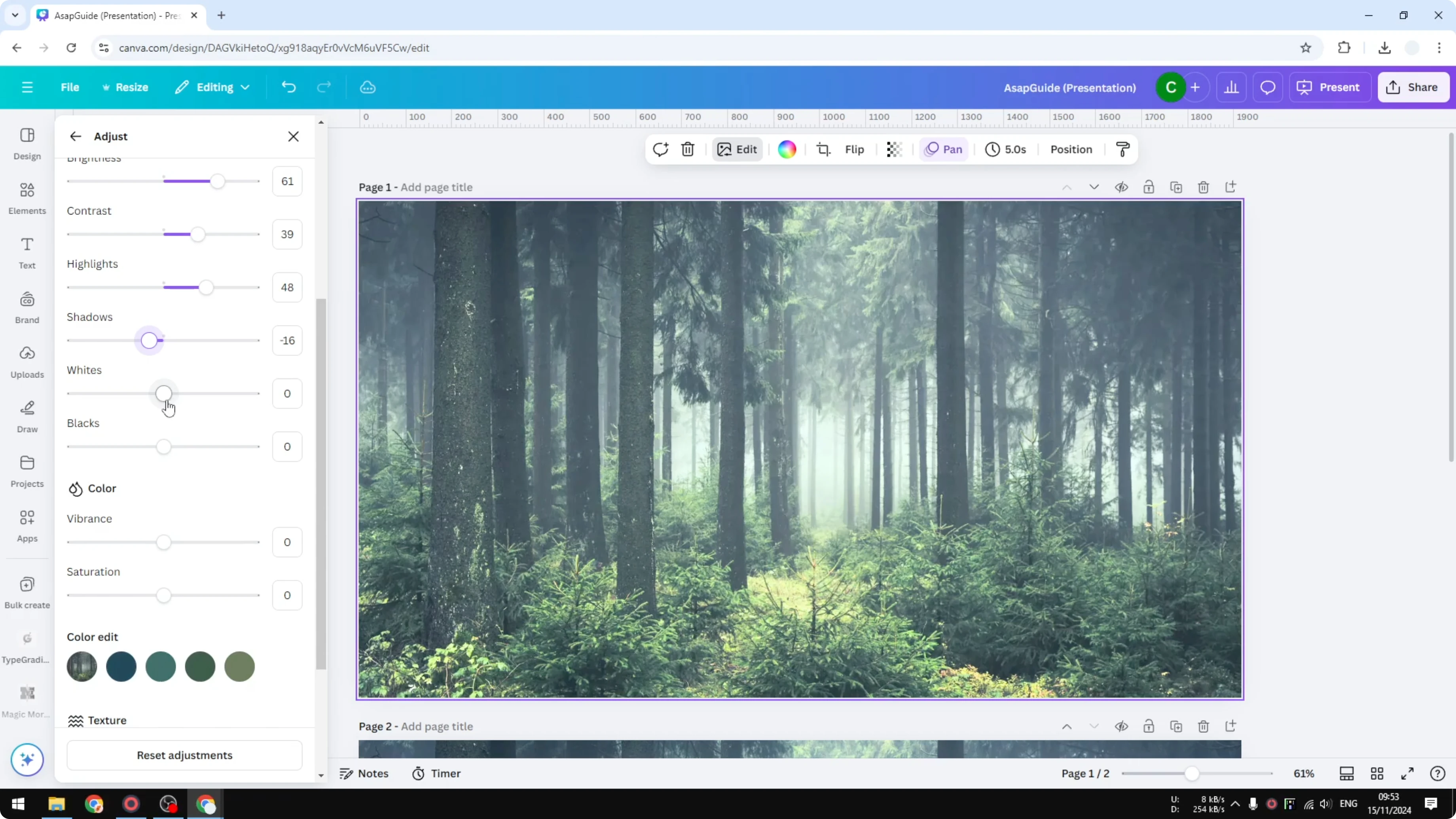
Shadows controls the dark parts and feels similar to contrast, but only for shadow areas. If I want the whole photo brighter, I can nudge Shadows to the right, but I usually reduce it a bit to maintain contrast and avoid flat tones.
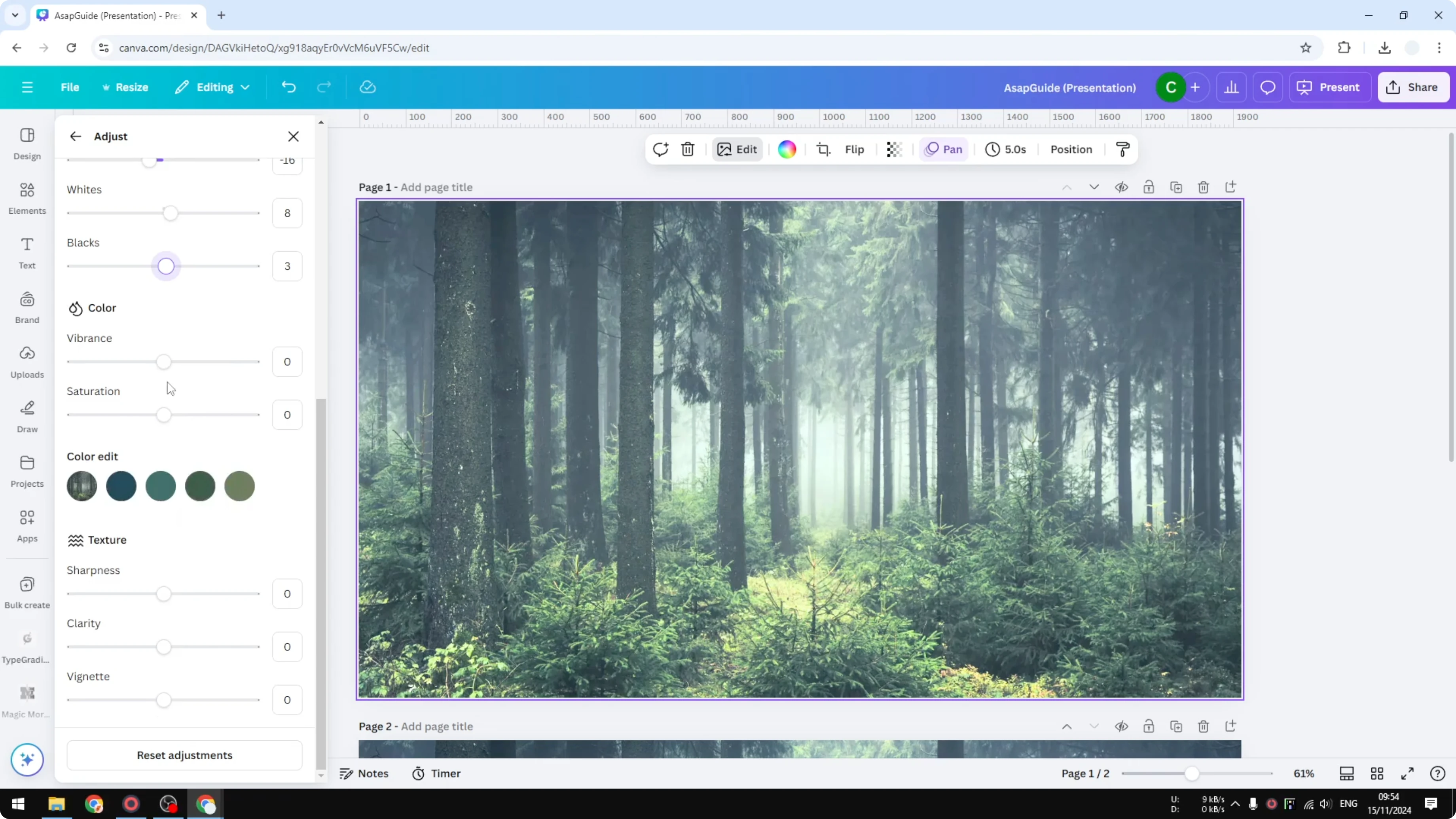
Whites is like Highlights but targets the very brightest parts. I keep Whites under 10 to avoid clipping and odd color shifts.
Blacks is similar in spirit for the darkest tones. I keep it very low, often just 2 or 3 points, to anchor the image without crushing detail.
Read More: Fade Image Canva
Restore color
If the colors look washed after brightening, adjust Vibrance and Saturation in the Color section. In my case, the greens can look faded after increasing Whites, so a small boost to Vibrance and a touch of Saturation brings them back.
For targeted tweaks beyond vibrance and saturation, see how to change colors in Canva for more control.
Optional tweaks
You can refine the look further with Temperature and Tint for white balance. Sharpening, Clarity, and Vignette can add crispness or focus, but I use them lightly.
The core work still happens in the Light and Color sections. The exact numbers will differ, but this approach consistently gets a bright, natural result.
Read More: How To Add Text Behind Image In Canva
Final thoughts
Increase Brightness moderately, restore depth with Contrast, and balance tones with Highlights, Shadows, Whites, and Blacks. If colors fade, bring them back with Vibrance and Saturation. The Light and Color sections do most of the heavy lifting, and small, careful moves keep the image looking natural.
Recent Posts
How to Visualize Yourself as a Pixelized Character with AI?
How to Visualize Yourself as a Pixelized Character with AI?
How to Revive Faded Memories and Enhance Image Clarity with AI?
How to Revive Faded Memories and Enhance Image Clarity with AI?
How to Visualize Yourself as an Animal Crossing Character with AI?
How to Visualize Yourself as an Animal Crossing Character with AI?